MDT/Papyrus/UserGuide/CSS
Contents
- 1 Introduction
- 2 Installation
- 3 Using StyleSheets
- 4 Deploying a CSS Theme
- 5 Editing a StyleSheet
- 6 Supported properties
- 6.1 Selector properties
- 6.2 Style properties
- 6.3 Stereotype Name Display
- 6.4 Stereotype Properties Display
- 6.5 Default display settings
- 6.6 Override the default settings
- 6.6.1 CSS Exemple
- 6.6.2 Shape customization
- 6.6.2.1 Introduction
- 6.6.2.2 Rounded Corner
- 6.6.2.3 Oval shape setting
- 6.6.2.4 Floating Label
- 6.6.2.5 SVG symbol usage
- 6.6.2.6 SVG color set
- 6.6.2.7 Border style
- 6.6.2.8 Compartment top line length
- 6.6.2.9 Compartment top line position
- 6.6.2.10 Name position
- 6.6.2.11 Add header
- 6.6.2.12 Port position
- 6.6.2.13 Display as a package
- 6.6.2.14 Shadow improvement
- 7 Manipulating styles
- 8 Limitations and issues
Introduction
The standard UML specification provides a few hints to represent graphical elements. However, it only focuses on the general representation of these elements (e.g. A Class is a rectangle, with optional compartments for its attributes and operations, and its name should be displayed in italic if the Class is abstract).
Nevertheless, for a better readability (and even esthetic), the user has a certain freedom for changing some graphical properties, such as an Element's color. Until now, in Papyrus, this customization could be done by two complement means:
- Appearance tab (Properties view): change the appearance of the selected element(s)
- Preferences page: change the initial appearance of all newly created element(s)
While this allows defining a custom theme for our diagrams, this mechanism suffers from a few limitations:
- It is not possible to create different categories of appearance for the same semantic Element (e.g. "Blue Class" and "Green class"). We'd have to create "Blue classes" and change some of them to "Green"manually.
- If we wanted to change the current theme, we'd have either to change each object's appearance one by one, or to write an automatic transformation, which could be really complicated.
- It is not easy to export a Theme, as they are stored in the Eclipse preferences. It is almost impossible to ship a ready-to-use distribution of Papyrus with a custom theme.
The Cascading StyleSheets (CSS) component adds the capacity to define some Stylesheets for your diagrams. Just like in web pages, the CSS format is used to separate the contents of our diagrams from their appearance. It becomes possible to change the appearance of a whole diagram, or even a set of diagrams, independently of the number of represented elements, in a single click.
Installation
The CSS Stylesheet support is now shipped in the base installation of Papyrus. It doesn't require any specific installation step anymore.
Without the CSS component, or with the "Black & White" CSS Theme, your diagrams look like:
With the default "Papyrus" CSS Theme, your diagrams look like:
Note: If you opened a diagram which has been created without the CSS Support, it may still have a user-defined appearance, e.g. without Element icons. This might or might not be a problem, as this may conflict with the CSS Theme. You can reset all custom appearances by pressing the "Default style" button in the Style tab of the Diagram's properties view.
Using StyleSheets
To define a custom style, the first step is to create a Stylesheet. The creation is really straightforward: a Stylesheet is a text file with the .css extension. You can create such a file using the "New > File" wizard.
There are several options for using stylesheets.
Diagram Stylesheets
You can define a particular style for a diagram.
- Select a diagram
- Go to the Style tab of the properties view
- Add a new "Diagram style sheet". There isn't currently any style sheet available from the diagram, so you need to create a new "Stylesheet reference".
- Browse your workspace to find your css file, and press OK. Your stylesheet is now associated to your diagram.
Model StyleSheet
Similarily to "Diagram Stylesheet" you can define a particular style for a Model.
- Select a model
- Go to the Style tab of the properties view
- Add a new "Model style sheet"
- Browse your workspace to find your css file, and press OK. Your stylesheet is now associated to your Model.
Project Stylesheets
You can associate to a project specific stylesheets.
- Select a project in "Project Explorer" view
- Open project preference properties: "Right click > properties"
- Go to CSS stylesheets page: "Papyrus > Style sheets"
- Add a new "Project style sheet". There isn't currently any style sheet available from project, so you need to create a new "Stylesheet reference".
- Browse your workspace to find your css file, and press OK. Now, your stylesheet is associated with the project.
Deploying a CSS Theme
Once you have defined your style sheets, you may want to export it to create a new theme (Or to extend an existing theme). To do so, Papyrus provides two ways to define a theme.
With extension point
Papyrus provides an extension point: org.eclipse.papyrus.infra.gmfdiag.css.theme.
This extension point needs two entries: a Theme Definition (ID, Label and icon of the Theme), and Theme contributions (A set of style sheets which will compose the Theme). More than one plug-in can contribute to the same Theme, which makes it possible to extend a Theme.
The Theme can be modified from the Papyrus preferences page "CSS Theme". Only one theme can be activated at the same time. A Theme applies to all Papyrus Diagrams from the workspace.
In workspace preference
You can define theme in workspace preferences. A theme is defined by style sheets.
- Go to the Papyrus preference: "Window > Preferences > Papyrus > CSS Theme"
- Add a new theme. There are currently two existing themes: "Papyrus Theme" and "Black & White".
- Write a name for this new theme
- (optional) Choose an icon
- Associate one or more style sheets with this theme
- Press OK to finish creation
You can edit or create a theme with a selection of CSS files in Project Explorer view. For this, select the CSS files, right click and select "CSS Theme"
Editing a StyleSheet
Papyrus Stylesheets are stored in text files with the ".css" extension (e.g. stylesheet.css).
Manually: The CSS Syntax
Syntax elements
The CSS syntax is a list of rules, which associates selectors and properties.
- The selector: describes the condition which has to be fulfilled for a rule to be applied
- The properties: describes the appearance of the elements matching the rule
Eclipse implements the 2.1 version of the CSS syntax. The available selectors are:
- *: Matches all elements
- ElementType: Matches the elements of type "ElementType"
- .myStyle: Matches the elements on which the style "myStyle" is applied
- #myID: Matches the element with the CSS ID "myID". The CSS ID must be unique among a diagram. To avoid confusing the users, and because this selector doesn't make much sense on diagrams, this selector has been disabled in Papyrus.
- [property=value]: Matches the elements which have a property "property" with the value "value". It can also match the properties of Stereotypes
- [appliedStereotypes~="MyStereotype"]: Matches the elements on which the Stereotype "MyStereotype" is applied. You can use either the Stereotype's name or qualified name (MyProfile::MyPackage::MyStereotype). Note: always use the "~=" operator (Which means "contains"), because UML elements can have more than one applied stereotype.
- :pseudo: Matches the element on which the pseudo-selector "pseudo" is applied. Pseudo-selectors are typically used for dynamic events, and for filtering some non-semantic properties. In Papyrus, they are used for identifying more precisely the floating labels (When an element has more than one label: see the [#Mask_Label Mask Label] chapter below), and they are also used by the animation framework to specify events (See the Moka documentation)
These selectors can be combined using one of the following combinators:
- Selector1 Selector2: Descendant selector. Matches the elements which match Selector2 and are contained in an element matching Selector1
- Selector1 > Selector2: Child selector. Matches the elements which match Selector2 and are directly contained in an element matching Selector2
- Selector1 + Selector2: Sibling selector. Matches the elements which match Selector2 and are immediately preceded by a Sibling element which match Selector1.
- Selector1, Selector2: Alternative selector. Matches elements matching either Selector1 or Selector2
A rule also contains a list of properties, in the form property:value;
In Papyrus, the selectors apply to semantic elements and properties (i.e. UML Elements), and the properties apply to the appearance properties (i.e. GMF Appearance properties). A few custom properties (Independent from the GMF Appearance model) are also available (See "Supported properties" below).
Examples
* { fillColor: red; fontColor: #0000FF; }
Meaning: all elements should be filled in red, and all texts should be blue (RGB Color #0000FF)
Class { gradient: white vertical; elementIcon:true; shadow:true; qualifiedNameDepth:full; }
Meaning: this style applies to all UML Classes. They will have a white and vertical gradient. The Element icon and the shadow will be displayed, as well as their fully qualified name.
ClassDiagram Class>Property { fontColor: red; }
Meaning: The properties directly contained in a Class, which is drawn on a ClassDiagram (Either as a root element of the diagram, or in a Package) will be displayed in red.
[appliedStereotypes~="Block"]{ bold:true; } /* Equivalent: qualified name */ [appliedStereotypes~="SysML::Blocks::Block"]{ bold:true; }
Meaning: The elements with the "Block" stereotype must be displayed in bold.
[appliedStereotypes~=Block][isEncapsulated=true]{ fontColor:red; }
Meaning: The elements with the "Block" stereotype, and the stereotype property "isEncapsulated" set to true, must be displayed in red.
All these rules can be combined:
Class[appliedStereotypes~=Block][appliedStereotypes~=MyCustomStereotype][isEncapsulated=true][myCustomProperty=SomeValue][isAbstract=false]{ /* A class on which the stereotypes "Block" and "MyCustomStereotype" are applied, * and on which the stereotype property "isEncapsulated" is set to true, * the stereotype property "myCustomProperty" is set to "SomeValue", and * the UML Property "isAbstract" is set to false */ fillColor:red; }
With the Papyrus tooling
Papyrus also provides a tool to generate a CSS Rule from an element displayed in the diagram. You need to create a stylesheet before you can edit it with the Create style tool, and it is recommended (Although not required) to associate this style sheet with your current diagram.
To use it, create an element and change its appearance via the "Appearance" tab of the properties view. Then, right click on the element, and select "Format", "Create a new style". The dialog box contains three tabs:
- Conditions: The conditions under which the style will be applied (Corresponds to the "CSS Selectors")
- Properties: The graphical properties to export to the style sheet
- Stylesheet: The style sheet to edit
In the Stylesheet tab, select your stylesheet:
- If you have already associated the style sheet to your diagram, you can use the "Applies stylesheet" button.
- Otherwise, you need to select "External stylesheet", and browse your workspace to retrieve the file. Note that in this case, as the edited stylesheet might not be applied to your diagram, you won't be able to see the changes in the current diagram.
In the conditions tab, there are three groups of options:
- The kind of element to which the style applies (e.g. the style will be applied to "Class" elements, or to any kind of elements). It can be restricted to a specific diagram.
- You can add restrictions on the current value(s) of the element (e.g. the style will be applied to concrete classes). Only primitive type and enumerated attributes are supported here.
- The style name is used to apply a style manually.
The properties tab contains all the graphical properties that can be applied to the selected object. It is used to choose the graphical properties to apply on the objects matching the conditions.
Supported properties
Selector properties
Selector properties are semantic element properties. They can be used with one of the following syntaxes:
[isAbstract=true]
Class[isAbstract=true]
The supported semantic element properties are:
- Strings: [name=MyName], [name="My name"] (Quotes are required for complex Strings)
- Integers: [size="12"] (Quotes are required)
- Booleans: [isAbstract=true] (Quotes are optional)
- Enumerations: [visibility=visible] (Quotes are optional)
- References to named elements (UML NamedElement or Ecore ENamedElement): [type=String]
The supported properties are the semantic properties of the UML element (e.g. isAbstract, name, type, ...), as well as the semantic properties of the stereotypes applied to the UML element (e.g. isEncapsulated for a SysML Block)
Some selectors can also be used to represent some specific parts of an element. For example, it is possible to hide a specific compartment:
Class > Compartment[kind="attributes"] { visible:false; } Class > Compartment[kind="symbol"] { visible:true; } Compartment[kind="internalstructure"]{ collapsed:true; }
To manage the name of the named element and its stereotype name, a specifier for the selector can be added :
Port > Label { visible: false; } Port > Label:Stereotype { visible: false; }
You can determine the "kind" of the Compartments by opening the "Filters > Show/Hide Compartments" context menu on a diagram element.
Style properties
Style properties are graphical properties supported by the display. Note that some graphical elements may not support some specific properties (Either because they shouldn't support them, or because they are not yet implemented). For example, a UML::Class will not support the italic property, because in UML, italic means abstract.
The CSS Supports all GMF Notation properties, as well as a few Papyrus-specific properties. This chapter will only list all the Papyrus-specific properties.
The simplest way to discover new style properties is to use the Appearance tab of the Properties view in Papyrus. When hovering one of the appearance properties, the tooltip indicates the name of the corresponding CSS property
This table lists the most common properties:
Property name | Value type | Initial Value | Applies to | Comment |
---|---|---|---|---|
fillColor | Color | white | Shapes | In the default "Papyrus Theme", the fill color depends on the type of element. The used colors are #C3D1D5 (Light blue, Default), #C3D7DD (Lighter blue, Class), #FFFFCC (Yellow, Comment), #C8FFE6 (Teal, Constraints) |
transparency | integer | 0 | Shapes | Value is a percentage: values in the range (0, 100) are supported. Transparency works only if the gradient is activated: Bug 419320 |
gradient | [Color Color [ horizontal | vertical ] | none] | none | Shapes | Examples: "white blue horizontal" or "none" |
fontColor | Color | black | Shapes, floating labels | Comments support HTML syntax. Most style-properties have no effect on comments |
fontName | String | "Segoe UI" | Shapes, floating labels | Most fonts are platform-specific. The list of available Fonts can be found in the "Appearance" tab of the properties view |
fontHeight | integer | 9 | Shapes, floating labels | |
bold | boolean | false | Shapes, floating labels | |
italic | boolean | false | Shapes, floating labels | In UML, "italic" means "isAbstract=true". This property is disabled for all elements which can be abstract (e.g. Class) |
underline | boolean | false | Shapes, floating labels | In UML, "underline" means "isStatic=true". This property is disabled for all elements which can be static (e.g. Property) |
strikeThrough | boolean | false | Shapes, floating labels | |
visible | boolean | true | All elements | Although this property will work for any diagram elements, it is probably a bad idea to use it with anything else than a Compartment or a Label |
collapsed | boolean | false | Compartments | |
showTitle | boolean | false | Compartments | |
lineColor | Color | black | Shapes, Connectors | |
lineWidth | integer | -1 | Shapes, Connectors | -1 means "default", and typically corresponds to 1px |
routing | [Manual | Rectilinear | Tree] | Manual | Connectors | The value is case-sensitive: don't forget the initial Capital |
roundedBendpointsRadius | integer | 0 | Connectors | Applies to connectors with routingStyle = Rectilinear or Tree |
smoothness | [None | Normal | Less | More] | None | Connectors | |
avoidObstructions | boolean | false | Connectors | |
closestDistance | boolean | false | Connectors | |
jumpLinkStatus | [None | All | Below | Above] | None | Connectors | It is not recommended to use jump links via CSS, as it gives strange results for overlapping connectors |
jumpLinkType | [Semicircle | Square | Chamfered] | Semicircle | Connectors | |
jumpLinkReverse | boolean | false | Connectors | |
leftMarginLabel | integer | 0 | Labels | Define the left margin of the label in pixel. This is the space between the text box and his container |
topMarginLabel | integer | 0 | Labels | Define the top margin of the label in pixel. This is the space between the text box and his container |
rightMarginLabel | integer | 0 | Labels | Define the right margin of the label in pixel. This is the space between the text box and his container |
bottomMarginLabel | integer | 0 | Labels | Define the bottom margin of the label in pixel. This is the space between the text box and his container |
bodyCutLength | integer | 0 | Opaque behaviors (transition effect or state entry/exit/do actions) | Control length of shown code in case of an opaque behavior within a transition or an entry/exit/do action of a state (use Transition > Label for the former, State > OpaqueBehavior for the latter) |
indicateParameters | boolean | false | Labels of transition | if a behavior of a transition has parameters, show these instead of abbreviating with (..) |
lineBreakBeforeEffect | boolean | false | Labels of transition | add a linebreak between guards and transitions. May avoid large transition labels |
Property name | Value type | Initial Value | Applies to | Comment |
---|---|---|---|---|
isNameWrap | boolean | true | Shapes | If set to true, the name of the Shape will be wrapped. |
displayBorder | boolean | true | Shapes | If set to false, the borders of the Shape will be hidden. |
displayName | boolean | true | Shapes | If set to false, the name of the Shape will be hidden |
displayTags | boolean | true | Shapes, connectors | If set to false, the tags (e.g. « component ») of the element will be hidden |
maintainSymbolRatio | boolean | true | Shapes | If the shape is represented with a Symbol, specifies whether the ratio should be maintained or not. If the Symbol is displayed in a compartment, it is usually a good idea to maintain the ratio. If the symbol is the only representation (e.g. when the name, border and compartments are hidden), it is recommended to not maintain the ratio |
elementIcon | boolean | false | Shapes, floating labels | Whether the icon should be displayed next to the label of the element. In the default "Papyrus Theme", the icon is displayed by default |
shadow | boolean | false | Shapes | Display a shadow under the shape |
qualifiedNameDepth | [full | none | integer] | none | Shapes, floating labels | The depth of the qualified name to display. Applies to UML::NamedElement |
lineStyle | [solid | dashed | dotted | hidden | double] | N/A | Connectors | In UML, the line type depends on the semantic element (e.g. solid line for associations, dashed line for dependencies...). In most cases, you should avoid using this property, as this would change the well-known UML notation. However, it can be useful for creating pure DSML, where the UML notation should be hidden. |
lineDashLength | integer | N/A | Connectors | When the lineStyle is set to "Dash", specifies the length of the dash |
lineDashGap | integer | N/A | Connectors | When the lineStyle is set to "Dash", specifies the gap between the dashes |
targetDecoration | [none] | N/A | Connectors | If "targetDecoration" is set to None, hides the target decoration of the Connector (e.g. the arrow) |
sourceDecoration | [none] | N/A | Connectors | If "sourceDecoration" is set to None, hides the source decoration of the Connector (e.g. the arrow) |
maskLabel | string[] | N/A | Labels, floating labels | This property can be used to configure the display of complex labels (e.g. properties). See examples in the [#Mask_Label Mask Label] chapter below |
svgFile | path | N/A | Shapes | The path to an SVG file, which should be used as a symbol for the element. It will be displayed in the "symbol" compartment of the shape. In case of ports, the magic string "position" (if following a slash or dot) will be replaced by "north", "south", "east" or "west", depending on the location of the port. |
shapeVisibility | boolean | N/A | Shapes | Show a configured symbol (e.g. an SVG file) as a decoration. Correspond to the "shape decoration" visibility button in the Appearance tab. |
shapeDirection | integer | N/A | Shapes | The position of the shape decoration, the following values are valid: 0 = top-left, 1 = top, 2 = top-right, 3 = left, 4 = center, 5 = right, 6 = bottom-left, 7 = bottom, 8 = bottom-right. |
imagePath | path | N/A | Shapes | The path to an image file, which should be used as a symbol for the element. It will be displayed in the "symbol" compartment of the shape. The format will be SVG, PNG, JPG, GIF, BMP, ... |
followSVGSymbol | boolean | false | Shapes | If the SVG file has a path with the ID "PapyrusPath", this path will be used to connect edges |
svgCssFile | path | N/A | Shapes | The path to a CSS file which will be applied to the SVG symbol (If an SVG symbol is used). Can be used to dynamically change the appearance of the SVG image (e.g. change color, ...) |
svgCssClass | string | N/A | Shapes | The CSS Class to be applied at the root of the SVG document (If an SVG symbol is used). Can be used to dynamically change the appearance of the SVG image |
textAlignment | string | left/center | Floating labels | Set the text alignment of the label. (left, center, right) |
labelConstrained | boolean | false | Labels of Port | Constraint the label, according to the position attribute. Left by default. position:AUTO; will be automatic positioned at the proper position according to the position of the Port on its parents. Text alignment will be forced according to the position of its parent. The label can't be moved. |
position | String | EAST | Set the forced position. | |
labelOffsetX | integer | 0 | Labels of Port | Set the offset on X when label is constrained |
labelOffsetY | integer | 0 | Labels of Port | Set the offset on Y when label is constrained |
radiusWidth | Integer | 0 | Shapes | Set the radius width of corners |
radiusHeight | Integer | 0 | Shapes | Set the radius height of corners |
isOval | Boolean | false | Shapes | Set to true if you want to have an oval shape |
isFloatingLabelConstrained | Boolean | false | Shapes | Set to true if the floating label is constrained on eight position, you can move it manually. |
labelConstrained | Boolean | false | Ports | Forced the label to one position, by default(for port) it will placed according to the parent position. |
position | String | EAST | Set the forced position. | |
floatingLabelOffsetWidth | Integer | 0 | Shapes | Define the width offset of the label when it is not attached. |
floatingLabelOffsetHeight | Integer | 0 | Shapes | Define the height offset of the label when it is not attached. |
maskLabel | List of String | name | Set the mask of the floating label. | |
maxNumberOfSymbol | Integer | 10 | Shape | Set the maximum number of of symbols to be displayed. |
useOriginalColors | Boolean | true | Shapes | Set if the SVG image use original colors. |
borderStyle | String | solid | Shapes | Set the style of the border(dash, dashDot, dashDotDot, dot, solid, custom). |
customDash | Int[] | [5,5] | Shape | Set the custom style. |
lineLength | int | -1 | Compartment | Set the top line length of the compartment. By default the length is set to the width of the compartment. |
lineLengthRatio | String | “1.0” | Compartment | Set the top line length ratio of the compartment. |
linePosition | String | “center” | Compartment | Set the compartment top line position.Can be left, center, right. |
displayHeader | Boolean | true | Shape | Set to true to add a header. |
portPosition | String | “onLine” | Affixed Shape | Set the position of the port. Can be “inside”, “ouside” or “onLine”. |
isPackage | Boolean | false | Shapes | Set if the shape have to be displayed as a package. |
shadowWidth | Integer | 4 | Shapes | Set the width of the shadow. |
shadowColor | String | N/A | Shapes | Set the color of the shadow. By default the shadow have the same color as the border. |
leftMarginLabel | integer | 0 | Labels | Define the left margin of the label in pixel. This is the space between the text box and his container |
topMarginLabel | integer | 0 | Labels | Define the top margin of the label in pixel. This is the space between the text box and his container |
rightMarginLabel | integer | 0 | Labels | Define the right margin of the label in pixel. This is the space between the text box and his container |
bottomMarginLabel | integer | 0 | Labels | Define the bottom margin of the label in pixel. This is the space between the text box and his container |
shapeStereotype | boolean | true | Shapes | true if shapes provided by stereotypes should be included in the list of visible shapes in the symbol compartment |
shapeTypedElement | boolean | true | Shapes | true if shapes provided by TypeSymbolDefinition stereotype should be included in the list of visible shapes in the symbol compartment |
shapeStyle | boolean | true | Shapes | true if shapes provided by property svgFile should be included in the list of visible shapes in the symbol compartment |
shapeDecorationStereotype | boolean | true | Shapes | true if shapes provided by stereotypes should be included in the list of visible shapes as decorations |
shapeDecorationTypedElement | boolean | true | Shapes | true if shapes provided by TypeSymbolDefinition stereotype should be included in the list of visible shapes as decorations |
shapeDecorationStyle | boolean | true | Shapes | true if shapes provided by property svgFile should be included in the list of visible shapes as decorations |
Other properties address presentation aspects that relate not so much to visual style as to content of the diagram:
Property name | Value type | Initial Value | Applies to | Comment |
---|---|---|---|---|
canonical | boolean | false | Shapes, diagrams | Whether visually-contained elements (for shapes, diagrams) and connections (for shapes) are synchronized with the model. For example, a canonical class shape always shows all of the class's owned operations, attributes, and nested classifiers as well as relationships such as generalizations and associations to other elements that are also shown in the diagram (although compartments may still be collapsed to hide their contents). |
Value types
String: Simple (Ascii) strings can be written without quotes: property:value. Complex strings must be written with quotes: property: "my value"; path: "platform:/plugin/my.example.plugin/resources/myFile.ext";
Integer: Quotes are optional: size: 18
Boolean: Quotes are optional: bold: true
Color: There are three ways for using colors. The simplest one is to use the list of predefined CSS Color names: fillColor: teal. It is also possible to use the Hexadecimal RGB notation: fillColor: #008080. The last option is to use the rgb() function: fillColor: rgb(0, 128, 128)
Mask Label
Some labels can be configured with a "Mask": in the appearance tab of the properties view, some elements have a list of checkboxes which are used to select which parts of the label should be displayed (e.g. visibility, type, name, multiplicity...)
The CSS property "maskLabel" has the same purpose. The value of this property is the list of labels to display. For example, if you want to display only the name of the Ports, write:
/* Broken in Papyrus 1.0.0 (See Erratum below) */ Port > Label { maskLabel: name; }
/* Works in Papyrus 1.0.0 (See Erratum below) */ Port { maskLabel: name; }
If you want to display the name, type and multiplicity of a Property, write:
Property { maskLabel: name type multiplicity; }
Note that the order of the values doesn't matter. It is also important to understand the difference between the port and the property: the rule to match the port's label is different than the one for the property, because the Port is represented with two graphical elements: a square for the Port, and a floating text for its label. The Property is represented with a single text element. It is especially important for Associations, as Association have six different labels: one label for the Association itself, two labels for each association end (Source and target), and one label for the Association's stereotypes. The rules for configuring associations thus needs to be more precise.
Erratum: Due to Bug 437186, in Papyrus 1.0.0 / Luna, the rule Port > Label doesn't work for maskLabel. You need to use Port. In Papyrus 1.0.1, both rules should be valid. The syntax Association > Label is still valid for Associations, because we still need to distinguish the different labels (Whereas the Port has a single Label and doesn't require the distinction)
For example:
Association > Label:sourceMultiplicity { visible:false; } Association > Label:targetMultiplicity { visible:false; } Association > Label:sourceRole { maskLabel: name multiplicity; } Association > Label:targetRole { maskLabel: name multiplicity; } Association > Label:name { visible:false; }
These rules result in:
The list of accepted values depends on the element. To find the list of values, select an element in a Diagram (e.g. a Property), go to the Appearance tab of the properties view, and find the list of checkboxes named "Label customization". Hover the checkboxes, and look at the tooltip to find the value:
To obtain the result shown in this screenshot, write:
Property { maskLabel: name type defaultValue; }
Which results in:
Stereotype Display
Since Papyrus 1.1, the applied stereotypes display of an element can be managed via CSS. In order to understand what those CSS represents, here is some pieces of information.
First of all the applied stereotypes can display their Name and / or their Properties.
Stereotype Name Display
The Name of the Stereotype can be displayed with different depth. Full depth means that all the path of the stereotype is displayed.
Full depth => "SysML::Blocks::Block"
No depth means that just the last segment is displayed.
No depth => "Block"
Stereotype Properties Display
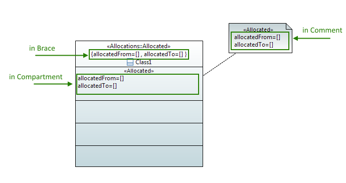
The Properties of a stereotype can be displayed in 3 different locations:
- In a compartment in case of node element (ex: a Class, a Block)
- In braces into the header of the element
- In an external figure as a comment
Default display settings
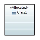
By default, only the name of the Stereotypes with no depth are displayed. None of the properties are displayed.
For your information, here is the default CSS implemented for the stereotype display.
Default CSS
The following CSS rules are implemented by default for all the Diagrams:
Shape[type=StereotypeComment]{ visible:false; } StereotypeComment Compartment[type=StereotypeBrace]{ visible:false; } Compartment[type=StereotypeCompartment]{ visible:false; } Compartment[type=StereotypeBrace]{ visible:false; } Label[type=StereotypeLabel]{ depth:"none"; }
Override the default settings
To override the default settings, a new CSS has to be implemented.
CSS Exemple
Here is some exemple of CSS to display the Stereotype:
/* To modify the depth */ Label[type=StereotypeLabel]{ depth:"-1"; } /* To make the properties visible into compartment */ Compartment[type=StereotypeCompartment]{ visible:true; } /* Hide the property "allocatedTo" into the compartment */ Compartment[type=StereotypeCompartment]>[property="allocatedTo"]{ visible:false; } /* Hide all the properties into the Compartment of the stereotype Block */ Compartment[stereotype="SysML::Blocks::Block"]{ visible:false; } /* Display the Comment shape */ StereotypeComment{ visible:true; } /* Display the properties in Brace into the Comment*/ StereotypeComment Compartment[type=StereotypeBrace]{ visible:true; }
Shape customization
Introduction
The idea of this feature is to create a generic compartment figure which have rounded corner. This figure can be used for most cases. For specific cases an SVG symbol can be displayed. A floating label is created to be used with symbol. This label can be constrained or free, with feedback.
This rounded compartment figure must implements a set of features. To permit the customization of the figure, it must be allowed to set it by CSS.
Feature | Description |
---|---|
Rounded corner | It shall be possible to set rounded corners |
Shadow | Shadow shall be compliant with rounded corner figure |
Vertical and horizontal radiant | Radiant shall be compliant with rounded corner figure |
Oval figure | It shall be possible to force the figure to be oval |
Floating label | It shall be possible to add a floating label and customize it |
CSS customization | Each feature shall be customize thanks to CSS properties |
SVG Color | the Color of SVG figure shall be chosen |
Rounded Corner
The radius of corners can be set throught CSS.
CSS properties
Property name | Value type | Default Value | Comment |
---|---|---|---|
radiusWidth | Integer | 0 | Set the radius width of corners |
radiusHeight | Integer | 0 | Set the radius height of corners |
Result
Class { radiusWidth:150; radiusHeight:50; }
Oval shape setting
To force the figure to be an oval, even if it is resized, a specific CSS property has been added. The radius width and height will be not take into account anymore.
CSS property
Property name | Value type | Default Value | Comment |
---|---|---|---|
isOval | Boolean | false | Set to true if you want to have an oval shape |
Result
Class { isOval:true; }
Floating Label
A floating label is now available on most nodes. It’s managed throws CSS properties, it can be specificly selected with:*>Label[kind="FloatingLabel"]
CSS properties
Property name | Value type | Default Value | Comment |
---|---|---|---|
isFloatingLabelConstrained | Boolean | false | Set to true if the floating label is constrained on eight position, you can move it manually. |
labelConstrained | Boolean | false | Forced the label to one position, by default(for port) it will placed according to the parent position. |
position | String | EAST | Set the forced position. |
floatingLabelOffsetWidth | Integer | 0 | Define the width offset of the label when it is not attached. |
floatingLabelOffsetHeight | Integer | 0 | Define the height offset of the label when it is not attached. |
maskLabel | List of String | name | Set the mask of the floating label. |
Attributes for the mask label:
Value | Description! |
---|---|
stereotype | Style constant for stereotype display in labels. |
name | Style constant for name display in labels. |
visibility | Style constant for visibility display in labels. |
derived | Style constant for isDerive display in labels. |
type | Style constant for name display in labels. |
multiplicity | Style constant for multiplicity display in labels. |
defaultValue | Style constant for default value display in labels. |
direction | Style constant for direction display in labels. |
returnType | Style constant for return type display in labels. |
returnMultiplicity | Style constant for return multiplicity display in labels. |
Result
Class> Label[kind="FloatingLabel"] { visible:true; }
Class { isFloatingLabelConstrained:true }
Class{ floatingLabelOffsetWidth:10; floatingLabelOffsetHeight:-30; }
SVG symbol usage
SVG is available on symbol compartment like before. The maximum number of displayed symbols can now be set by CSS. Note: SVG Symbol don’t work with affixed Node as Port.
CSS property
Property name | Value type | Default Value | Comment |
---|---|---|---|
maxNumberOfSymbol | Integer | 10 | Set the maximum number of of symbols to be displayed. |
SVG color set
The color of the SVG symbol can be chosen. For that, set the CSS properties “useOriginalColors” of the element to false. The white color of the SVG image will be changed by the fill color of the element. The black color of the SVG image will be changed by the line color of the element. Gradient must be disabled.
CSS property
Property name | Value type | Default Value | Comment |
---|---|---|---|
useOriginalColors | Boolean | true | Set if the SVG image use original colors. |
Result
Border style
The border style can be customized through CSS. Six styles are available: dash, dashDot, dashDotDot, dot, solid and custom. With custom style you can set the customDash.
CSS properties
Property name | Value type | Default Value | Comment |
---|---|---|---|
borderStyle | String | solid | Set the style of the border(dash, dashDot, dashDotDot, dot, solid, custom). |
customDash | Int[] | [5,5] | Set the custom style. |
Result
Class { borderStyle:dash; /*dashDot; dashDotDot; dot; */ lineWidth:2; }
Class { borderStyle:custom; customDash:10 10; lineWidth:2; }
Compartment top line length
The top line length of compartments can be setted.
CSS properties
Property name | Value type | Default Value | Comment |
---|---|---|---|
lineLength | int | -1 | Set the top line length of the compartment. By default the length is set to the width of the compartment. |
lineLengthRatio | String | “1.0” | Set the top line length ratio of the compartment. |
Result
Figure 15: Default compartment top line
Class > Compartment{ lineLength:40; }
Class > Compartment{ lineLengthRatio:"0.80"; }
Compartment top line position
The position of line can be setted, the default is center.
CSS property
Property name | Value type | Default Value | Comment |
---|---|---|---|
linePosition | String | “center” | Set the compartment top line position.Can be left, center, right. |
Result
Class > Compartment{ lineLengthRatio:"0.50"; linePosition:"left"; /*center; right;*/ }
Name position
The name position (left, middle, right) of named nodes can be chosen with the CSS property “textAlignment”.
CSS property
Property name | Value type | Default Value | Comment |
---|---|---|---|
textAlignment | String | “center” | Set name the position of the name. |
Result
Class{ textAlignment:"left"; /*center, right*/ }
Add header
A header can be added to the figure at the top-left corner with the CSS attribute “displayHeader”.
CSS properties
Property name | Value type | Default Value | Comment |
---|---|---|---|
displayHeader | Boolean | true | Set to true to add a header. |
Result
Class{ textAlignment:"left"; displayHeader:true; }
Port position
The port position can be setted to inside, outside or on the line. The "onLine" option is the default value. The CSS property to applied on port is “portPosition”
CSS Property
Property name | Value type | Default Value | Comment |
---|---|---|---|
portPosition | String | “onLine” | Set the position of the port. Can be “inside”, “ouside” or “onLine”. |
Result
Port{ portPosition:"inside"; /*onLine, outside*/ }
Display as a package
Shape of elements can be displayed as a package through the CSS attribute "isPackage". This property has a higher priority than others customizations.
CSS Property
Property name | Value type | Default Value | Comment |
---|---|---|---|
isPackage | Boolean | false | Set if the shape have to be displayed as a package. |
Result
Class{ isPackage:true; textAlignment:"left"; }
Shadow improvement
The shadow width and color can now be chosen.
CSS Property
Property name | Value type | Default Value | Comment |
---|---|---|---|
shadowWidth | Integer | 4 | Set the width of the shadow. |
shadowColor | String | "-1" | Set the color of the shadow. By default the shadow have the same color as the border. |
Result
Class{ shadow:true; shadowWidth:10; shadowColor:"blue"; }
Manipulating styles
The computed styles will be applied automatically. For example, if your stylesheet tells that all your abstract classes must be red, the classes color will change automatically according to the value of their "isAbstract" property.
In some other cases, however, you may want to specify manually the style that should be applied to your objects. For this case, you can use the "Applied styles" property in the "Style" tab of the properties view.
.myOwnStyle { fillColor: #A6C198; gradient:white horizontal; }
Once a style is applied on an object, the object will be refreshed each time the style definition changes. For example, changing the style "myOwnStyle" to the following declaration:
.myOwnStyle { fillColor: #E3A49C; gradient: #FFFFFF horizontal; }
All the green classes will become red.
Limitations and issues
There are currently a few identified limitations to the Stylesheet framework, as well as a few minor bugs:
Selectors
Currently, some complex selectors are not supported in the Papyrus stylesheets. Especially, the following are not supported yet:
- Selector inheritance
- It is not possible to apply a style to all descendant of a given Metaclass. For example, a Behavior will not inherit styles from a Class, although a Behavior actually is a Class.
- Events support
- Selectors based on user events are not yet implemented. For example, the CSS specification defines the :hover pseudo-selector to represent an element hovered by the mouse, which is not yet supported in Papyrus.
Known bugs
The following bugs have been identified:
- Bug 386574: [CSS - Refresh] Only the active diagram is refresh when the stylesheets change
- Bug 436665: [CSS] Refresh issue when an element is moved to a different owner
- Bug 472167: lists some nodes that are currently not supported