Notice: This Wiki is now read only and edits are no longer possible. Please see: https://gitlab.eclipse.org/eclipsefdn/helpdesk/-/wikis/Wiki-shutdown-plan for the plan.
Papyrus/Mars Work Description/NewFeature/Shape customisation
Contents
Introduction
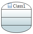
The idea of this feature is to create a generic compartment figure which have rounded corner. This figure can be used for most cases. For specific cases an SVG symbol can be displayed. A floating label is created to be used with symbol. This label can be constrained or free, with feedback.
This rounded compartment figure must implements a set of features. To permit the customization of the figure, it must be allowed to set it by CSS.
| Feature | Description |
|---|---|
| Rounded corner | It shall be possible to set rounded corners |
| Shadow | Shadow shall be compliant with rounded corner figure |
| Vertical and horizontal radiant | Radiant shall be compliant with rounded corner figure |
| Oval figure | It shall be possible to force the figure to be oval |
| Floating label | It shall be possible to add a floating label and customize it |
| CSS customization | Each feature shall be customize thanks to CSS properties |
| SVG Color | the Color of SVG figure shall be chosen |
Rounded Corner
The radius of corners can be set throught CSS.
CSS properties
| Property name | Value type | Default Value | Comment |
|---|---|---|---|
| radiusWidth | Integer | 0 | Set the radius width of corners |
| radiusHeight | Integer | 0 | Set the radius height of corners |
Result
Class {
	radiusWidth:150;
	radiusHeight:50;
}
Oval shape setting
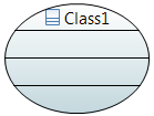
To force the figure to be an oval, even if it is resized, a specific CSS property has been added. The radius width and height will be not take into account anymore.
CSS property
| Property name | Value type | Default Value | Comment |
|---|---|---|---|
| isOval | Boolean | false | Set to true if you want to have an oval shape |
Result
Class {
	isOval:true;
}
Floating Label
A floating label is now available on most nodes. It’s managed throws CSS properties, it can be specificly selected with:*>Label[kind="FloatingLabel"]
CSS properties
| Property name | Value type | Default Value | Comment |
|---|---|---|---|
| isFloatingLabelConstrained | Boolean | false | Set to true if the floating label is constrained on eight position, you can move it manually. |
| labelConstrained | Boolean | false | Forced the label to one position, by default(for port) it will placed according to the parent position. |
| position | String | EAST | Set the forced position. |
| floatingLabelOffsetWidth | Integer | 0 | Define the width offset of the label when it is not attached. |
| floatingLabelOffsetHeight | Integer | 0 | Define the height offset of the label when it is not attached. |
| maskLabel | List of String | name | Set the mask of the floating label. |
Attibutes for the mask label:
| Value | Description! |
|---|---|
| stereotype | Style constant for stereotype display in labels. |
| name | Style constant for name display in labels. |
| visibility | Style constant for visibility display in labels. |
| derived | Style constant for isDerive display in labels. |
| type | Style constant for name display in labels. |
| multiplicity | Style constant for multiplicity display in labels. |
| defaultValue | Style constant for default value display in labels. |
| direction | Style constant for direction display in labels. |
| returnType | Style constant for return type display in labels. |
| returnMultiplicity | Style constant for return multiplicity display in labels. |
Result
Class> Label[kind="FloatingLabel"] {
	visible:true;
}
Class {
	isFloatingLabelConstrained:true
}
Class{
	floatingLabelOffsetWidth:10;
	floatingLabelOffsetHeight:-30;
}
SVG symbol usage
SVG is available on symbol compartment like before. The maximum number of displayed symbols can now be set by CSS. Note: SVG Symbol don’t work with affixed Node as Port.
CSS property
| Property name | Value type | Default Value | Comment |
|---|---|---|---|
| maxNumberOfSymbol | Integer | 10 | Set the maximum number of of symbols to be displayed. |
SVG color set
The color of the SVG symbol can be chosen. For that, set the CSS properties “useOriginalColors” of the element to false. The white color of the SVG image will be changed by the fill color of the element. The black color of the SVG image will be changed by the line color of the element. Gradient must be disabled.
CSS property
| Property name | Value type | Default Value | Comment |
|---|---|---|---|
| useOriginalColors | Boolean | true | Set if the SVG image use original colors. |
Result
Border style
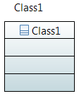
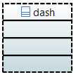
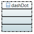
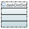
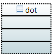
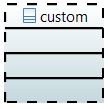
The border style can be customized through CSS. Six styles are available: dash, dashDot, dashDotDot, dot, solid and custom. With custom style you can set the customDash.
CSS properties
| Property name | Value type | Default Value | Comment |
|---|---|---|---|
| borderStyle | String | solid | Set the style of the border(dash, dashDot, dashDotDot, dot, solid, custom). |
| customDash | Int[] | [5,5] | Set the custom style. |
Result
Class {
	borderStyle:dash; /*dashDot; dashDotDot; dot; */
	lineWidth:2;
}
Class {
	borderStyle:custom;
	customDash:10 10;
	lineWidth:2;
}
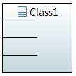
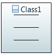
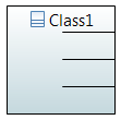
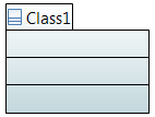
Compartment top line length
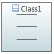
The top line length of compartments can be setted.
CSS properties
| Property name | Value type | Default Value | Comment |
|---|---|---|---|
| lineLength | int | -1 | Set the top line length of the compartment. By default the length is set to the width of the compartment. |
| lineLengthRatio | String | “1.0” | Set the top line length ratio of the compartment. |
Result
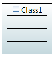
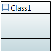
Figure 15: Default compartment top line
Class > Compartment{
	lineLength:40;
}
Class > Compartment{
	lineLengthRatio:"0.80";
}
Compartment top line position
The position of line can be setted, the default is center.
CSS property
| Property name | Value type | Default Value | Comment |
|---|---|---|---|
| linePosition | String | “center” | Set the compartment top line position.Can be left, center, right. |
Result
Class > Compartment{
	lineLengthRatio:"0.50";
	linePosition:"left"; /*center; right;*/
}
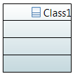
Name position
The name position (left, middle, right) of named nodes can be chosen with the CSS property “textAlignment”.
CSS property
| Property name | Value type | Default Value | Comment |
|---|---|---|---|
| textAlignment | String | “center” | Set name the position of the name. |
Result
Class{
	textAlignment:"left"; /*center, right*/
}
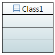
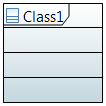
Add header
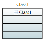
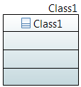
A header can be added to the figure at the top-left corner with the CSS attribute “displayHeader”.
CSS properties
| Property name | Value type | Default Value | Comment |
|---|---|---|---|
| displayHeader | Boolean | true | Set to true to add a header. |
Result
Class{
	textAlignment:"left";
	displayHeader:true;
}
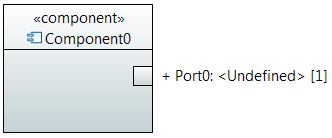
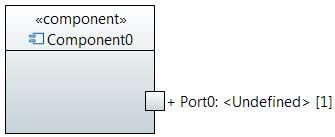
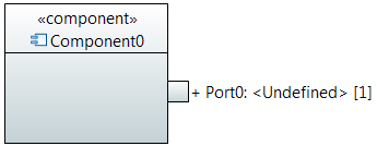
Port position
The port position can be setted to inside, outside or on the line. The "onLine" option is the default value. The CSS property to applied on port is “portPosition”
CSS Property
| Property name | Value type | Default Value | Comment |
|---|---|---|---|
| portPosition | String | “onLine” | Set the position of the port. Can be “inside”, “ouside” or “onLine”. |
Result
Port{
	portPosition:"inside"; /*onLine, outside*/
}
Display as a package
Shape of elements can be displayed as a package through the CSS attribute "isPackage". This property has a higher priority than others customizations.
CSS Property
| Property name | Value type | Default Value | Comment |
|---|---|---|---|
| isPackage | Boolean | false | Set if the shape have to be displayed as a package. |
Result
Class{
	isPackage:true;
	textAlignment:"left";
}
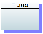
Shadow improvement
The shadow width and color can now be chosen.
CSS Property
| Property name | Value type | Default Value | Comment |
|---|---|---|---|
| shadowWidth | Integer | 4 | Set the width of the shadow. |
| shadowColor | String | "-1" | Set the color of the shadow. By default the shadow have the same color as the border. |
Result
Class{
	shadow:true;
	shadowWidth:10;
	shadowColor:"blue";
}
Known issues
Bug 472167 lists some nodes that are currently not supported

