Notice: This Wiki is now read only and edits are no longer possible. Please see: https://gitlab.eclipse.org/eclipsefdn/helpdesk/-/wikis/Wiki-shutdown-plan for the plan.
Nebula RoundedToolbar
Introduction
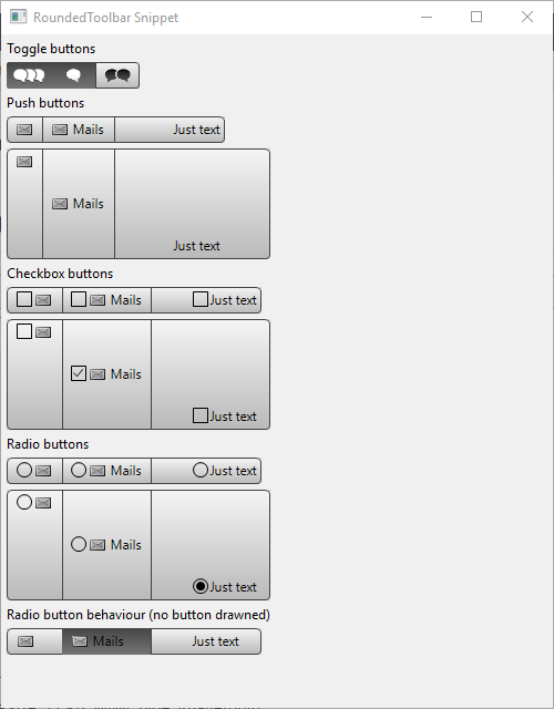
A simple rounded toolbar with grey buttons.
Contents
Usage
This is very simple : you instantiate a RoundedToolbar and then you create RoundedToolItems (like the Toolbar widget):
final RoundedToolbar roundedToolBar = new RoundedToolbar(shell, SWT.PUSH);

RoundedToolItem item = new RoundedToolItem(roundedToolBar);
item.setTooltipText("Simple item");
item.setSelectionImage(iconBubble1w);
item.setImage(iconBubble1b);
item.setWidth(40);
And voilà !
If you want to implement a "radio button behaviour" (when you click on a button this button keeps selected and the other are un-selected) without drawing the radio circle, just add SWT.HIDE_SELECTION to the constructor of RoundedToolbar : new RoundedToolbar(shell, SWT.HIDE_SELECTION).
Actually, the buttons can be PUSH BUTTON (default behaviour, SWT.PUSH), RADIO BUTTONS(SWT.RADIO) or CHECKBOX BUTTONS(SWT.CHECK).
You can customize your buttons: selection image, image when not selected or disabled, font color, size...
Examples
An example called RoundedToolbarSnippet.java is located in the plugin org.eclipse.nebula.widgets.opal.roundedtoolbar.snippets.
This example is also available here : RoundedToolbarSnippet.java

