Notice: This Wiki is now read only and edits are no longer possible. Please see: https://gitlab.eclipse.org/eclipsefdn/helpdesk/-/wikis/Wiki-shutdown-plan for the plan.
Nebula PreferenceWindow
Introduction
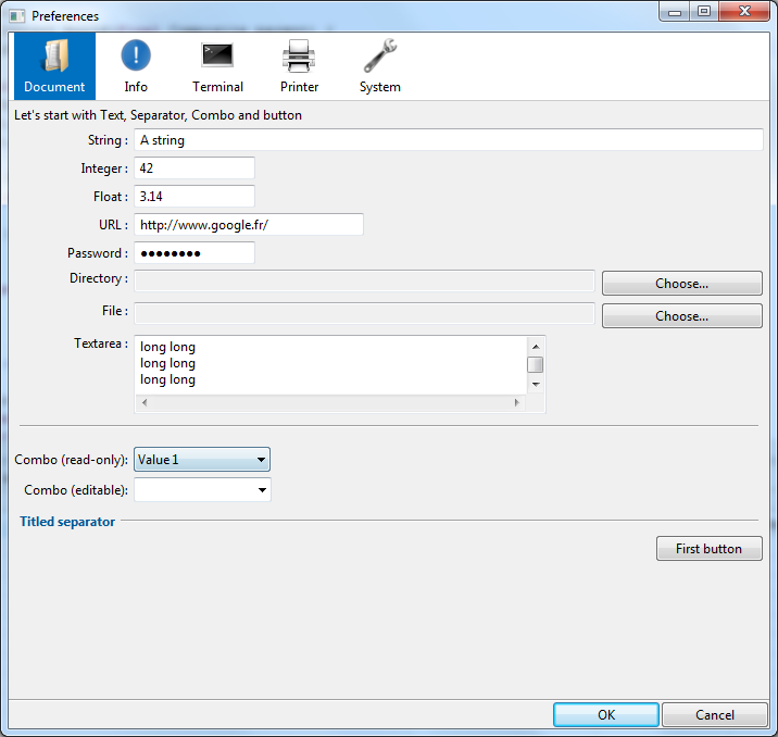
A widget that displays a window to set up preferences.
Why did I create this widget whereas the PreferenceDialog exists in JFace ? Well, first of all the look is different. Then I think that even if my widget is less flexible, it is easier to configure and covers 95% of all cases. Finally, I had a lot of fun creating this widget :)
Contents
- 1 Introduction
- 2 Usage
- 3 Available widgets
- 3.1 PWLabel
- 3.2 PWSeparator
- 3.3 PWGroup
- 3.4 PWStringText
- 3.5 PWIntegerText
- 3.6 PWFloatText
- 3.7 PWURLText
- 3.8 PWPasswordText
- 3.9 PWTextarea
- 3.10 PWDirectoryChooser
- 3.11 PWFileChooser
- 3.12 PWFontChooser
- 3.13 PWColorChooser
- 3.14 PWButton
- 3.15 PWSpinner
- 3.16 PWScale
- 3.17 PWCheckbox
- 3.18 PWCombo
- 3.19 PWRadio
- 4 Additional methods for widgets
- 5 Enable/disable a widget, a row or a group
- 6 Example
Usage
Methodology
Fill data
The first thing to do is to fill a Map<String,Object> to store preference value. Each value is associated to a key. If a data is not initialised, the widget will initialise it to a default value that depends on the type :
- False for Boolean
- Empty string for Strings
- 0 for Float and Integer
Example :
final Map<String, Object> data = new HashMap<String, Object>();
data.put("text", "A string");
data.put("int", new Integer(42));
data.put("float", new Float(3.14));
data.put("url", "http://www.google.fr/");
data.put("password", "password");
data.put("directory", "");
data.put("file", "");
data.put("textarea", "long long\nlong long\nlong long\ntext...");
data.put("comboReadOnly", "Value 1");
data.put("combo", "Other Value");
Create the window
Instanciating the window is done with the static method create. You can enter a parent shell or not :
final PreferenceWindow window = PreferenceWindow.create(shell, data);
Add the tabs
Once the window is created, simply call the method addTab() with 2 arguments : an image and a text label.
final PWTab documentTab = window.addTab(new Image(Display.getCurrent(), PreferenceWindowSnippet.class.getClassLoader().getResourceAsStream("org/mihalis/opal/preferenceWindow/images/document.png]]")), "Document");
Fill your tab with widgets
Once the tab is created, you can add widgets, row or group :
- If you want to add just one widget, simply use the
add()method with an instance of a widget. Each widget will be displayed in its own row.
documentTab.add(new PWPasswordText("Password :", "password"));
documentTab.add(new PWDirectoryChooser("Directory :", "directory"));
documentTab.add(new PWFileChooser("File :", "file"));
documentTab.add(new PWTextarea("Textarea :", "textarea"));
will display 4 widgets one below the others.
The add() method returns the tab, so you can chain statements :
documentTab.add(new PWLabel("Let's start with Text, Separator, Combo and button")).//
    add(new PWStringText("String :", "text").setAlignment(GridData.FILL)).//
    add(new PWIntegerText("Integer :", "int"));
- If you want to put 2 or more widgets on one row, use the
add()method with an instance of PWRow.
terminalTab.add(new PWRow().//
    add(new PWButton("First button", new SelectionAdapter() {
    })).//
    add(new PWButton("Second button", new SelectionAdapter() {
    })).//
    add(new PWButton("Third button", new SelectionAdapter() {
    })));
- If you want to create a group box, use the
add()method with an instance of PWGroup. In this instance, you can add rows or widgets
final PWGroup group = new PWGroup(false);
group.add(new PWRow().add(new PWCheckbox("First choice", "cb4")).add(new PWCheckbox("Second choice", "cb5")));
group.add(new PWRow().add(new PWCheckbox("Third choice", "cb6")).add(new PWCheckbox("Fourth choice", "cb7")));
group.add(new PWRow().add(new PWCheckbox("Fifth choice", "cb8")).add(new PWCheckbox("Sixth choice", "cb9")));
group.add(new PWRow().add(new PWCheckbox("Seventh choice", "cb10")).add(new PWCheckbox("Eighth choice", "cb11")));
printerTab.add(group);
Open the window and retrieve data
Once the window is built, simply use the method public boolean open() that will returns true if the user pressed the "Ok" button, and false
if the user pressed the "Cancel" button. You can retrieve values by calling the method public Map<String, Object> getValues().
Available widgets
Most of the widget are binded to a key. The key correspond to a key in the map used to configure the PreferenceWindow.
PWLabel
Accepted data type : None
Constructor : public PWLabel(final String label)
This widgdet is a label. The text can contains some pseudo-HTML tags for formatting :
-
<br/>for adding a line break -
<i>...</i>to render text in italic -
<u>...</u>to render text in underline -
<b>...</b>to render text in bold -
<size>...</size>to increase/decrease text size. You can use the following syntaxes :<size=10> (10px), <size=+4>, <size=-4> -
<color>...</color>to change foreground color. You can use the following syntaxes :<color=#FFCCAA>(HTML color code),<color=9,255,10>(RGB values) and<color=aliceblue> (HTML color code) -
<backgroundcolor>...</backgroundcolor>to change background color. You can use the following syntaxes :<backgroundcolor=#FFCCAA>(HTML color code),<backgroundcolor=9,255,10>(RGB values) and<backgroundcolor=aliceblue>(HTML color code)
PWSeparator
Accepted data type : 'None
Constructors :
-
public PWSeparator() -
public PWSeparator(final String label) -
public PWSeparator(final String label, final Image image)
This widget is a separator, that can possibly contains a text and/or an image
PWGroup
Accepted data type : None
Constructors :
-
public PWGroup(final boolean hasBorder) -
public PWGroup(final String label) -
public PWGroup(final String label, final boolean hasBorder)
This widgdet is a group, that can have a label and/or a border. In a row, you can put Widgets or Rows, like in Tabs.
PWStringText
Accepted data type : String
Constructor : public PWStringText(final String label, final String propertyKey)
This widget is a text box. The user can type anything, there is no validation rule.
PWIntegerText
Accepted data type : Integer
Constructor : public PWIntegerText(final String label, final String propertyKey)
This widget is a text box. The user can type only integers.
PWFloatText
Accepted data type : Float
Constructor : public PWFloatText(final String label, final String propertyKey)
This widget is a text box. The user can type only floats.
PWURLText
Accepted data type : String
Constructor : public PWURLText(final String label, final String propertyKey)
This widget is a text box. The user can type only URL. If a typed URL is not typed correctly, an error message is displayed.
PWPasswordText
Accepted data type : String
Constructor : public PWPasswordText(final String label, final String propertyKey)
This widget is a text box. The user can type passwords.
PWTextarea
Accepted data type : String
Constructor : public PWTextarea(final String label, final String propertyKey)
This widget is a text box for long texts (more than one line, for example a description).
PWDirectoryChooser
Accepted data type : String
Constructor : public PWDirectoryChooser(final String label, final String propertyKey)
This widget can be use to select a directory. Once the user clicks on the "Choose..." button, a pop-up directory selector is displayed.
PWFileChooser
Accepted data type : String
Constructor : public PWFileChooser(final String label, final String propertyKey)
This widget can be use to select a file. Once the user clicks on the "Choose..." button, a pop-up file selector is displayed.
PWFontChooser
Accepted data type : FontData
Constructor : public PWFontChooser(final String label, final String propertyKey)
This widget can be use to select a font. Once the user clicks on the "Choose..." button, a pop-up font selector is displayed.
PWColorChooser
Accepted data type : Color
Constructor : public PWColorChooser(final String label, final String propertyKey)
This widget can be use to select a color. Once the user clicks on the button, a pop-up color selector is displayed.
PWButton
Accepted data type : None
Constructor : public PWButton(final String label, final SelectionListener listener)
This widget is a button, not associated to a value. You must specify an instance of SelectionListener to execute the code when the button is pressed.
PWSpinner
Accepted data type : Integer
Constructor : public PWSpinner(final String label, final String propertyKey, final int min, final int max)
This widget is a spinner. The value entered by the user should be between min and max.
PWScale
Accepted data type : Integer
Constructor : public PWScale(final String label, final String propertyKey, final int min, final int max, final int increment)
This widget is a slider. The value entered by the user should be between min and max.
PWCheckbox
Accepted data type : Boolean
Constructor : public PWCheckbox(final String label, final String propertyKey)
This widget is a chekbox.
PWCombo
Accepted data type : String if the combo box is editable, any object otherwise
Constructors :
-
public PWCombo(final String label, final String propertyKey, final Object... values)(for read-only combo) -
public PWCombo(final String label, final String propertyKey, final boolean editable, final Object... values)
This widget is a combo box. If the widget is not editable, the user has to pick one value in a list. Otherwise, the user can choose one given value or type any value.
If the widget is not editable, you can initialize the combo with a list of objects. The value displayed in the combo box is the String representation of the Object (toString() method).
If the widget is editable, the value displayed in the combo are necessarly String objects.
PWRadio
Accepted data type : Any object
Constructor : public PWRadio(final String label, final String prop, final Object... values)
This widget is a list of radio buttons : the user has to pick one value in a list. Otherwise, the user can choose one given value or type any value.
The value displayed for each button is the String representation of the Object (toString() method).
Additional methods for widgets
You can set up some extra parameters for each widget with the following setters :
-
public PWWidget setAlignment(final int alignment), to set the alignment of the widget (GridData.BEGINNING,GridData.CENTER,GridData.END,GridData.FILL) -
public PWWidget setEnabler(final Enabler enabler)to set a disabler/enabler (see below) -
public PWWidget setGrabExcessSpace(final boolean grabExcessSpace), to set the behaviour of the widget -
public PWWidget setHeight(final int height), to set the height of the widget -
public PWWidget setIndent(final int indent), to set the indentation space on the left side of the widget -
public PWWidget setWidth(final int width), to set the width of the widget
Because these setters return the widget itself, you can chain instructions :
printerTab.add(new PWRow().//
     add(new PWCheckbox("Automatically check for new versions", "cb12").setWidth(300)).//
     add(new PWButton("Check for updates...", new SelectionAdapter() {
     }). //
setWidth(250).setAlignment(GridData.END)));
Enable/disable a widget, a row or a group
You can decide to enable or disable a widget regarding the value of another widget. Because a widget is binded to a property, you have to establish a link beetwen the key (that stores a value) and the widget. This link is done by an object called an Enabler.
3 enablers are provided by the library :
-
EnabledIfTrue(String prop). The widget is enabled only if a boolean property is true (for example, a checkbox is checked). -
EnabledIfEquals(String prop, Object value). The widget is enabled only if a property is equal to a given value (for example, a value in a combo box or a radio group). -
EnabledIfNotEquals(String prop, Object value). The widget is enabled only if a property is NOT equal to a given value (for example, a value in a combo box or a radio group).
Otherwise, you can create your own enabler. You just has to extend the abstract class org.eclipse.nebula.widgets.opal.preferencewindow.enabler.Enabler.Enabler and implements the method public abstract boolean isEnabled().
You can set an enabler to a widget, a row or a group. If a row has an enabler and a widget in this row has another enabler, the widget is enabled only if both conditions are true.
Example :
systemTab.add(new PWGroup("Open Mode").setEnabler(new EnabledIfTrue("show")).//
     add(new PWRadio(null, "openMode", "Double click", "Single click")).//
     add(new PWCheckbox("Select on hover", "selectonhover").setIndent(10).setWidth(200).setEnabler(new EnabledIfEquals("openMode", "Single click"))).//
     add(new PWCheckbox("Open when using arrow keys", "openarrow").setIndent(10).setWidth(200).setEnabler(new EnabledIfEquals("openMode", "Single click"))));
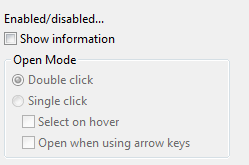
By default, the preference window will show that :
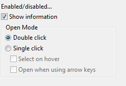
When the user clicks on the "Show information button", the group "Open mode" is activated :
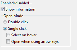
And when the users clicks on the radio button "Single Click", the 2 checkboxes are enabled :
Example
A snippet called PreferenceWindowSnippet is available in the plugin org.eclipse.nebula.widgets.opal.preferencewindow.snippets.
This example is also available here : PreferenceWindowSnippet.java


