Notice: This Wiki is now read only and edits are no longer possible. Please see: https://gitlab.eclipse.org/eclipsefdn/helpdesk/-/wikis/Wiki-shutdown-plan for the plan.
Nebula CSS CDateTime
Introduction
This page explains how to use the CSS theming for the CDateTime widget.
Contents
Installation
In you e4 application you can install :
- The plugin org.eclipse.nebula.widgets.cdatetime.css OR
- The feature org.eclipse.nebula.widgets.cdatetime.css.feature
Properties
General Properties
These properties allow the developer to customize the "text" part of the widget.
| SWT Method | Impact | CSS Property Name | CSS Example |
|---|---|---|---|
| setBackground(Color) | Set the bacgkround color of the text part | cdt-background-color | CDateTime { cdt-background-color: #cccccc; } |
| setForeground(Color) | Set the foreground color of the text part | cdt-color | CDateTime { cdt-color: black; } |
| setFont(Font) | Set the font of the text part | cdt-font | CDateTime { cdt-font: italic 12 bold "Terminal"; } |
| cdt-font-style cdt-font-size |
CDateTime { font-style: italic; cdt-font-size: 12; |
Picker part Properties
These properties allow the developer to customize the "picker" part of the widget.
| SWT Method | Impact | CSS Property Name | CSS Example |
|---|---|---|---|
| setPickerBackgroundColor(Color) | Set the bacgkround color of the picker | cdt-picker-background-color | CDateTime { cdt-picker-background-color: #cccccc; } |
| setPickerForegroundColor(Color) | Set the foreground color of the picker | cdt-picker-color | CDateTime { cdt-picker-color: black; } |
| setPickerFont(Font) | Set the font of the picker | cdt-picker-font | CDateTime { cdt-picker-font: italic 12 bold "Terminal"; } |
| cdt-picker-font-style cdt-picker-font-size |
CDateTime { cdt-picker-font-style: italic; cdt-picker-font-size: 12; |
||
| setPickerActiveDayColor(Color) | Set the foreground color for the "active" days | cdt-picker-active-day-color | CDateTime { cdt-picker-active-day-color:magenta; } |
| setPickerInactiveDayColor(Color) | Set the foreground color for the "inactive" days | cdt-picker-inactive-day-color | CDateTime { cdt-picker-active-day-color: green; } |
| setPickerTodayColor(Color) | Set the foreground color for today | cdt-picker-today-color | CDateTime { cdt-picker-today-color: darkblue; } |
Picker for hour selector
These properties allow the developer to customize the "hour selector".
| SWT Method | Impact | CSS Property Name | CSS Example |
|---|---|---|---|
| setPickerMinutesBackgroundColor(Color) | Set the background color of the "minutes" part of the selector | cdt-picker-minutes-background-color | CDateTime { cdt-picker-minutes-background-color: #cccccc; } |
| setPickerMinutesColor(Color) | Set the foreground color of the "minutes" part of the selector | cdt-picker-minutes-color | CDateTime { cdt-picker-minutes-background-color: black; } |
Button Properties
These properties allow the developer to customize the buttons of the picker.
| SWT Method | Impact | CSS Property Name | CSS Example |
|---|---|---|---|
| setButtonHoverBackgroundColor(Color) | Set the background color of the buttons when the mouse is over the button | cdt-button-hover-background-color | CDateTime { cdt-button-hover-background-color: #cccccc; } |
| setButtonHoverBorderColor(Color) | Set the border color of the buttons when the mouse is over the button | cdt-button-hover-border-color | CDateTime { cdt-button-hover-border-color: black; } |
| setButtonSelectedBackgroundColor(Color) | Set the background color of the selected button | cdt-button-selected-background-color | CDateTime { cdt-button-selected-background-color: #cccccc; } |
| setButtonSelectedBorderColor(Color) | Set the border color of the selected button | cdt-button-selected-border-color | CDateTime { cdt-button-selected-border-color: black; } |
Ok/Cancel/Clear button Properties
These properties allow the developer to customize the OK, Cancel and Clear buttons of the picker.
| SWT Method | Impact | CSS Property Name | CSS Example |
|---|---|---|---|
| setOkButtonColor(Color) | Set the foreground color of the OK button | cdt-ok-color | CDateTime { cdt-ok-color: #cccccc; } |
| setCancelButtonColor(Color) | Set the foreground color of the Cancel button | cdt-cancel-color | CDateTime { cdt-cancel-color: #ffffcc; } |
| setClearButtonForegroundColor(Color) | Set the foreground color of the clear button | cdt-clear-color | CDateTime { cdt-ok-color: black; } |
| setClearButtonFont(Font) | Set the font of the clear button | cdt-clear-font | CDateTime { cdt-clear-font: italic 12 bold "Terminal"; } |
| cdt-clear-font-style cdt-clear-font-size |
CDateTime { cdt-clear-font-style: italic; cdt-clear-font-size: 12; |
Examples
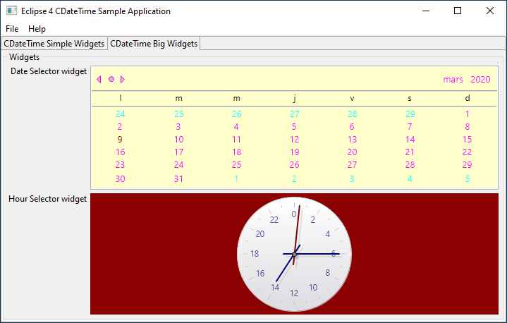
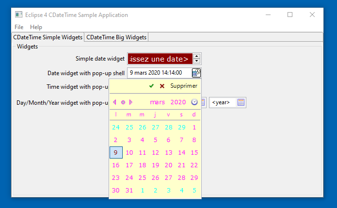
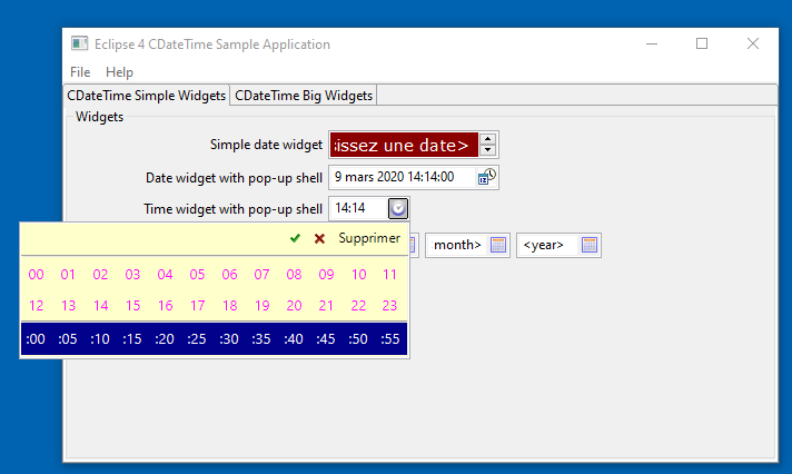
An e4 example application called org.eclipse.nebula.widgets.cdatetime.example.e4 shows how to customize the CDateTime widget.
This example is also available here : org.eclipse.nebula.widgets.cdatetime.example.e4


