Notice: this Wiki will be going read only early in 2024 and edits will no longer be possible. Please see: https://gitlab.eclipse.org/eclipsefdn/helpdesk/-/wikis/Wiki-shutdown-plan for the plan.
UI Graphics : Design : Templates
Design Templates
Return to the main UI Graphics (3.x Updates) section on the UI Best Practices page.
All design templates here.
This section provides design files for producing different types of user interface graphics. A description of the templates and guidance on how to work with them is also provided to help you get started quickly and working effectively.
Maintaining the simple structure of the templates will facilitate easy file sharing and efficient production of a large set of graphics for one tool.
Icon Design Template
- Populating the template : Fill out the icon_design_template.psd file with the names of all known required icons separated by type, for example view, toolbar, and model object. Feel free to add or remove rows as you need them. Each plug-in should have its own separate Photoshop document (PSD). If you have access to old icon files, these can be placed into the orig. (original) column as a reference or starting point.
- Designing the icons : Before beginning to design Eclipse-style icons or wizard banner graphics, first check if the concept or visual elements have been covered already. See the Consistency and Reuse and Common Elements sections.
Create initial passes of your ideas, and then place them in the template. Up to five different concepts for any given icon can be placed in the version cells provided, i.e., columns A, B, C, D and E.
When you are satisfied with the results, mark the icons you think are the strongest candidates with boxes on the preferred (black) layer, and send to the requester for feedback in the form of a flattened GIF image.
- Revising the original concept : It is likely that revisions to the first pass will be required. If there is room, revised icons can be placed in the version cells next to the first pass ones. If you run out of cells or need to erase any previous icon concepts, but do not want to lose them forever, save a new version of the design file and make space for new ideas by removing the icons that are not likely to be used.
Once the icons have been approved, move the chosen images to the cut column. To ensure they are positioned properly within the allotted screen space, turn on the cut layer (pink) in the PSD. For guidance on size and placement of different types of icons, see the Icon Size and Placement section.
- Creating the disabled versions : See the Icon States section for instructions on creating the disabled state for Toolbar and Local Toolbar icons.
- Cutting the icons : See the Cutting Actions section for instructions on cutting the final images for delivery.
- Marking revised icons : It is likely that even after the icons have been cut and delivered to the developer, further revisions will be required or entirely new icons may be requested. To keep track of which icons and their instances need to be cut or re-cut, a red box can be placed around each, using the cut or re-cut (red) layer.
Wizard Design Template
- Populating the vector-based template : Fill out the vector-based template vector-wizard_design_template.ai with the names of all required wizard banner graphics. As with the Icon Template, you can add or remove rows to suit the number of graphics you will be creating. If you have access to the related toolbar wizard icon file, add it to the file as a primary starting point. If you have access to old wizard graphics, these can be placed into the orig. (original) column as a secondary starting point.
- Designing the wizard banner graphics : Before beginning to design Eclipse-style wizard banner graphics, first check if the toolbar icon that launches the wizard has been created already. This will provide the basis of your design. Also, check if any of the visual elements that will be part of the wizard graphic have been created already in Adobe Illustrator. See the Consistency and Reuse and Common Elements sections for existing elements.The concept for a wizard banner should be closely aligned with, if not identical to, the toolbar wizard icon that launches the wizard dialog. Create an initial pass of each image on the New Wizard graphics layer, following the wizard banner stylistic treatment detailed in the Style & Design section. As with the icons, more than one pass on the design may be required before coming to the final design.When you are satisfied with the results, create a JPEG version of the template and send it to the requestor for feedback. Be sure to include the toolbar icon that corresponds to the wizard banner graphic as a reference.
- Transferring vector-based images to the PSD template : Once the graphics are approved and ready to be cut, you will need to transfer them from the AI template to the PSD template. In the AI template, turn off all layers, except New Wizard graphics.
Select File > Save for Web from the menu. The settings you will need for this part of the transfer are shown here: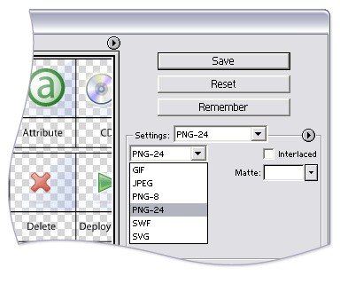
- Populating the PSD template : Fill out the eclipse_wizard_design_template.psd template with Layer Sets for each wizard banner graphic. Each Layer Set should have a single layer for the PNG-formatted wizard image. Add Layer Sets as you need them.Open the temporary PNG file and transfer the wizard graphics, one per layer, to the corresponding Layer Set in the PSD file. Once all of your wizard graphics are transferred, Save the file. You are ready to cut.
- Cutting the wizard banner graphics: See the Cutting Actions section for instructions on cutting wizard banner graphics.
