Notice: this Wiki will be going read only early in 2024 and edits will no longer be possible. Please see: https://gitlab.eclipse.org/eclipsefdn/helpdesk/-/wikis/Wiki-shutdown-plan for the plan.
Difference between revisions of "Nebula RoundedSwitch"
m (Minor typo in the code fixed) |
m (→Usage: typo in class name [re]-fixed: correct name is RoundedSwitch) |
||
| Line 17: | Line 17: | ||
You use this widget like a Button with <code>SWT.CHECKBOX</code> style : | You use this widget like a Button with <code>SWT.CHECKBOX</code> style : | ||
| − | final | + | final RoundedSwitch button = new RoundedSwitch(shell, SWT.NONE); |
button.setSelection(true); | button.setSelection(true); | ||
Latest revision as of 19:17, 12 August 2020
Introduction
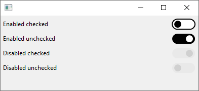
This widget is a checkbox widget that is represented by a switch button.
It has the same API than the Button widget API, but the look is different.
Please notice that the widget only consists in a checkbox without text. You can not setText(something), you have to create a Label widget besides the checkbox.
Contents
Usage
You use this widget like a Button with SWT.CHECKBOX style :
 final RoundedSwitch button = new RoundedSwitch(shell, SWT.NONE);
 button.setSelection(true);
And voilà, it is done !
Examples
An example called RoundedSwitchSnippet.java is located in the plugin org.eclipse.nebula.widgets.roundedswitch.snippets.
This example is also available here : RoundedCheckBoxSnippet.java

