Notice: this Wiki will be going read only early in 2024 and edits will no longer be possible. Please see: https://gitlab.eclipse.org/eclipsefdn/helpdesk/-/wikis/Wiki-shutdown-plan for the plan.
Difference between revisions of "Nebula LED"
(Created page with "< Back to Nebula Main Page ==Introduction== File:Ledwidget.png This widget displays characters as if they were displayed on a LED. __TOC__ ==Usage== 3 com...") |
m (→LED) |
||
| Line 16: | Line 16: | ||
This component displays a single character, and possibly a dot in the left bottom corner of the widget. | This component displays a single character, and possibly a dot in the left bottom corner of the widget. | ||
| − | To set the character to display you have to pick a value in the enumeration '''LEDCharacter''': all letters and digits are available, plus 2 special values : '''CLEAR''' to display a blank widget (no element is lit) and '''MINUS''' to display a dash character. | + | To set the character to display you have to pick a value in the enumeration '''LEDCharacter''' : all letters and digits are available, plus 2 special values : '''CLEAR''' to display a blank widget (no element is lit) and '''MINUS''' to display a dash character. |
[[File:Character_no_dot.png]] | [[File:Character_no_dot.png]] | ||
Latest revision as of 06:34, 19 March 2020
Introduction
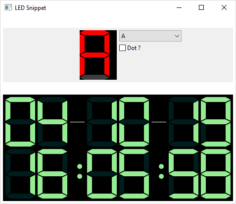
This widget displays characters as if they were displayed on a LED.
Usage
3 components are available.
LED
This component displays a single character, and possibly a dot in the left bottom corner of the widget. To set the character to display you have to pick a value in the enumeration LEDCharacter : all letters and digits are available, plus 2 special values : CLEAR to display a blank widget (no element is lit) and MINUS to display a dash character.
LED led = new LED(top, SWT.NONE);
led.setCharacter(LEDCharacter.THREE);
If you want to display the dot in the left bottom corner, you have to set the flag SWT.ICON.
To switch on/off the light, you can use the method setShowDot(boolean value)
LED led = new LED(composite, SWT.ICON);
led.setCharacter(LEDCharacter.THREE);
led.setShowDot(true);
DotsLed
This component display a colon :
To switch on/off the colon, you have to use the methods switchOn() and switchOff()
DotsLed dots = new DotsLed(composite, SWT.NONE);
dots.switchOn();
LEDSeparator
This components displays a separator (thin line, white by default)
LEDSeparator sep = new LEDSeparator(composite, SWT.NONE);
Customization
Because the widget is a canvas, you can change the background color with the method setBackground(...).
For the LEDS, you can change the color of the line with the method setForeground(...)
For both LED and DotsLed components, you can change the idle and selected color with the suitable method :
LED led = new LED(top, SWT.NONE);
led.setCharacter(LEDCharacter.A);

Color idleColor = new Color(shell.getDisplay(), 60, 60, 60);
led.setIdleColor(idleColor);

Color selectedColor = new Color(shell.getDisplay(), 255, 0, 0);
led.setSelectedColor(selectedColor);
Example
An example called LEDSnippet.java is located in the plugin org.eclipse.nebula.widgets.led.snippets.
This example is also available here : LEDSnippet.java


