Notice: This Wiki is now read only and edits are no longer possible. Please see: https://gitlab.eclipse.org/eclipsefdn/helpdesk/-/wikis/Wiki-shutdown-plan for the plan.
EDT:Declaring widgets
When you write a Rich UI application, the typical process is as follows:
- Create a Handler type of stereotype RUIHandler.
- Declare the widgets and customize them; for example, by assigning and coding event handlers.
- Display a given widget by including it either in the initialUI array of the Rich UI handler or in the children array of another widget.
- Write initialization code in the on-construction function.
The following sections give examples of widget use and are in the same order as the sections of the Rich UI palette: Display and input, Layout, and Visualization.
Contents
- 1 Display and input
- 1.1 Button
- 1.2 Button (DojoButton)
- 1.3 Calendar (DojoCalendar)
- 1.4 Checkbox
- 1.5 Checkbox (DojoCheckbox)
- 1.6 ColorPalette (DojoColorPalette)
- 1.7 Combo
- 1.8 ComboBox (DojoComboBox)
- 1.9 CurrencyTextBox (DojoCurrencyTextBox)
- 1.10 DataGrid and related types
- 1.11 DateTextBox (DojoDateTextBox)
- 1.12 Editor (DojoEditor)
- 1.13 Grid (DojoGrid)
- 1.14 HorizontalSlider (DojoHorizontalSlider)
- 1.15 HTML
- 1.16 Hyperlink
- 1.17 Image
- 1.18 List
- 1.19 ListMulti
- 1.20 Menu
- 1.21 Menu (DojoMenu)
- 1.22 PasswordTextField
- 1.23 ProgressBar (DojoProgressBar)
- 1.24 RadioGroup
- 1.25 RadioGroup (DojoRadioGroup)
- 1.26 Shadow
- 1.27 Span
- 1.28 TextArea
- 1.29 TextArea (DojoTextArea)
- 1.30 TextField
- 1.31 TextField (DojoTextField)
- 1.32 TextLabel
- 1.33 TimeTextBox (DojoTimeTextBox)
- 1.34 ToggleButton (DojoToggleButton)
- 1.35 Tooltip (DojoTooltip)
- 1.36 TooltipDialog (DojoTooltipDialog)
- 1.37 Tree (DojoTree) and related types
- 2 Layout
- 2.1 AccordionContainer (DojoAccordionContainer)
- 2.2 BorderContainer (DojoBorderContainer)
- 2.3 Box
- 2.4 ContentPane (DojoContentPane)
- 2.5 ContextMenu (DojoContextMenu)
- 2.6 Dialog (DojoDialog)
- 2.7 Div, FloatLeft, and FloatRight
- 2.8 GridLayout and related types
- 2.9 Grouping
- 2.10 StackContainer (DojoStackContainer)
- 2.11 TabContainer (DojoTabContainer)
- 2.12 TitlePane (DojoTitlePane)
- 3 Visualization
Display and input
Button
Button (DojoButton)
Calendar (DojoCalendar)
Checkbox
Checkbox (DojoCheckbox)
ColorPalette (DojoColorPalette)
Combo
A combo box presents one of several selectable options and lets the user temporarily open a dropdown list to select a different option.
The next example shows that you present a set of options and retain the one selected:

package client;

import org.eclipse.edt.rui.widgets.Box;
import org.eclipse.edt.rui.widgets.Combo;
import org.eclipse.edt.rui.widgets.TextField;
import eglx.ui.rui.Event;
import eglx.ui.rui.RUIHandler;


Handler MyHandler Type RUIHandler
   { initialUI = [myBox] }

   myBox Box{columns=2, children= [myCombo, myTextField]};

   myCombo Combo
   {
      values = ["one", "two", "three", "four"],
      selection = 2, onChange ::= changeFunction
   };

   myTextField TextField
      {text = myCombo.values[myCombo.selection]};

   Function changeFunction(e Event IN)
      myTextField.text = myCombo.values[myCombo.selection];
   end
end
ComboBox (DojoComboBox)
CurrencyTextBox (DojoCurrencyTextBox)
A Rich UI data grid defines an array of row values in a table.
The following example shows that you can use a grid tooltip to present information that is specific to a cell:

package client;

import org.eclipse.edt.rui.widgets.Box;
import org.eclipse.edt.rui.widgets.DataGrid;
import org.eclipse.edt.rui.widgets.DataGridColumn;
import org.eclipse.edt.rui.widgets.DataGridTooltip;
import org.eclipse.edt.rui.widgets.TextArea;
import eglx.ui.rui.RUIHandler;

Record Stock
   Symbol STRING;
   Quote  DECIMAL(5,2);
   NumShares INT;
end

handler MyHandler type RUIhandler { initialUI = [ grid ],
                                      onConstructionFunction = start }
   stockList Stock[] = [
      new Stock{Symbol = "Company1", Quote = 100.00, NumShares = 40 },
      new Stock{Symbol = "Company2", Quote = 200.00, NumShares = 10 },
      new Stock{Symbol = "Company3", Quote = 100.00, NumShares = 40 } ];

   grid DataGrid {
      data = stockList as any[],
      behaviors = [myDataGridToolTip.setToolTips],
      pageSize = 15,
      columns = [
         new DataGridColumn { name = "Symbol", displayName = "Symbol Display"},
         new DataGridColumn { name = "Quote", displayName = "Quote Display"},
         new DataGridColumn { name = "NumShares", displayName = "NumShares Display"  }]};

   myDataGridTooltip DataGridTooltip { provider = tooltipText, tooltip.delay = 1000 };

   tooltipBox Box{columns=1, width=475};

   function start()

   end

   function tooltipText (rowData any in, fieldName String in, td Widget in) returns (Box)

      tooltipArea TextArea { width=450, height=100, paddingLeft=7, marginLeft=7 };
      tooltipBox.children = [ tooltipArea ];
      tooltipArea.text =
      "In function tooltipText (a tooltip provider):" +
      "\n   o  fieldName is the column name ('"+fieldName+"')." +
      "\nYou can access cell content:" +
      "\n   o  td.innerText is '"+td.innerText+"'." +
      "\n   o  rowData["+fieldName+"] is '"+rowData[fieldName] + "'.";
      return (tooltipBox);
   end
end
DateTextBox (DojoDateTextBox)
Editor (DojoEditor)
Grid (DojoGrid)
HorizontalSlider (DojoHorizontalSlider)
HTML
Hyperlink
Image
List
ListMulti
Menu
Menu (DojoMenu)
PasswordTextField
ProgressBar (DojoProgressBar)
RadioGroup
RadioGroup (DojoRadioGroup)
Shadow
Span
TextArea
TextArea (DojoTextArea)
TextField
TextField (DojoTextField)
TextLabel
TimeTextBox (DojoTimeTextBox)
ToggleButton (DojoToggleButton)
Tooltip (DojoTooltip)
TooltipDialog (DojoTooltipDialog)
Layout
AccordionContainer (DojoAccordionContainer)
BorderContainer (DojoBorderContainer)
Box
ContentPane (DojoContentPane)
ContextMenu (DojoContextMenu)
Dialog (DojoDialog)
Div, FloatLeft, and FloatRight
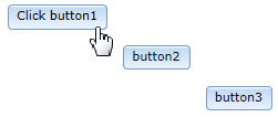
A grid layout is a container with variably spaced rows and columns.
The following example shows how to replace the content of a cell at run time:
- Before:

- After:
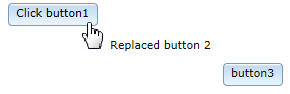

package client;

import org.eclipse.edt.rui.widgets.Button;
import org.eclipse.edt.rui.widgets.GridLayout;
import org.eclipse.edt.rui.widgets.GridLayoutData;
import org.eclipse.edt.rui.widgets.TextLabel;
import eglx.ui.rui.Event;
import eglx.ui.rui.RUIHandler;

handler MyHandler type RUIhandler{initialUI =[myGridLayout]}

   myGridLayout GridLayout{rows = 4, columns = 4, cellPadding = 4, children =[
                Button3, Button1, Button2]};

   myLayoutData GridLayoutData{row = 1, column = 2};
   button1 Button{layoutData = myLayoutData, text = "Click button1", onClick ::= respond};
   button2 Button{layoutData = new GridLayoutData{row = 2, column = 3}, text = "button2"};
   button3 Button{layoutData = new GridLayoutData{row = 3, column = 4}, text = "button3"};

   function respond(e Event in)
      myLabel TextLabel{text = "Replaced button 2"};
      myLabel.layoutData = new GridLayoutData{row = 2, column = 3};
      Button2.layoutData = null;
      myGridLayout.appendChild(myLabel);
   end
end
The next example shows the use of spanning and alignment:

package client;

import org.eclipse.edt.rui.widgets.Button;
import org.eclipse.edt.rui.widgets.CheckBox;
import org.eclipse.edt.rui.widgets.GridLayout;
import org.eclipse.edt.rui.widgets.GridLayoutData;
import org.eclipse.edt.rui.widgets.GridLayoutLib;
import org.eclipse.edt.rui.widgets.TextField;
import org.eclipse.edt.rui.widgets.TextLabel;
import eglx.persistence.sql.column;
import eglx.ui.rui.RUIHandler;

handler MyHandler type RUIhandler {initialUI = [ myGridLayout ]}

   myGridLayout GridLayout{
      rows = 4, columns = 3, cellPadding = 4,
      children = [ myLabel, myTextField, myCheckBox, myButton ]};

   myLabel TextLabel{ layoutData = new GridLayoutData{ row = 1, column=1},
      text = "Label: " };

   myTextField TextField{ layoutData = new GridLayoutData{ row = 1, column = 2,
      horizontalSpan = 2 }, text = "Text field"};

   myCheckBox CheckBox{ layoutData = new GridLayoutData{ row = 2, column = 2,
      verticalSpan = 2 }, text="Check box" };

   myButton Button{ layoutData = new GridLayoutData{ row = 4, column = 1,
                    horizontalSpan = 2,
                    horizontalAlignment = GridLayoutLib.Align_Center },
                    text="Button" };
end
Grouping
A grouping is a rectangle that embeds one or more widgets and that displays text in the topmost border. Here is an example:
package client;

import org.eclipse.edt.rui.widgets.CheckBox;
import org.eclipse.edt.rui.widgets.Grouping;

handler MyHandler type RUIHandler{initialUI =[myGrouping]}
   myCheckbox Checkbox{};
   myGrouping Grouping {
      text = "Yellow!",
      backgroundColor = "yellow",
      width = 100,
      children = [myCheckbox]};
end
StackContainer (DojoStackContainer)
TabContainer (DojoTabContainer)
TitlePane (DojoTitlePane)