Notice: This Wiki is now read only and edits are no longer possible. Please see: https://gitlab.eclipse.org/eclipsefdn/helpdesk/-/wikis/Wiki-shutdown-plan for the plan.
Difference between revisions of "Eclipse User Profile"
(→Sign In) |
m (→Create an account) |
||
| (16 intermediate revisions by the same user not shown) | |||
| Line 1: | Line 1: | ||
| − | + | testing issue with links: | |
| − | + | http://wiki.eclipse.org/File:EclipseUserProfile-Overview.png | |
| − | + | ||
| − | + | ||
| − | + | ||
| − | + | ||
| − | + | ||
| − | + | ||
| − | + | ||
| − | + | ||
| − | + | ||
This page will gather all information relative to the User Profile project. | This page will gather all information relative to the User Profile project. | ||
| Line 62: | Line 53: | ||
=== December 2016 === | === December 2016 === | ||
| − | + | In December, we will mostly improve user experience, taking in account feedback we have. We need pagination for some activity tabs with a lot of content, that is why this will be the priority. We will start with pagination for Gerrit. Then, we will add a "Projects" tab, listing the involvements of Community users. | |
| − | + | We will also start the work to move the "edit preferences" form to the user profile, making it more easy to use: same look'n feel, same place. | |
== Overview == | == Overview == | ||
| Line 399: | Line 390: | ||
</ol> | </ol> | ||
| + | We also need a honeypot, like a hidden checkbox or something like that. | ||
And yes, again, this is inspired of how Google is doing it. | And yes, again, this is inspired of how Google is doing it. | ||
| Line 411: | Line 403: | ||
== Search a user == | == Search a user == | ||
| − | + | ||
| + | <b>Relative bug -> https://bugs.eclipse.org/bugs/show_bug.cgi?id=493457</b> | ||
| + | |||
| + | Your feedback is welcome, the best place for a discussion is on the dedicated bug. | ||
| + | |||
| + | === Quick search === | ||
| + | [[File:EclipseUserProfile-SearchQuickCut.png|400px|thumb|Quick search, with annotations]] | ||
| + | <ol> | ||
| + | <li>Type in this field the keywords to search. Information we can use to search:<ul> | ||
| + | <li>First name</li> | ||
| + | <li>Last Name</li> | ||
| + | <li>Nickname</li> | ||
| + | <li>Email</li> | ||
| + | </ul></li> | ||
| + | <li>Like on the Markeplace, a quick search is displayed below the search field</li> | ||
| + | <li>Form's submit button, with an icon</li> | ||
| + | </ol> | ||
| + | |||
| + | === Search result and filters === | ||
| + | [[File:EclipseUserProfile-SearchResults.png|400px|thumb|Search results, with annotations]] | ||
| + | |||
| + | <ol> | ||
| + | Results | ||
| + | <li>A small avatar, just enough to fit the 2 lines of text.</li> | ||
| + | <li>First Name, Name and link icon with the permalink to the profile. Can be the same layout than on the user profile, but with smaller text.</li> | ||
| + | <li>Social icons. Again, smaller than on the user profile</li> | ||
| + | <li>Even if the link to the user profile is already available, there is an obvious "go/see/add/follow/more/..." button on most search results (social networks, ...) so we need to stay consistant with that in term of UX. The main feature of this button can evolve (eg: follow, ...) based on how users will use the profiles.</li> | ||
| + | Filters | ||
| + | <li>Status filter allows to check for specific kind of users. We can add other kind of users if we need it. We will start with: | ||
| + | <ul> | ||
| + | <li>ECA</li> | ||
| + | <li>Friend of Eclipse</li> | ||
| + | <li>Committer</li> | ||
| + | </ul></li> | ||
| + | <li>Location should be available for most users, as we ask at least for the country when a user creates an account. The aim is to help people to find other people in their area (e.g: Local User Groups). In a second time, maybe we could add a "search in your area" feature, that would filter people around a place (50km around a city).</li> | ||
| + | <li>Interests comes from the user profile. You type a keyword in the field (with autocompletion) and then click add. The keyword is then added to the list below. To remove a keyword, just click on the - icon next to it. We should to choose between OR and XOR, and we will add a tooltip to inform the user.</li> | ||
| + | <li>Project will allow to filter contributors with project contribution. Same behaviour than Location.</li> | ||
| + | <li>Pagination when there are too many results. We need to do some tests before choosing how many results we display, or maybe we can add a select at the top of the results so the end users choose how many results he wants to display.</li> | ||
| + | <li>Select the number of results to be displayed on the page, e.g: 20, 50, 100. We need to do some tests to check what makes sense. Also, could it be possible to store the value in a cookie, so the user don't have to set it every time? | ||
| + | </ol> | ||
| + | |||
| + | === Fields and information about users === | ||
| + | For the search feature, we use only public information available on user profiles, so it should be ok with the term of use. We need to check that to be sure. And also we might have some feedback from the Community users. | ||
| + | |||
| + | Here is the list: | ||
| + | <ul> | ||
| + | <li>First Name</li> | ||
| + | <li>Last Name</li> | ||
| + | <li>Avatar</li> | ||
| + | <li>Email</li> | ||
| + | <li>ECA, Friend of Eclipse and Committer status</li> | ||
| + | <li>Location</li> | ||
| + | <li>Interests</li> | ||
| + | <li>Project participation</li> | ||
| + | </ul> | ||
| + | |||
| + | === Advanced search === | ||
| + | If the needs is identified, an advanced search form could be available, using the same fields. It would mainly add the possibility to do a direct search with the filters of the standard search. At least, Location and Project might be very useful. | ||
| + | |||
| + | There is no mockup at the moment for this feature. | ||
| + | |||
| + | === Upgrade the "Interests" view to the "Search result" view === | ||
| + | When a user clicks on an interest tag on a user profile, it goes to a view listing other users with the same interests. Based on the work done for the search result, we need to upgrade the current "Interests" to the "Search result" view, with the filters. So the UX stay the same on each search view. | ||
Latest revision as of 11:32, 11 January 2017
testing issue with links: http://wiki.eclipse.org/File:EclipseUserProfile-Overview.png
This page will gather all information relative to the User Profile project.
Note that all icons on the mockups comes from the Foundations Icon pack. But of course, feel free to use another one if already have one for the websites. Font Awesome is also a good source for icons.
We will do our best to update the mockups, however, for reference, please have a look at https://ttoine.github.io/eclipse-user-profile/user-profile.html#overview to be sure to see the latest version.

Contents
Use Case
The aim of the user profile (previously known as the user dashboard) is to provide an overview of the activity of Community users over eclipse.org websites and services.
It will provide:
- A simple URL, easy to remember and to share
- An overview for a user to see his own activity in one place
- A way for Community users to find other users, and understand who they are
The typical use case:
- A young developer is using a plugin in Eclipse IDE, and fills a bug to ask for an improvement. A top contributor, or a project lead answers. On bugzilla, the only information you know about a user is the email address. How the young engineer can understand the value of the the answers he gets?
- Instead of having just the email, providing a link to the user profile will help him understand who are the others participating in the discussion.
Bugs tree
All bugs relative to the work around the User Profile are blockers for bug 493458. You can find the complete dependency tree here:
-> https://bugs.eclipse.org/bugs/showdependencytree.cgi?id=493458&hide_resolved=0
Priorities
- The new sign in / create an account / authorise forms. The end users are using them everyday on eclipse.org and with plugins. This is the base. Plus, this will solve some important security issues.
- The "overview", with the simple URL "eclipse.org/user/foobar". The Storage part, to manage the USS data.
- User information, settings, notification and ECA
- User Search
Release plan
After the first release of the user profile, we need to add eye-candy to the activity table and statistic block. We started with Gerrit and marketplace, so now, let's add other services.
October 2016
First week of October, we did a diagnostic of what is easy to do using APIs, and what is complicated. Because of the time we took to do the diagnostic, the October sprint will be a bit shorter. So we chose for the first release to work on the Storage tab, so users can download and share their data on the USS. We will also add marketplace favourites to the activity tab, and a permalink on the name of the user, so it will be possible to share it.
Relative bugs: https://bugs.eclipse.org/bugs/showdependencytree.cgi?id=505722&hide_resolved=0
November 2016
We continue with more activity and statistics. First, we will add Gerrit in statistic block to be more consistent. Then, we will work on content that are more complicated to add to the activity table. To attract power users, we will migrate the Hudson block to the user profile. And for the end users, we will add the forum to the activity table. Last but not least, we will improve the OpenID "Authorize" page to the same look'n feel than the new login page: this way, users of services like Tuleap will have the same experience, and it will be ready for USS SDK.
December 2016
In December, we will mostly improve user experience, taking in account feedback we have. We need pagination for some activity tabs with a lot of content, that is why this will be the priority. We will start with pagination for Gerrit. Then, we will add a "Projects" tab, listing the involvements of Community users.
We will also start the work to move the "edit preferences" form to the user profile, making it more easy to use: same look'n feel, same place.
Overview
Related bug -> https://bugs.eclipse.org/bugs/show_bug.cgi?id=499448
- Bio
Display the information we know. Simply hide non available information.
The first line of the Bio is a computed text based on "job title", "organisation", and "location". Then, add the bio with some space in between.
I can not show that on the mockup (Wireframesketcher limitation) but I would like to have a monotype font for the information area. This way users can add some fun stuff like ascii art or fake code/commands.
- Activity
The first tab "Latest" displays all gathered information simply sorted by date, latest first. Available publically.
If a user clicks on a tab, it will refine and display only the relative content. E.g: clicking on "Bugzilla" will only display the latest notification from Bugzilla.
At the bottom, a page navigation system allows to browse older data. We need to define how many lines we will display per default (will depend on how big the block is with the theme).
In the details, there is a link to go to the relative content (forum post, gerrit commit, ...).
- Activity chart
Not for the first version of the User Profile.
We need to see what kind of data we get. Then we can choose if we display a calendar chart like Github, or if an activity chart is better to show a progression like on Stackoverflow".
- Projects
If a user is a committer, we display this block.
It displays information we can find here: https://projects.eclipse.org/user/1267
If necessary, this block can take all the width of the page. Then the committer tools can go to the right column.
- Committer tools
Displayed only if the user is logged and visiting his own profile.
Display the usual tools.
This block can go in the right column instead of staff and webmaster. I put it here on the mockup so that the right column is not too long.
- Social icons
Display what is available. Don't display an icon if the user didn't provide the information.
Order to be clear: email, website, github, linkedin, stackoverflow, twitter.
When a logged user is visiting his own profile, display all the icons. When an information is missing, the icon is grey (disabled) with a link to the user profile information. E.g: on the disabled Twitter icon, add a tooltip or an alt text like "add my Twitter account", and if the user click, it goes to the dedicated field.
- Status
When ECA, Friend of Eclipse or Committer status is not validated, display an information icon. If the status is validated, display a "check".
If the user is logged and visiting his own profile, the ECA link goes to his own ECA settings. If the user is not logged or is visiting someone else profile, it goes to the wikipage about ECA.
Logged or not, Friend of Eclipse link goes to the dedicated landing page, and Committer goes to a ressource about how to become a contributor to an Eclipse project.
- Statistics
Gather here the data we can collect about the different eclipse.org services, keep it simple for the first version.
Links on the topics goes to the dedicated pages. E.g: clicking on Bugzilla goes to the bugs followed by the user; Marketplace goes to the marketplace page of the user.
- Upcoming events
Display the upcoming events. Would be great if we can refine it based on location information from the user profile when a user is logged or if we are able to do some IP tracking.
Some json data are available about events, and are used at http://events.eclipse.org/
- Staff & Webmaster
Just simple blocks for internal use.
Storage
Data
Relative bug -> https://bugs.eclipse.org/bugs/show_bug.cgi?id=499450

- User information
Same than the User Profile overview
- Tabs
The "Data" tab is public.
We don't show the "Applications" tab and its content when users are not logged in, or are visiting a different profile than their own.
- List, expanded
The triangle is used to expand the content and see details of the data, when available.
We need to be able to display a minimum of meta data. E.g: for the Marketplace, the description includes the "import link".
The download link is public, so that users understand that all data on the USS is public.
- Data details
In a second version, we will document for projects and plugins a way to provide a kind of small .js app, so that a user can interact with the data. We can do that for the Marketplace favorites, as an example of best practice.
But this is not a priority.
- List
Display the name of the data (and not the link of the application), and the description when available. Perhaps we need to document some best practice about that.
Adding some navigation if there are a lot of data. Also, we need to set the default number of lines in the list, when we will see how it looks with the the theme.
- Actions
The last date of synchronisation is private for the logged user visiting his profile.
Checkboxes are used to select different data.
At the bottom, some actions are possible, the obvious one is deleting, and we can add a bulk download. If other actions are possible, we can add them here.
- Disclaimer
We need a short disclaimer to recall that all data stored in the USS is public, with a link to the wiki for more information
We can add a paragraph to promote the use of the USS in plugins and projects, with a link to the wiki.
Applications
Relative bug -> https://bugs.eclipse.org/bugs/show_bug.cgi?id=499452

- User information
Same than the User Profile overview
- Tabs
The "Applications" tab is private, visible only for the logged user visiting is own profile.
- Expanded application
The triangle is used to expand information.By default, no application is expended.
Details list some data like the date of first time using the USS, the last sync date.
It also lists the authorisations
And display some information about the application. Perhaps we need to provide best practice about that in a documentation.
- Remove access
The cross is in black when the application block is selected or active.
When the mouse is over the cross, display a tooltip "remove access".
- Other applications
By default, the cross is "disabled" or gray.
This is possible to display them on many columns if necessary.
- Disclaimer
Same than on the Data tab
Account
Public Profile
Relative bug -> https://bugs.eclipse.org/bugs/show_bug.cgi?id=499453

At the moment, I didn't make a difference between mandatory and optionnal fields. Could you please add a * to the mandatory fields?
- Tabs "Public Profile", "Settings" and "Notifications
The tabs are actually the same forms, split in 3 by topics to make it easy for the user to understand.
Maybe the "Save button" at the bottom must be displayed in each tab, or just one time. Do what is possible.
- Tab "ECA"
This tab is a separate form, and so goes at the end.
- Avatar
The avatar is square, the choice of the size is up to the webdevs for performance.
If possible, I would like to have an assistant for the upload, like other websites are doing. The user clicks on "Upload a file", the websites open a div on top of the page. It displays to choose an image, and an assistant to crop it and resize it to fit what we need.
Not sure if the assistant should run on our server, or if we can use a .js app on the client side for that so we don't use our server to resize.
- Personal information
Nothing special here.
Do we need to check that we know the organisation?
- Display nickname
I am pretty sure that for privacy issues or something like that, some users might prefer to display their nickname instead of their real name. This is also very common on other tech communities to use the nickname. So it makes sense to allow user to diplay it.
- Location
For what I know, only country is mandatory, can we please continue like that?
If the province/state and city fields could depend on country, and be checked, that would be great.
- Information
A place where a user could put anything, even ascii art.
I can not show that on the mockup (Wireframesketcher limitation) but I would like to have a monotype font for the information area. This way users can add some fun stuff like ascii art or fake code/commands.
no html allowed, no links.
- Interests
A taxonomy, we will have to manage it, there is a Drupal plugin for that (e.g to merge them if necessary.)
Do you know if we can limit the creation of new interests to a category of users, like the committers, or people who signed the ECA?
- Social
Feel free to change the order (alphabetical, for example)
I don't know what is better: ask for the entire urls, or just for the nicknames or accounts. So please do what you think it the best with Drupal.
If possible, verify that the url exists, or complies with the standard of the websites.
- Save
As stated at the beginning, see if one is enough or if one per tabs is necessary
We discussed that in order to save, the form will ask the password again. Technically, Is it better to ask the password when a user start to edit a field? or when he clicks on save? Both are fine for usability, so please choose the best for security.
Do we need a cancel button to appear when the user is starting to edit something, but changed his mind?
- Disclaimer
Just a paragraph to tell that some fields are mandatory, why we are asking this information, and what we do with it (including non mandatory fields.)
If we already have a page somewhere explaining why we ask so many information, we add the link here. Otherwise we need to write something about it.
Settings
Relative bug -> https://bugs.eclipse.org/bugs/show_bug.cgi?id=499454

- Tabs
Same than on Public Profile 1 & 2.
- Email
The fields checks the format of the text to be sure this is an email.
- Confirmed
This is the status when a user change his email.
It can be orange if the user needs to do an action to confirm the email. We can add an other button like "resend the confirmation email", depending on the technical workflow.
- Nickname
The nickname must be customisable. Some users have the same nickname on many communities, on some services like Skype, so they might want to have the same on eclipse.org to make it clear.
We need a workflow to check that the new nickname is available.
- Available
This label inform when a nickname is available or not. Green with a check when available, red with a cross when not available.
Other websites propose free alternatives, like automatic derivatives (adding a number, or an other information about the user), do we really need to do that?
Also, we might want to put some rules. It is available for users who confirmed their email, and perhaps already signed the ECA. If we enable this king of rules, a tooltip or a message must be visible explaining what to do to be allowed to change the nickname. The field is disabled, or gray, and the tooltip is visible when the user try to edit it.
- Timezone
Nothing special here, we can do the same as usual.
- Password
The basics, with a confirmation field.
- Weak & Match
The first label inform about the weakness of the password. Red is not acceptable, Orange is Weak (but acceptable), Green is Good.
The second label checks if the two password fields are matching. Green with a check when ok, red with a cross if not.
- Gerrit
Like on the current form, nothing special here. Let's discuss together how to improve that in the future.
- Save
Like on Public Profile
- Disclaimer
This a copy paste of the current disclaimer. I just added some information about the workflow if the user edits his email, please change it if this is wrong to match the good workflow.
Notifications
Relative bug -> https://bugs.eclipse.org/bugs/show_bug.cgi?id=499455

- Tabs
Like on Public Profile
- Subscription
At the moment, we just manage what the Eclipse Foundation is sending by email.
- Save
Like on Public Profile.
- Notifications
Not for the first version.
Let see in the future if we add notifications next to the account name, in the top menu of our websites. We will display activity on the user profile overview, and perhaps a user would like to be notified only for some services, not all.
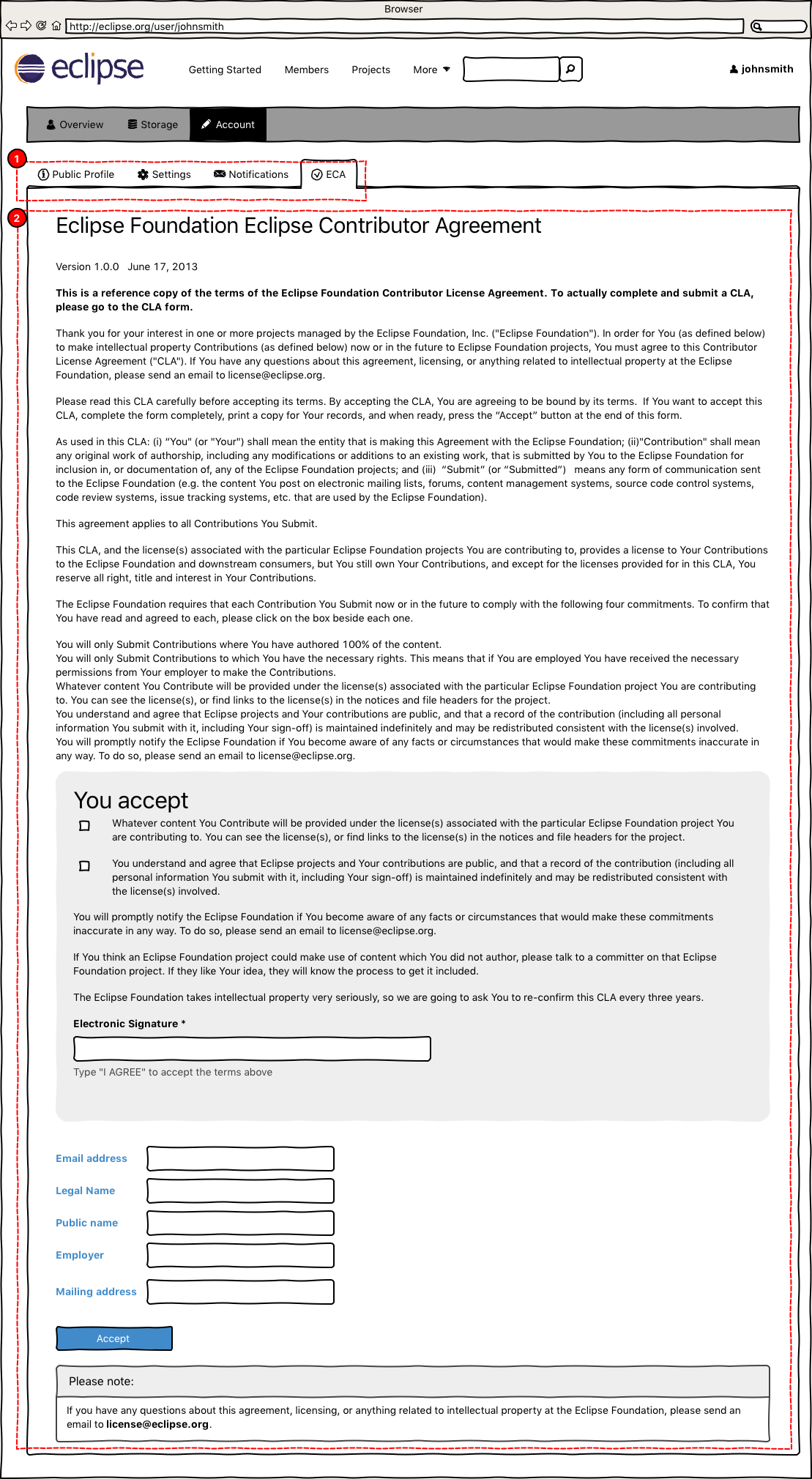
ECA
Relative bug -> https://bugs.eclipse.org/bugs/show_bug.cgi?id=499456
This section is very small, and the picture is too big to fit in. So I don't include it. View it here:
Media:EclipseUserProfile-AccountECA.png
- Tabs
Like on Public Profile
ECA is a separate form from the three first one.
- ECA form
Nothing special, I did a basic copy past of the current form and renamed it to ECA, its future name.
Sign In
Sign In
Relative bug -> https://bugs.eclipse.org/bugs/show_bug.cgi?id=499386


This is a very simple design. Please note that on the Sign In page, "Sign In" is not displayed in the top right of the page menu. When the user click on "Sign In", he is redirected where he came from. Or to his User Profile.
If the user does not have an account, he just has to click on "Create an account".
Simple workflow. And yes, it was inspired of Google is doing it.
Reset my Password
Relative bug -> https://bugs.eclipse.org/bugs/show_bug.cgi?id=499575
In order to save development time, we can re-use most of the design done for the "Sign in" form.
Step 1
Please note at the bottom that the link is "Sign in", this is a fall back in case the user wants to go back.
Of course, we keep the confirmation message (green background) when the user is submitting the email. Question: do we need to tell that the address exist or doesn't exist? for security purpose, is it better to not disclose a non existing email?
And also, what do you think about adding another link like that:
- or -
Create an account
And keep the sign in link?
Step 2
When the user type new password, we check that this is matching and we inform the user that this might be too weak.
If possible, try to re-use the work done on other forms with password settings.
The captcha is a best practice to avoid bots and spam, so we can keep it.
When the user click on "Save the password", we keep the current workflow, display a confirmation and go to the sign in form.
Create an account
Relative bug -> https://bugs.eclipse.org/bugs/show_bug.cgi?id=499447

The icons are here to make it obvious.
- New to Eclipse?
This page resume that an Eclipse account is used to log in many service. Do not hesitate to add some services, this list might not be complete.
At the bottom of the column, there is a small disclaimer, the same than in "Account - Settings", in order to reming that the email field is important!!!
- Email
The field should check that the user typed an actual email. Not sure we need a confirmation label but why not?
- Nickname
Users can choose their nickname.
of course, the field check that this is available. The label is green with a check when nickname is available, and red with a cross when not available.
- Name & organisation
Nothing special
Do we need to check that we know the organisation?
- Password
Same workflow than on "Account - Settings".
- Country
This is the only mandatory location field, list of choice.
- Checkboxes
The user can subscribe to Eclipse Newsletter, but this is not mandatory.
The user must agree to the tems of use and privacy policy.
- Create account
When the user clicks on the button, it goes to "Account - Public Profile". This is a way to invite him to complete non mandatory informations.
- All fieds are mandatory
Add a small information icon with a link, to display on information about why we are asking the fields.
- Sign In
Display "Sign in", a fallback if the user as an account.
We also need a honeypot, like a hidden checkbox or something like that. And yes, again, this is inspired of how Google is doing it.

If we upgrade the top menu, we can manage the user submenu this way.
We already have a template that we can use as a base: https://www.eclipse.org/eclipse.org-common/themes/solstice/html_template/index.php?theme=solstice&layout=thin-header
Search a user
Relative bug -> https://bugs.eclipse.org/bugs/show_bug.cgi?id=493457
Your feedback is welcome, the best place for a discussion is on the dedicated bug.
Quick search

- Type in this field the keywords to search. Information we can use to search:
- First name
- Last Name
- Nickname
- Like on the Markeplace, a quick search is displayed below the search field
- Form's submit button, with an icon
Search result and filters

-
Results
- A small avatar, just enough to fit the 2 lines of text.
- First Name, Name and link icon with the permalink to the profile. Can be the same layout than on the user profile, but with smaller text.
- Social icons. Again, smaller than on the user profile
- Even if the link to the user profile is already available, there is an obvious "go/see/add/follow/more/..." button on most search results (social networks, ...) so we need to stay consistant with that in term of UX. The main feature of this button can evolve (eg: follow, ...) based on how users will use the profiles.
- Status filter allows to check for specific kind of users. We can add other kind of users if we need it. We will start with:
- ECA
- Friend of Eclipse
- Committer
- Location should be available for most users, as we ask at least for the country when a user creates an account. The aim is to help people to find other people in their area (e.g: Local User Groups). In a second time, maybe we could add a "search in your area" feature, that would filter people around a place (50km around a city).
- Interests comes from the user profile. You type a keyword in the field (with autocompletion) and then click add. The keyword is then added to the list below. To remove a keyword, just click on the - icon next to it. We should to choose between OR and XOR, and we will add a tooltip to inform the user.
- Project will allow to filter contributors with project contribution. Same behaviour than Location.
- Pagination when there are too many results. We need to do some tests before choosing how many results we display, or maybe we can add a select at the top of the results so the end users choose how many results he wants to display.
- Select the number of results to be displayed on the page, e.g: 20, 50, 100. We need to do some tests to check what makes sense. Also, could it be possible to store the value in a cookie, so the user don't have to set it every time?
Filters
Fields and information about users
For the search feature, we use only public information available on user profiles, so it should be ok with the term of use. We need to check that to be sure. And also we might have some feedback from the Community users.
Here is the list:
- First Name
- Last Name
- Avatar
- ECA, Friend of Eclipse and Committer status
- Location
- Interests
- Project participation
Advanced search
If the needs is identified, an advanced search form could be available, using the same fields. It would mainly add the possibility to do a direct search with the filters of the standard search. At least, Location and Project might be very useful.
There is no mockup at the moment for this feature.
Upgrade the "Interests" view to the "Search result" view
When a user clicks on an interest tag on a user profile, it goes to a view listing other users with the same interests. Based on the work done for the search result, we need to upgrade the current "Interests" to the "Search result" view, with the filters. So the UX stay the same on each search view.