Notice: this Wiki will be going read only early in 2024 and edits will no longer be possible. Please see: https://gitlab.eclipse.org/eclipsefdn/helpdesk/-/wikis/Wiki-shutdown-plan for the plan.
UI Graphics : Design : States
Return to the main UI Graphics (3.x Updates) section on the UI Best Practices page.
Contents
Icon States
This section describes the use of enabled and disabled icons in the user interface. It also provides instructions and an automated action set for creating the disabled state of your enabled color icons, a useful tool when producing a large volume of icons.
Enabled state
The enabled icon state is the color version of all toolbar, toolbar wizard, and local toolbar icons. This state indicates that a command is active and available for use. Information on creating the enabled color version of these icons can be found under Style & Design above.
Disabled state
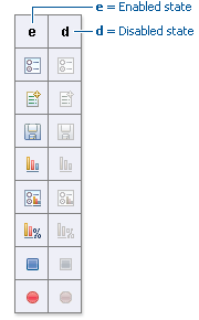
The disabled icon state is a dimmed version of the enabled color toolbar, toolbar wizard, and local toolbar icons. This state indicates that a command is inactive and not available for use. The following image shows a set of disabled toolbar icons beside the enabled state. Note that the disabled versions are not strictly grayscale, they retain a hint of color from the original icon. This is achieved by adjusting the saturation and lightness as you will see in the automated action below:
- NOTE: It is important to implement the graphical versions of the disabled state of toolbar and local toolbar icons. The quality and legibility of algorithmically rendered disabled icons is poor and they are not consistent with the majority of other tools that use the graphical versions.
- Creating the disabled icon state
- To create this state, you will use the "eclipse_disabledrender_R3V6.atn" action in the Eclipse-style Actions palette. Click here to download the Eclipse-style Actions.
- Load the "eclipse_disabledrender_R3V6.atn" into the the Adobe Photoshop Actions palette.
- Use the marquee tool to select all the enabled versions of the toolbar and local toolbar icons you plan to create a disabled state for.
- Next, hold the control key and hit the left or right arrow key once, then let go of the control key and hit the opposite arrow key to bump the images back into their exact initial position.
- Start the "Create Disabled State" action by clicking on the "play" arrow at the bottom of the Actions palette. A copy of the color icons will be created and a series of changes will be made to the copies to make them look disabled. It happens quickly so if you want to deconstruct it, you will need to enable the dialog boxes to show while you run the action. These toggles on located on the left side of the Actions palette.
- Once the disabled state is made, there is usually some minor adjustments required. We recommend you go through each icon and tweak any pixels that don't look right and to give a consistent treatment to similar elements.
- Here is what the "Create Disabled State" action looks like in the Actions palette:
Toggled states
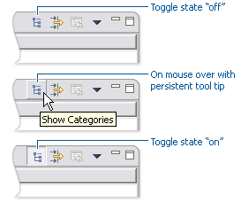
The toggled state is used on toolbars, local toolbars, and in menus. On toolbars and local toolbars, a toggle is represented by a button with two physical positions—up and down—which define a state, most commonly “on” and “off”. Icons on a toggle button, like the tool tips that accompany them, should persist from one state to the next. The only thing that changes is the position of the button. For example:
- Sometimes a toggle is not a simple on/off state. For example, there might be two different ways information can be displayed in a view. In this case, two buttons with two separate icons are required. The buttons sit beside one another on the local toolbar and when one is on, the other is off. For example:
- File:Listvshierarchy
- (Image not yet available: Toggle sample of two different ways of viewing something, e.g., list vs hierarchy)
Opened and closed folder states
In the treeview, ideally, folders would be closed when the -/+ widget beside the folder icon is in a closed state, as in [+], and opened when the -/+ widget beside the folder icon is in an opened state, as in [-]. Because Eclipse does not animate opened and closed folder states in the treeview, project folders and regular folders are closed on the toolbar and local toolbar, but open in wizard banners and in treeviews. Here is the reasoning:
-
- On the toolbar, a closed folder represents one that has not been created yet.
-
- In a wizard banner, an open folder represents one that will be created in the form of a model object in the treeview.
-
- In the treeview, an open folder represents one an existing and active folder.
- One notable exception to open folders in the treeview is when used to represent a “group”, as is the case with high-level project groupings in the Project Explorer View. These are shown with closed folders.
NOTE: All instructions for creating visual elements are based on using Adobe Photoshop 7.0 and above and Adobe Illustrator 9.0 and above. If you use earlier versions of these tools, the instructions may not work exactly as described.


