Notice: this Wiki will be going read only early in 2024 and edits will no longer be possible. Please see: https://gitlab.eclipse.org/eclipsefdn/helpdesk/-/wikis/Wiki-shutdown-plan for the plan.
Difference between revisions of "UIGraphics : Specifications : IconSize"
m |
m (→Object Overlay (and Underlay)) |
||
| Line 150: | Line 150: | ||
|'''Image size in allotted space''' |||||||||||||||||||||||||||||||| '''Sample image in place''' | |'''Image size in allotted space''' |||||||||||||||||||||||||||||||| '''Sample image in place''' | ||
|- | |- | ||
| − | | [[Image:spec_size_ovr- | + | | [[Image:spec_size_ovr-mult.gif]] |||||||||||||||||||||||||||||||| [[Image:spec_size_ovr-multsamp.gif]] |
|} | |} | ||
| Line 162: | Line 162: | ||
Back to top | Back to top | ||
| − | |||
== Table == | == Table == | ||
Revision as of 13:24, 12 October 2007
* Work in progress *
Return to the main UI Graphics section on the UI Best Practices page.
Contents
- 1 Size & Placement
- 1.1 Product
- 1.2 Perspective and Fast View
- 1.3 View
- 1.4 Toolbar, Toolbar Wizard, and Local Toolbar
- 1.5 Model Object
- 1.6 Object Overlay (and Underlay)
- 1.7 Table
- 1.8 Palette
- 1.9 Diagram
- 1.10 Progress Indicator
- 1.11 Pointer and Cursor Mask
- 1.12 Wizard Banner
- 1.13 Welcome
- 1.14 Welcome User Roles
- 1.15 Welcome Content
Size & Placement
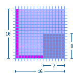
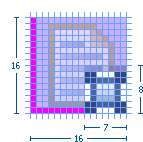
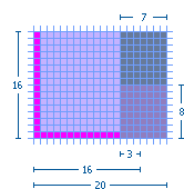
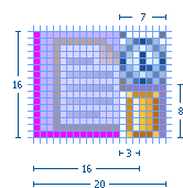
The majority of Eclipse style icons are designed within an area of 16 x 16 pixels. That is the final cut size of the image. Within that area, a 15 x 15 pixel space is reserved for the image itself, leaving both a vertical and horizontal line of empty pixels to allow for proper alignment of the image within the user interface. In the size and placement images below, the light blue represents the image area and the bright pink represents the empty pixel area.
If the height and width of the image are an even number of pixels smaller than 16 x 16 pixels, it is a rule of thumb to center the image within the 16 x 16 space. For example, a 14 x 14 pixel image will have a single row of empty pixels on all four sides.
Exceptions to the common 16 x 16 image size are also detailed below. All sizes are indicated with width before height.
Icons
Product
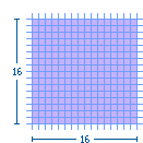
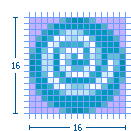
Product icons occupy the full space allotted for all five sizes: 16 x 16, 24 x 24, 32 x 32, 64 x 64, and 72 x 72 pixels. This shows how the 16 x 16 product icon fills the entire space:
| Image size in allotted space | Sample image in place | |||||||||||||||
 |
|
Back to top
Perspective and Fast View
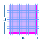
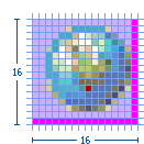
The maximum image size is 16 x 16 pixels, but 15 x 15 is recommended. If the image is 15 x 15 or smaller, the empty pixels must be on the right and bottom, as shown here. Image size in allotted space
| Image size in allotted space | Sample image in place | |||||||||||||||
 |
|
Back to top
View
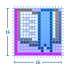
The maximum image size is 16 x 16 pixels, but 15 x 15 is recommended. If the image is 15 x 15 or smaller, the empty pixels must be on the left and bottom, as shown here.
| Image size in allotted space | Sample image in place | |||||||||||||||
 |
|
Back to top
Toolbar, Toolbar Wizard, and Local Toolbar
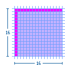
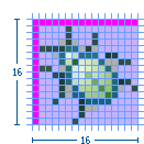
The maximum image size is 16 x 16 pixels, but 15 x 15 is recommended. If the image is 15 x 15 or smaller, the empty pixels must be on the left and top, as shown here.
| Image size in allotted space | Sample image in place | |||||||||||||||
 |
|
Back to top
Model Object
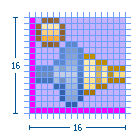
The maximum image size is 16 x 15 pixels, but 15 x 15 is recommended. Model Object icons must be no greater than 15 pixels high. The empty pixels must be on the left and bottom, as shown here.
| Image size in allotted space | Sample image in place | |||||||||||||||
 |
|
Back to top
Object Overlay (and Underlay)
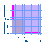
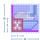
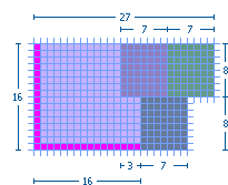
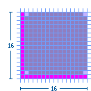
Most object overlay icons are a maximum image size of 7 x 8 pixels, always centered. There are some exceptions to this size, two of which are covered here: the "multiplicity" overlay and the "underlay". The multiplicity overlay spans the width of the model object to a maximum of 16 pixels wide and 6 pixels high. The underlay is a maximum size of 15 x 16 pixels, though commonly they are a square 15 x 15 pixels in size so they are uniform when seen multiple times in the treeview.
Overlay icons should have an outer white keyline surrounding the image to clearly separate them from the model object icons that they over lay. If there is not enough space to add the white keyline all the way around the overlay image, then add the white pixels only on the side that will be overlapping the model object. This can be determined by finding out what type of overlay it is. See the Graphic Types subsection for a sample and description of the different types of overlays. For information on how each of the overlays is positioned on the model object, see the subsection on Positioning in the UI.
Standard object overlay with a maximum image size of 7 x 8 pixels:
| Image size in allotted space | ||||||||||||||||
 |
Example of a standard Project Nature—Type—object overlay in place:
| Image size in allotted space | Sample image in place | |||||||||||||||
| File:Spec size ovr-proj.gif | 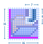
|
Example of a standard Auxiliary—Status—object overlay in place:
| Image size in allotted space | Sample image in place | |||||||||||||||
 |
|
Example of a standard Java—Attribute—object overlay in place:
| Image size in allotted space | Sample image in place | |||||||||||||||
 |
File:Spec size ovr-javasamp.gif |
Example of a standard Version Control—Transition-state—object overlay in place:
| Image size in allotted space | Sample image in place | |||||||||||||||
 |
|
Example of two stacking Version Control object overlays in place:
| Image size in allotted space | Sample image in place | |||||||||||||||
 |
|
Multiplicity object overlay with a maximum image size of 16 x 6 pixels:
| Image size in allotted space | Sample image in place | |||||||||||||||
| File:Spec size ovr-mult.gif | 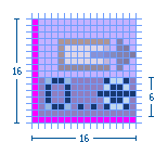
|
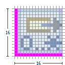
Underlay with a maximum image size of 16 x 15 pixels, but 15 x 15 is recommended. The empty pixels must be on the left and bottom, as shown here:
| Image size in allotted space | Sample image in place | |||||||||||||||
 |
|
Back to top
Table
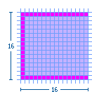
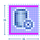
The maximum image size is 15 x 14 pixels. Table icons must be no greater than 14 pixels high. The empty pixels must be on the top, bottom, and left, as shown here.
| Image size in allotted space | Sample image in place | |||||||||||||||
 |
|
Back to top
Palette
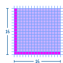
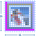
Standard small (16 x 16) palette icon: The maximum image size is 16 x 15 pixels, but 15 x 15 is recommended. Palette icons must be no greater than 15 pixels high. The empty pixels must be on the left and bottom, as shown here.
| Image size in allotted space | Sample image in place | |||||||||||||||
 |
|
Standard large (24 x 24) palette icon: The maximum image size is 24 x 23 pixels, but 23 x 23 is recommended. Palette icons must be no greater than 23 pixels high. The empty pixels must be on the left and bottom, as shown here.
| Image size in allotted space | Sample image in place | |||||||||||||||
 |

|
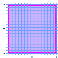
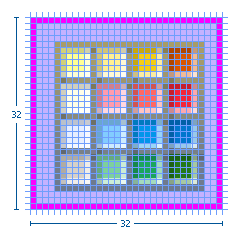
Large (32 x 32) palette icon: The maximum image size is 30 x 30 pixels with the image centered. The empty pixels are on all four sides of the image.
| Image size in allotted space | Sample image in place | |||||||||||||||
 |
|
Back to top
Diagram
Small (10 x 10) canvas icon: The maximum image size is 10 x 10 pixels. The image fills the space as required.
| Image size in allotted space | Sample image in place | |||||||||||||||
 |

|
Small (12 x 12) canvas icon: The maximum image size is 12 x 12 pixels. The image fills the space as required.
| Image size in allotted space | Sample image in place | |||||||||||||||
| File:Spec size dgm12.gif | 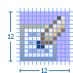
|
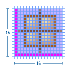
Small (16 x 16) canvas icon: The maximum image size is 16 x 15 pixels, but 15 x 15 is recommended. The empty pixels must be on the left and bottom, as shown here.
| Image size in allotted space | Sample image in place | |||||||||||||||
 |
|
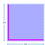
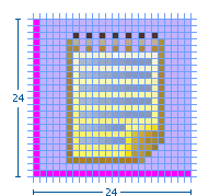
Large (24 x 24) canvas icon: The maximum image size is 24 x 23 pixels, but 23 x 23 is recommended. The empty pixels must be on the left and bottom, as shown here.
| Image size in allotted space | Sample image in place | |||||||||||||||
 |
|
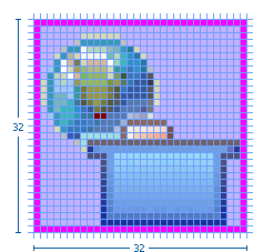
Large (32 x 32) canvas icon: The maximum image size is 32 x 32 pixels, but 30 x 30 is recommended with the image centered. The empty pixels are on all four sides of the image.
| Image size in allotted space | Sample image in place | |||||||||||||||
 |
|
Back to top
Progress Indicator
The maximum image size is 16 x 15 pixels, but 15 x 15 is recommended. Progress indicator icons must be no greater than 15 pixels high. The empty pixels must be on the left and bottom, as shown here.
| Image size in allotted space | Sample image in place | |||||||||||||||
 |
File:Spec size prodgsamp.gif |
Back to top
Pointer and Cursor Mask
The final size of the pointer and cursor masks is 32 x 32 pixels. The actual image size of the pointer is usually less than 20 x 20 pixels, often 16 x 16 pixels, but can also fill the entire 32 x 32 space. There are no empty pixels in the pointer and cursor mask images. Both are filled completely with black and white, with the mask being the opposite of the pointer or masking it out entirely.
Pointer and cursor mask image sizes shown in the 32 x 32 pixel space:
| Image size in allotted space | Sample image in place | |||||||||||||||
| File:Spec size point16.gif | 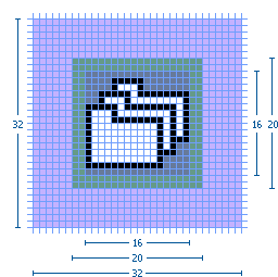
|
Back to top
Wizard Banner Graphics
Wizard Banner
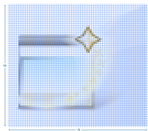
All wizard banner graphics are designed to fit within a specified screen space of 75 x 66 pixels on the right side of the wizard banner.
The actual size of each graphic will vary depending on the elements involved, but will generally be around 67 x 50 pixels in size.
Within the banner space allocation, there is no firm rule for where to place the wizard graphic. Generally, the graphic is centered vertically, and off-center to the left horizontally.

Back to top
== User Assistance Graphics ==
PLEASE NOTE: This subsection is still in progress. Some details are currently not available but will be soon.
Welcome
Welcome icons are 86 x 86 pixels in size. In standby mode and at the top of the welcome content pages, these icons are 52 x 52 pixels in size. Main welcome section icons: Image size in allotted space
Sample image in place Main welcome section icon image size of 72 x 72 pixels shown within the final 86 x 86 pixel space Main welcome section icon image placed in the alotted realestate
Main welcome section icons in standby mode and at top of content pages: Image size in allotted space
Sample image in place Main welcome section icon image size of 48 x 48 pixels shown within the final 52 x 52 pixel space Main welcome section icon image placed in the alotted realestate
Welcome User Roles
Welcome user role icons are 36 x 36 pixels in size. Image size in allotted space
Sample image in place Welcome user role image size of 32 x 32 pixels shown within the final 36 x 36 pixel space Welcome user role image placed in the alotted realestate
Welcome Content
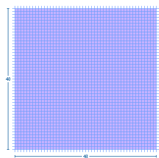
Welcome content page icons are 48 x 48 pixels in size.
Default size and placement:
| Image size in allotted space | Sample image in place | |||||||||||||||
 |
File:Spec size wel48samp.gif |
Hover size and placement:
| Image size in allotted space | Sample image in place | |||||||||||||||
| File:Spec size wel52.gif | File:Spec size wel52samp.gif |
== Tutorials and Samples Galleries ==
The treeview and lower-level content page icons are 16 x 16 (see under Model Object for size and placement of these images). The main content area of the galleries use 48 x 48 pixel icons, as shown here:
Image size in allotted space
Sample image in place Gallery content page image size of 48 x 48 pixels Gallery content page sample image placed in the alotted realestate
