Notice: this Wiki will be going read only early in 2024 and edits will no longer be possible. Please see: https://gitlab.eclipse.org/eclipsefdn/helpdesk/-/wikis/Wiki-shutdown-plan for the plan.
Difference between revisions of "Riena/Look and Feel"
(→Look&Feel Keys) |
(→Dialog) |
||
| Line 116: | Line 116: | ||
| − | [[Image: | + | [[Image:lnfDialogBorder.png]] |
The the dialog border is a compound of two (one pixel thick) borders. Every border has different colors a the top/left and bottom right: | The the dialog border is a compound of two (one pixel thick) borders. Every border has different colors a the top/left and bottom right: | ||
Revision as of 09:00, 27 April 2009
Riena Project > Look & Feel
Contents
Look&Feel for Riena
Riena provides a Look&Feel for the controls of the navigation. The Riena Look&Feel remembers the Look&Feel of Swing.
A Look&Feel of Riena consists of the Look&Feel with a Theme. The Theme provides the colors, fonts, images and some other settings. In the Look&Feel other renderers for some controls can be set.
Custom Look&Feel
In your own Look&Feel you must set your Theme and an ID.
The following steps are necessary:
- Extent the class RienaDefaultLnf
- Create and set the Theme
- Return the ID
Example:
public class ExampleLnf extends RienaDefaultLnf {

  public ExampleLnf() {
    super();
    setTheme(new ExampleTheme());
  }

  @Override
  protected String getLnfId() {
    return ExampleLnf;
  }

}
To set your custom Look&Feel call the static method setLnf(lnf) of the class LnfManager. The recommended place to do that is the constructor of the Riena Application (SwtApplication):
Example:
public SwtExampleApplication() {
  super();
  LnfManager.setLnf(new ExampleLnf());
}
Custom Theme
To write your own Theme you must implements the interface ILnfTheme.
The interface has the following four methods:
addCustomColors(Map<String, ILnfResource> table)
addCustomFonts(Map<String, ILnfResource> table)
addCustomImages(Map<String, ILnfResource> table)
addCustomSettings(Map<String, Object> table)
These methods must be implemented to define the colors, fonts, images and settings for the controls of the navigation.
It is recommend to extent the default theme of Riena, DefaultRienaTheme. All necessary resources and settings are already defined in the default theme. You must only put your own defaults into the tables of the Look&Feel.
The following line e.g. specifies the background color of a sub module:
table.put(ILnfKeyConstants.SUB_MODULE_BACKGROUND,new ColorLnfResource(186, 193, 225));
All existing keys for the Look&Feel you can find in the interface ILnfKeyConstants. It is not possible to add colors from the type org.eclipse.swt.graphics.Color. The colors must be wrapped from an instance of the class ColorLnfResource. This helps the Look&Feel to dispose all resources of the Look&Feel. Also wrappers for fonts and images exist.
Custom Renderer
For nearly every control of the navigation a renderer is used to paint it. This renderers can be replaced by own implementations. To write your own renderer please extent an existing default renderer
To set your own renderer you can use extensions. Therefore Riena provides an extension points: org.eclipse.riena.ui.swt.lnfrenderer
This extension can only have renderer elements. A renderer element has the following three attributes:
lnfkey Key of the Look&Feel for the renderer (see LnfKeyConstants)
lnfid ID of the your own Look&Feel (see getLnfId())
class Class of the RendererExample:
<extension point="org.eclipse.riena.ui.swt.lnfrenderer">
  <renderer class="org.eclipse.riena.example. application.ExampleModuleGroupRenderer"
            lnfid="ExampleLnf"
            lnfkey="ModuleGroup.renderer">
  </renderer>
</extension>
Look&Feel Keys
The class org.eclipse.riena.ui.swt.lnf.LnfKeyConstants defines a set of keys for the Look&Feel. These keys are used to access the color, fonts, images etc. of the Look&Feel.
Dialog
Riena draws an own title bar and border of a dialog, if the setting SHELL_HIDE_OS_BORDER has the value true.
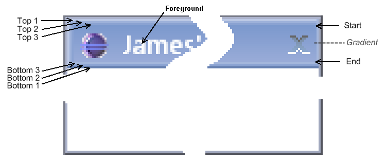
The picture above shows a dialog with a Riena title bar.
The background of the title bar is a gradient with start and end color. The keys of the L&F are DIALOG_TITLEBAR_BACKGROUND_START_COLOR and DIALOG_TITLEBAR_BACKGROUND_END_COLOR.
At the top (left) and the bottom (right) of the Riena title bar are three different other colors to simulate a 3D effect:
DIALOG_TITLEBAR_BACKGROUND_TOP_COLOR_1
DIALOG_TITLEBAR_BACKGROUND_TOP_COLOR_2
DIALOG_TITLEBAR_BACKGROUND_TOP_COLOR_3
DIALOG_TITLEBAR_BACKGROUND_BOTTOM_COLOR_1
DIALOG_TITLEBAR_BACKGROUND_BOTTOM_COLOR_2
DIALOG_TITLEBAR_BACKGROUND_BOTTOM_COLOR_3
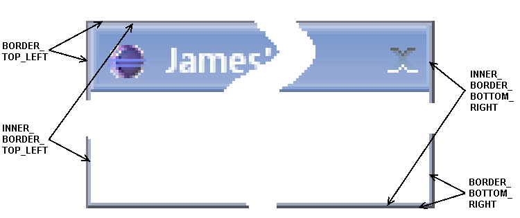
The the dialog border is a compound of two (one pixel thick) borders. Every border has different colors a the top/left and bottom right:
DIALOG_BORDER_BOTTOM_RIGHT_COLOR
DIALOG_BORDER_TOP_LEFT_COLOR
DIALOG_INNER_BORDER_BOTTOM_RIGHT_COLOR
DIALOG_INNER_BORDER_TOP_LEFT_COLOR


