Notice: this Wiki will be going read only early in 2024 and edits will no longer be possible. Please see: https://gitlab.eclipse.org/eclipsefdn/helpdesk/-/wikis/Wiki-shutdown-plan for the plan.
Difference between revisions of "Orion/UX Issues/Selections"
(→Ideas to try) |
(→Ideas to try) |
||
| Line 17: | Line 17: | ||
* When there is the "80% case" default action for an item, it should appear in-line in a dedicated location. The proposal is that it appears to the left of the item itself, before any decorator or model icons. We will need to style this in a way that it's clear that this thing is a clickable item (maybe the existing border/hover behavior is enough for now, but we may want distinct model icons vs. action icons later.) | * When there is the "80% case" default action for an item, it should appear in-line in a dedicated location. The proposal is that it appears to the left of the item itself, before any decorator or model icons. We will need to style this in a way that it's clear that this thing is a clickable item (maybe the existing border/hover behavior is enough for now, but we may want distinct model icons vs. action icons later.) | ||
[[Image:orion-defaultaction.png]] | [[Image:orion-defaultaction.png]] | ||
| − | * For the non-default actions, the problem remains that you could be deep in content and want to perform an action on the item, but you don't know what your selection state is and what the action will apply to. The idea is to use a Scroll Spy similar to twitter bootstrap, which would pin your section header (and action buttons) to the top. So if you are deep in the staged list, you see the staged section header pinned to the top. If you are deep in the unstaged list, you see that heading, etc. etc. | + | * For the non-default actions, the problem remains that you could be deep in content and want to perform an action on the item, but you don't know what your selection state is and what the action will apply to. The idea is to use a Scroll Spy with a presentation similar to twitter bootstrap, which would pin your section header (and action buttons) to the top. So if you are deep in the staged list, you see the staged section header pinned to the top. If you are deep in the unstaged list, you see that heading, etc. etc. |
| + | [[Image:orion-scrollspysectionheader.png]] | ||
== To do == | == To do == | ||
Revision as of 14:48, 23 May 2012
This page summarizes some ideas regarding how we choose commands for items in a list. The tracking bug is bug 367458.
In 0.5 we have moved to a traditional "extended select" model in many of our lists, such as navigator, git status, where you click on one or more items and choose commands that operate on the selection. Previously, we had a number of actions that appear in-line next to items in a list. We also had some inline actions collapsed into menus, giving a context menu like interaction, but the menu was scoped to a single item.
So far, we've removed these context menus and moved some lesser used inline actions into selection menus. The question is...what is our rule/strategy for when we show actions in-line vs. showing them in a selection menu.
Problems with current state
- When the initial state of a list is "nothing selected" the selection (More) menu is not appearing so the user has no idea what to do or that a selection model is available.
- For pages where the items can expand into very tall/heavy content (like the compare widgets under the git status changes), it is inconvenient to scroll from deep in the content to the toolbar or heading that provides the actions.
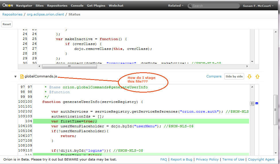
- Often there is a commonly used action that is more convenient to access inline. For example, in git status, it's common to want to stage the items. We've discussed having the actionable link for the item perform the default action, but this isn't obvious to people in use
Ideas to try
- The More menu should be called "Actions" and should always appear, even when there is no selection. If you click on it when it's empty, it tells you that need to make a selection.
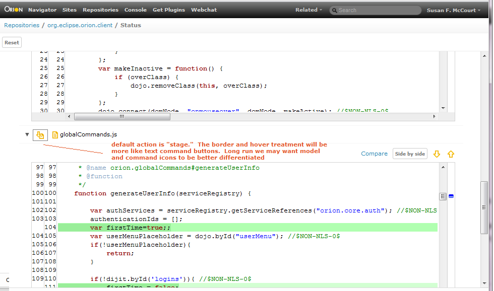
- When there is the "80% case" default action for an item, it should appear in-line in a dedicated location. The proposal is that it appears to the left of the item itself, before any decorator or model icons. We will need to style this in a way that it's clear that this thing is a clickable item (maybe the existing border/hover behavior is enough for now, but we may want distinct model icons vs. action icons later.)
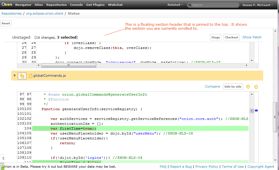
- For the non-default actions, the problem remains that you could be deep in content and want to perform an action on the item, but you don't know what your selection state is and what the action will apply to. The idea is to use a Scroll Spy with a presentation similar to twitter bootstrap, which would pin your section header (and action buttons) to the top. So if you are deep in the staged list, you see the staged section header pinned to the top. If you are deep in the unstaged list, you see that heading, etc. etc.
To do
- Susan will ensure the more menu is always visible and has instructions
- Szymon will try the "default action" idea in git status and also move the compare widget actions to their own line bug 380004
- We need to look at the specific pages to see if this will work (screenshots coming)
- We will need to implement this section header/scroll spy concept


