Notice: this Wiki will be going read only early in 2024 and edits will no longer be possible. Please see: https://gitlab.eclipse.org/eclipsefdn/helpdesk/-/wikis/Wiki-shutdown-plan for the plan.
Difference between revisions of "Orion/Page Layout"
(→Jazz) |
|||
| Line 40: | Line 40: | ||
== Orion 0.2/0.3 == | == Orion 0.2/0.3 == | ||
| + | In the initial designs for Orion, we wanted to honor this structure, but assigning high priority to constraining vertical space required. One of the primary tasks in Orion is editing code, a task that is very deep and complex, where as much room is needed for the resource itself as possible. We considered whether we should have a special layout for the editor vs. the other pages, but decided to try and design a layout that would work for all pages, that used less real estate than that used by jazz and github. | ||
| + | === Editor === | ||
| + | As you can see, the amount of vertical space used for the elements that do not belong to the resource/task at hand is about half that of the space used in jazz (112 vs. 245 pixels). But it is at the cost of combining many of these elements into the header. | ||
| + | In the editor, you don't really see any links/buttons for "in-resource tasks" because most of the tasks involve editing or using keybindings to execute commands that don't appear on the dark toolbar or in the editor. | ||
| + | |||
| + | [[Image:editorlayout.png]] | ||
| + | |||
| + | === Navigator === | ||
| + | The navigator uses the same approach, but since the "resource" being manipulated is a list of files and folders, there are more commands inside the list. | ||
| + | |||
| + | [[Image:navlayout.png]] | ||
| + | |||
| + | === Git === | ||
| + | Once we introduced git functionality, we realized that the "Where I Am" was getting more complicated. In git, it's important to know not only the resource being viewed, but also what branch in git is being used. So we start to get really crowded page headers. | ||
| + | |||
| + | [[Image:gitlog.png]] | ||
== Orion 0.4 == | == Orion 0.4 == | ||
Revision as of 15:47, 30 November 2011
We have often said that in Orion, a page is defined as "task + resource." We wish to follow a common page layout so that it's easy for the user to understand where to find the tasks they are interested in performing. In general, the top of the page contains links to other tasks and resources that you might wish to discover, and as you move down the page, the buttons and links become more focused on the task at hand.
The visual layout to support this idea has had to balance this idea of "moving down the page" with conserving vertical real estate. We don't want to take up too much of the page with items not directly related to the content that you are trying to work with. This all seems fairly obvious, but when organizing the page content it has been helpful to be explicit about this approach and to name these tasks and page elements.
We use the following terms when talking about the page organization, from general to specific.
- Branding isn't functional (though it may link to the home page) but establishes the brand.
- Discovery links appear prominently/consistently on the page and teach you what can you do. They may even link to other sites. They are the least related to what you are doing.
- Primary navigation links appear prominently/consistently and help you to search for things or go to common tasks.
- User info shows who you are and lets you manipulate your account, login, etc.
- Page title describes the kind of page/task you are on
- Where I am indicates where you are and perhaps has a breadcrumb to lead you elsewhere.
- Task links (or tabs or buttons) help you manipulate the entire task/resource at hand, there might be multiple levels of task links depending on what the page is doing
- In-resource navigation can help you find your way within a large resource or change the view within that resource.
- Resource/edit links (or buttons, gestures, etc.) appear inside the main resource you are working with and help to edit/act on that resource
For Orion pages, then, if a page is generally "task + resource" then the visual on the page that orients you to what you are doing is a combination of "Page Title (task) + Where I Am (resource)." Note also, that this combination is typically shown in the browser tab so you can quickly find the thing you want to work on when it's already open.
Contents
Site Examples
We've looked primarily to other developer sites for examples of how this kind of layout is done. Our main comparisons have been Github and Jazz.
Github
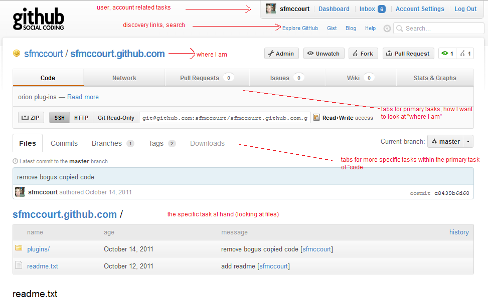
Github's primary and discovery links are organized in two rows. The top row is mostly concerned with things related to your overall account, and the bottom row seems more discovery focused, combined with a search box. (A little upside down conceptually, but presumably the account links are given more prominence since they are more common.)
Tasks are organized in tabs. The layout as it relates to what you are doing is very structured/explicit, with the downside that there might be a lot of vertical space used before you get to the primary task at hand. Note there is not an explicit "page title" from a task point of view, just "Github."
The browser tab uses "where I am - page title". 
Jazz
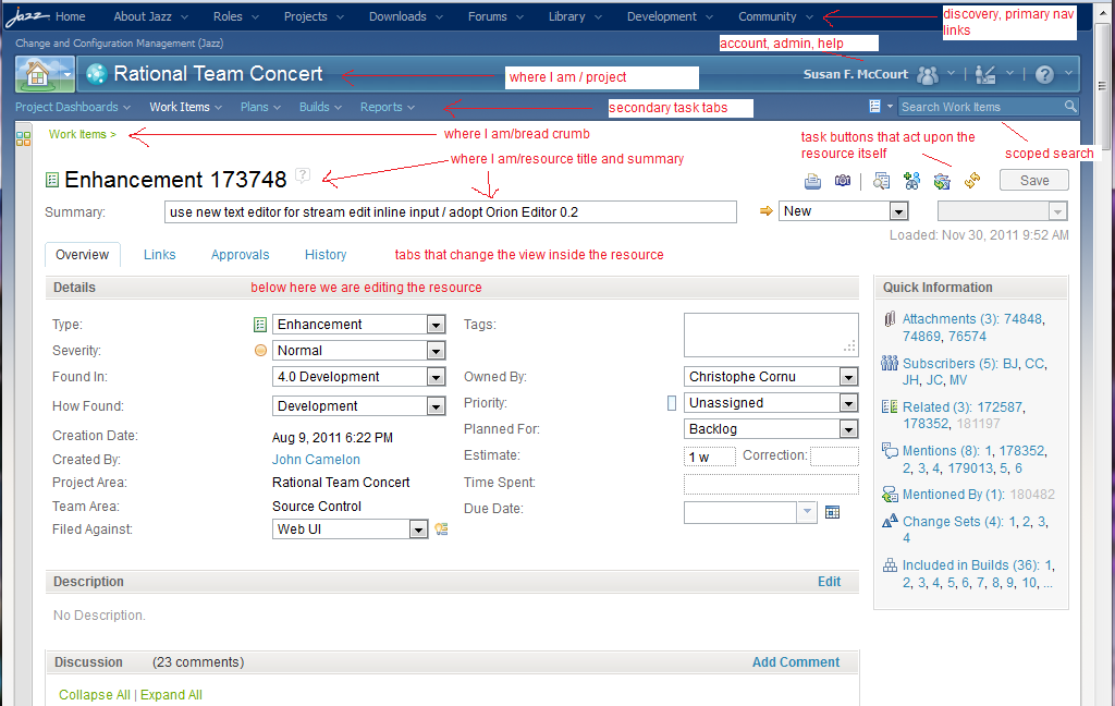
Jazz is navigating across various products (called projects) as well as helping navigate the jazz community (blogs, etc.). The top set of menus/links could be considered the high level discovery links (similar to what github puts in the second row). A second "bar" of links combines the top level project "where I am" (page title?) on the left with the account related links on the right. A third level of links/tabs navigates the secondary tasks, and the search appears on the right (the search is scoped to this secondary level). All of this task navigation is in various blue colors, with the resource itself shown in white.
The top part of the resource includes more "where I am" (with breadcrumb) along with the tasks that act upon the whole resource. Underneath, we can use tabs to pick a more specific view of the resource and then edit those aspects of the resource. Within the resource, gray bars are used to designate different parts of the resource, and commands/links related to those parts appear in the gray bar, to orient the task to the "section" of the resource.
Once again, this is very structured, with the downside of vertical space required to present the structure before you can actually work on the task.
The browser tab uses "where I am + summary".  Note that there is no use of the primary task or page title "Rational Team Concert" or "Work Item". This can work because the name of the resource (Enhancement NNN, Work Item NNN, etc.) implies that you are using workitems.
Orion 0.2/0.3
In the initial designs for Orion, we wanted to honor this structure, but assigning high priority to constraining vertical space required. One of the primary tasks in Orion is editing code, a task that is very deep and complex, where as much room is needed for the resource itself as possible. We considered whether we should have a special layout for the editor vs. the other pages, but decided to try and design a layout that would work for all pages, that used less real estate than that used by jazz and github.
Editor
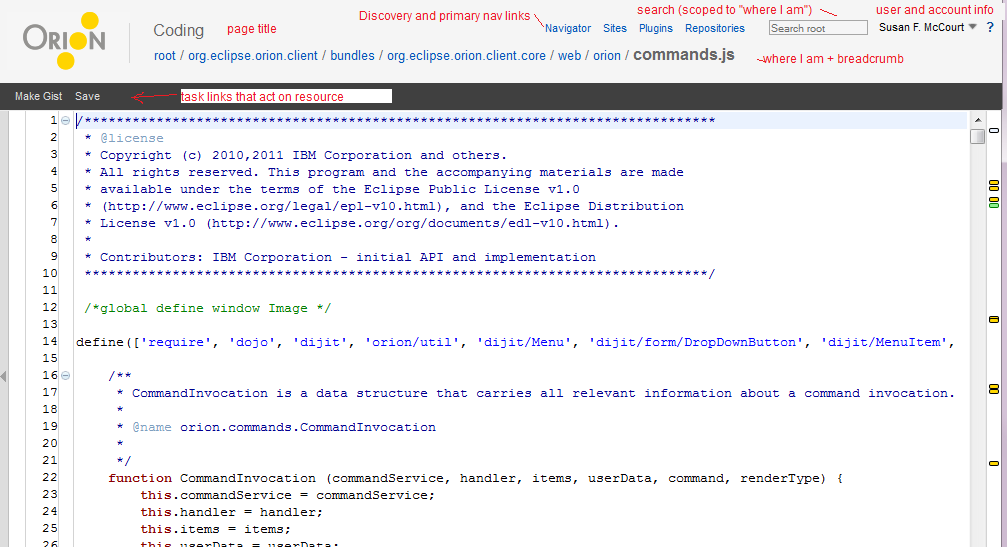
As you can see, the amount of vertical space used for the elements that do not belong to the resource/task at hand is about half that of the space used in jazz (112 vs. 245 pixels). But it is at the cost of combining many of these elements into the header.
In the editor, you don't really see any links/buttons for "in-resource tasks" because most of the tasks involve editing or using keybindings to execute commands that don't appear on the dark toolbar or in the editor.
The navigator uses the same approach, but since the "resource" being manipulated is a list of files and folders, there are more commands inside the list.
Git
Once we introduced git functionality, we realized that the "Where I Am" was getting more complicated. In git, it's important to know not only the resource being viewed, but also what branch in git is being used. So we start to get really crowded page headers.


