Notice: this Wiki will be going read only early in 2024 and edits will no longer be possible. Please see: https://gitlab.eclipse.org/eclipsefdn/helpdesk/-/wikis/Wiki-shutdown-plan for the plan.
Difference between revisions of "Field Decorators and Validation"
(→Content Assist) |
(→Blueprint Specifications) |
||
| Line 106: | Line 106: | ||
== Blueprint Specifications == | == Blueprint Specifications == | ||
| + | Note: Fields (and the dialog space surrounding the field) are not to grow/shrink due to presence/absence of the decorator, so it is the responsibility of the dialog designer to allocate space for it. | ||
[[Image:BlueprintSpecifications.gif]] | [[Image:BlueprintSpecifications.gif]] | ||
Revision as of 18:09, 21 November 2006
This document describes Use Cases and Solutions for field decorators of (1) Content Assist, (2) Required Fields, and (3) Errors/Warnings. Each of these indicators are shown in various UI contexts, such as Dialog Boxes, Wizards, and Forms, in order to describe the design issues and apply a consistent solution where possible. The main techniques that are described in the Blueprint Specifications and Solutions refer to icon/text treatment (size and position) at the Control-level, as well as messages at the UI-level.
| Indicator (cue) |
|
|---|---|
| UI Controls or Area |
|
| UI Context |
|
Content Assist
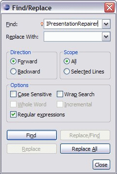
Figure 1.1 Find/Replace Dialog - Combo Box
Lightbulb overlay is middle-aligned vertically with the combo box and text labels, when the field has focus
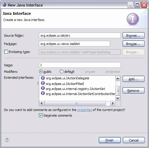
Figure 1.2 JDT New Java Interface Dialog - List Cell Editor
Lightbulb overlay is placed to the left of the list box, when the list item has focus.
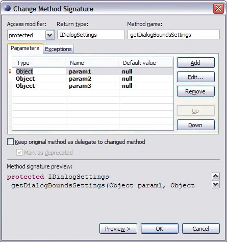
Figure 1.3 JDT Change Method Signature Dialog - Table Cell Editor
Lightbulb overlay is placed to the left of the table.
Required Input
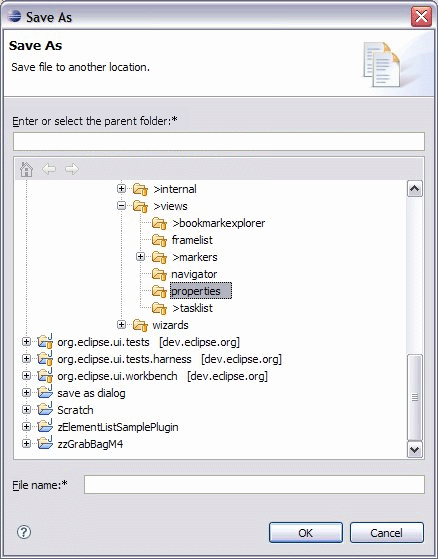
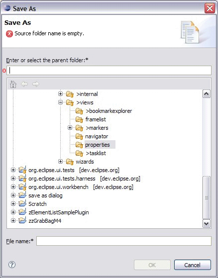
Figure 2.1 Save As Dialog: Parent folder and file name fields - Text Field
Asterisk is placed after the text label and colon.
Figure 2.2 Save As Dialog: Input error - Text Field, Header (banner)
Asterisk is placed after the text label and colon; Error icon with message replaces the description in the top banner info area; Large error icon provides association with the text field indicator inside the dialog page.
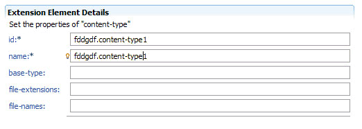
Figure 2.3 PDE Form - Text Field
Asterisk is placed after the text label and colon; Lightbulb overlay is middle-aligned vertically with the combo box and text labels.
Error and Warning Messages
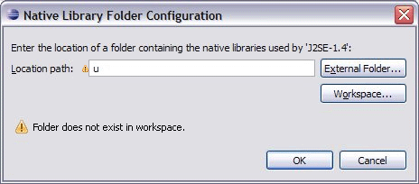
Figure 3.1 Native Library Folder Configuration Dialog: Input error - Text field, Body of dialog
Warning indicator is placed to the left of the text field.
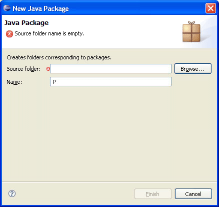
Figure 3.2 New Package Wizard - Text Field, Header
Error icon with message replaces the description in the top banner info area; Large error icon provides association with the text field indicator inside the dialog page.
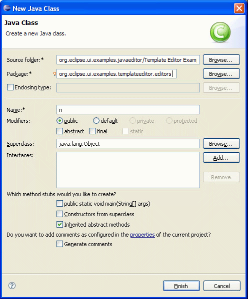
Figure 3.3 New Class Wizard - Text Field, Header
Asterisk is placed after the text label and colon; Content assist icon is placed to the left of text field; indicator inside the dialog page. Warning icon with message replaces the description in the top banner info area; Large error icon provides association with the text field
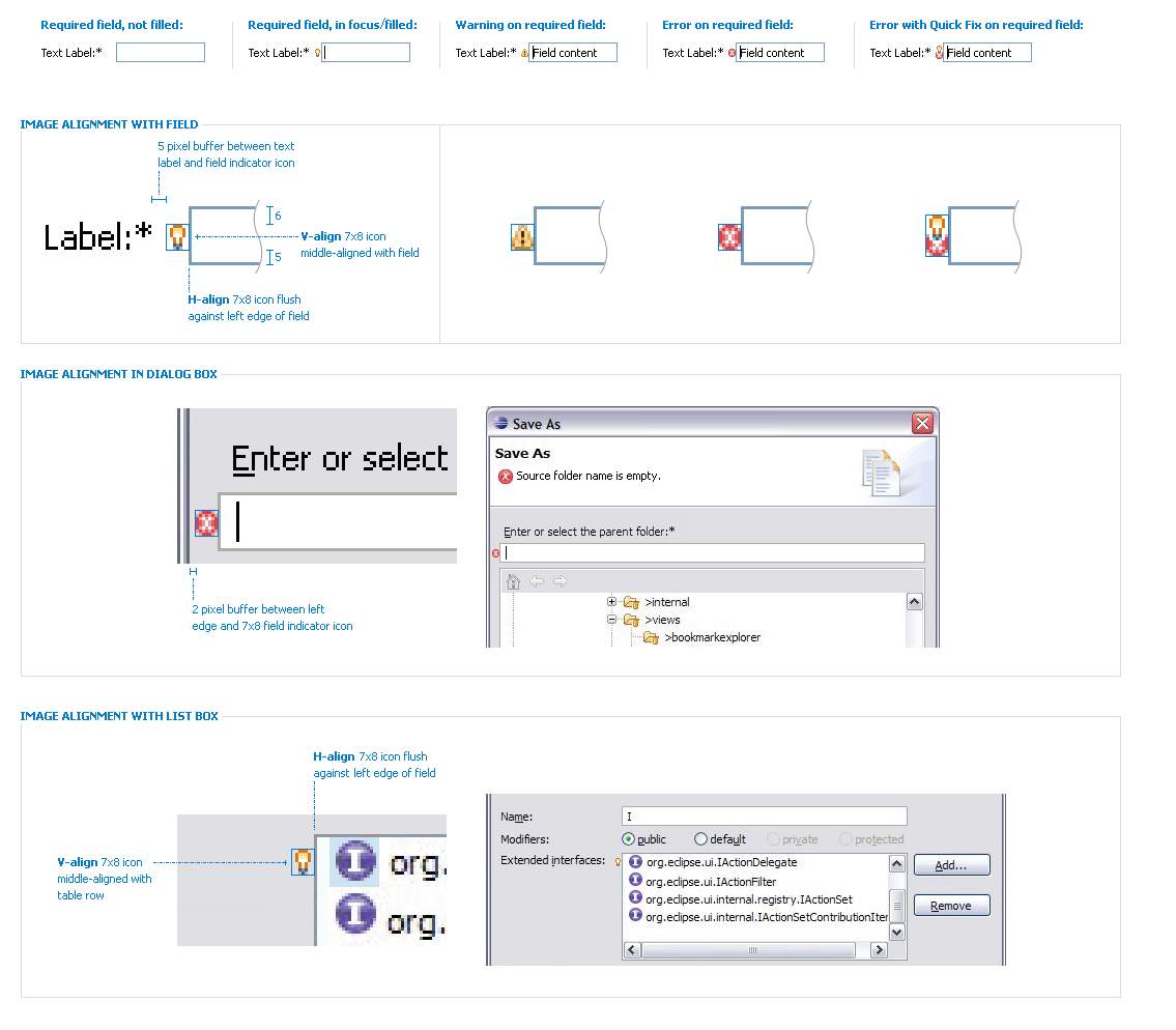
Blueprint Specifications
Note: Fields (and the dialog space surrounding the field) are not to grow/shrink due to presence/absence of the decorator, so it is the responsibility of the dialog designer to allocate space for it.

