Notice: this Wiki will be going read only early in 2024 and edits will no longer be possible. Please see: https://gitlab.eclipse.org/eclipsefdn/helpdesk/-/wikis/Wiki-shutdown-plan for the plan.
Difference between revisions of "EDT:Tutorial: RUI With DataBase Lesson 4"
| Line 98: | Line 98: | ||
<li>In the New EGL Rich UI Data Fields wizard, | <li>In the New EGL Rich UI Data Fields wizard, | ||
| − | request a new record variable based on the | + | request a new record variable based on the '''paymentRec''' record: |
<ul><li>Make sure '''Type Selection''' is set to '''Record'''. | <ul><li>Make sure '''Type Selection''' is set to '''Record'''. | ||
| − | <li>Select the | + | <li>Select the '''paymentRec''' record. This record should |
be the only one in the list. | be the only one in the list. | ||
<li>In the '''Array Properties''' section, select | <li>In the '''Array Properties''' section, select | ||
| Line 135: | Line 135: | ||
<ol><li>Under '''Create Widgets for''', leave | <ol><li>Under '''Create Widgets for''', leave | ||
the default value of '''Read-only data'''. | the default value of '''Read-only data'''. | ||
| − | <li>The check boxes under the | + | <li>The check boxes under the '''allPayments''' variable |
indicate the fields that are to be used as columns in the display. | indicate the fields that are to be used as columns in the display. | ||
Clear all the fields by clicking '''None'''. | Clear all the fields by clicking '''None'''. | ||
| Line 147: | Line 147: | ||
<li>Change the labels for those fields: | <li>Change the labels for those fields: | ||
| − | <ul><li>Change '''category''' to | + | <ul><li>Change '''category''' to '''Type'''. |
| − | <li>Change '''description''' to | + | <li>Change '''description''' to '''Description'''. |
| − | <li>Change '''amount''' to | + | <li>Change '''amount''' to '''Amount due'''. |
</ul> | </ul> | ||
The wizard uses these labels as column headers for the grid. | The wizard uses these labels as column headers for the grid. | ||
| Line 179: | Line 179: | ||
Take this | Take this | ||
opportunity to reduce the width of two columns in the data grid. Specifically, | opportunity to reduce the width of two columns in the data grid. Specifically, | ||
| − | consider the DataGridColumn declarations for the | + | consider the DataGridColumn declarations for the '''category''' and '''amount''' columns |
and change the width property from the default 120 pixels to 90 pixels. Here is the data grid declaration after your change:<code> | and change the width property from the default 120 pixels to 90 pixels. Here is the data grid declaration after your change:<code> | ||
allPayments_ui DataGrid { | allPayments_ui DataGrid { | ||
| Line 201: | Line 201: | ||
</code> | </code> | ||
| − | Add prototype data in the | + | Add prototype data in the '''start''' function, |
which is referenced in the '''onConstructionFunction''' property | which is referenced in the '''onConstructionFunction''' property | ||
of the handler and which runs before the user first accesses the web | of the handler and which runs before the user first accesses the web | ||
| Line 247: | Line 247: | ||
<ol><li>In the Palette view, go to the Display and Input drawer | <ol><li>In the Palette view, go to the Display and Input drawer | ||
and then to '''Button (Dojo)'''. Drag a Dojo Button | and then to '''Button (Dojo)'''. Drag a Dojo Button | ||
| − | widget to the leftmost cell of | + | widget to the leftmost cell of '''buttonLayout'''. [[Image:EDT_Tutorial_edt_richui_sql08_drag_button.jpg|Dragging a button onto the new GridLayout widget]] |
<li>Assign the following name to the button: | <li>Assign the following name to the button: | ||
| Line 256: | Line 256: | ||
<ul><li>On the '''General''' page, change the '''text''' property | <ul><li>On the '''General''' page, change the '''text''' property | ||
| − | to | + | to '''Add'''. |
<li>On the '''Events''' page, select the row for | <li>On the '''Events''' page, select the row for | ||
the '''onClick''' event. A plus sign (+) is displayed | the '''onClick''' event. A plus sign (+) is displayed | ||
| Line 268: | Line 268: | ||
</ol> | </ol> | ||
| − | The Source view opens to display the | + | The Source view opens to display the '''addRow''' function. |
Rather than complete the function now, finish laying out this section | Rather than complete the function now, finish laying out this section | ||
of the web page. Click the Design tab to return to the Design surface. | of the web page. Click the Design tab to return to the Design surface. | ||
| Line 275: | Line 275: | ||
<ol><li>In the Palette view, go to the Display and Input drawer | <ol><li>In the Palette view, go to the Display and Input drawer | ||
and then to '''Button (Dojo)'''. Drag a Dojo Button | and then to '''Button (Dojo)'''. Drag a Dojo Button | ||
| − | widget to the middle cell of | + | widget to the middle cell of '''buttonLayout'''. |
<li>Assign the following name to the button: | <li>Assign the following name to the button: | ||
| Line 283: | Line 283: | ||
<ul><li>On the '''General''' page, change the '''text''' property | <ul><li>On the '''General''' page, change the '''text''' property | ||
| − | to | + | to '''Delete'''. |
<li>On the '''Events''' page, assign the following | <li>On the '''Events''' page, assign the following | ||
function name to the '''onClick''' event: | function name to the '''onClick''' event: | ||
| Line 291: | Line 291: | ||
</ul> | </ul> | ||
| − | <li>When the | + | <li>When the '''deleteRow''' function is displayed, |
click the Design tab. | click the Design tab. | ||
</ol> | </ol> | ||
<li>Using the same process as in previous steps, create a Dojo | <li>Using the same process as in previous steps, create a Dojo | ||
| − | button in the rightmost cell of | + | button in the rightmost cell of '''buttonLayout'''. Name |
| − | the button | + | the button '''sampleButton''', change the '''text''' property |
| − | to | + | to '''Sample''', and use the following name for the '''onClick''' function: '''sampleData'''. The '''sampleData''' function is displayed. |
<li>Inspect the source code, noting the code that was provided | <li>Inspect the source code, noting the code that was provided | ||
for each of the buttons. | for each of the buttons. | ||
| Line 322: | Line 322: | ||
<ol><li>Make sure that '''Type Selection''' is | <ol><li>Make sure that '''Type Selection''' is | ||
set to '''Record'''. | set to '''Record'''. | ||
| − | <li>Select the | + | <li>Select the '''paymentRec''' record. |
<li>In the '''Array Properties''' section, | <li>In the '''Array Properties''' section, | ||
make sure that the '''Array''' check box is cleared. | make sure that the '''Array''' check box is cleared. | ||
| Line 345: | Line 345: | ||
<ol><li>In the Palette view, go to the Layout drawer and find the | <ol><li>In the Palette view, go to the Layout drawer and find the | ||
TitlePane (Dojo) widget type. Drag a new title pane to the lower right | TitlePane (Dojo) widget type. Drag a new title pane to the lower right | ||
| − | cell of the main grid layout, next to the cell that holds the | + | cell of the main grid layout, next to the cell that holds the '''allPayments_ui''' grid. [[Image:EDT_Tutorial_edt_richui_sql09_drag_title_pane.jpg|The TitlePane widget drops in the last cell.]] |
<li>Assign the following name to the title pane: | <li>Assign the following name to the title pane: | ||
| Line 351: | Line 351: | ||
editPane | editPane | ||
Click '''OK'''. | Click '''OK'''. | ||
| − | <li>Make the following changes to the properties for the | + | <li>Make the following changes to the properties for the '''editPane''' widget: |
<ul><li>On the '''General''' page, change the '''title''' property | <ul><li>On the '''General''' page, change the '''title''' property | ||
| − | to | + | to '''Payment record''' |
<li>On the '''Position''' page, change the '''width''' property | <li>On the '''Position''' page, change the '''width''' property | ||
| − | to | + | to '''350'''. This value leaves room for error messages. |
<li>On the '''Layout''' page, change the '''verticalAlignment''' property | <li>On the '''Layout''' page, change the '''verticalAlignment''' property | ||
| − | to | + | to '''TOP'''. |
</ul> | </ul> | ||
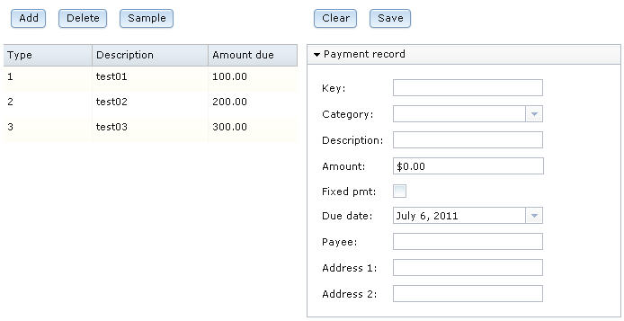
The web page should now look like the following image:[[Image:EDT_Tutorial_edt_richui_sql09_title_pane.jpg|The web page with the payment record pane]] | The web page should now look like the following image:[[Image:EDT_Tutorial_edt_richui_sql09_title_pane.jpg|The web page with the payment record pane]] | ||
<li>Save the file. | <li>Save the file. | ||
| − | <li>From the EGL Data view, drag the | + | <li>From the EGL Data view, drag the '''selectedPayment''' variable |
to the bracketed area inside the payment record pane. [[Image:EDT_Tutorial_edt_richui_sql09_drag_record.jpg|The bracketed area inside the pane.]] | to the bracketed area inside the payment record pane. [[Image:EDT_Tutorial_edt_richui_sql09_drag_record.jpg|The bracketed area inside the pane.]] | ||
The Configure | The Configure | ||
| Line 410: | Line 410: | ||
You must specify colons explicitly, as they are not added | You must specify colons explicitly, as they are not added | ||
automatically to labels. | automatically to labels. | ||
| − | <li>For the | + | <li>For the '''category''' field, in the Widget |
Type column, click '''DojoTextField'''. A down arrow | Type column, click '''DojoTextField'''. A down arrow | ||
is displayed. Click the arrow, and then click '''DojoComboBox'''. | is displayed. Click the arrow, and then click '''DojoComboBox'''. | ||
| − | <li>For the | + | <li>For the '''amount''' field, in the Widget |
Type column, click '''DojoTextField'''. A down arrow | Type column, click '''DojoTextField'''. A down arrow | ||
is displayed. Click the arrow, and then click '''DojoCurrencyTextBox'''. This widget provides some basic formatting for currency. | is displayed. Click the arrow, and then click '''DojoCurrencyTextBox'''. This widget provides some basic formatting for currency. | ||
| Line 448: | Line 448: | ||
only that widget is surrounded by a dotted line. | only that widget is surrounded by a dotted line. | ||
<li>On the '''Position''' page of the Properties | <li>On the '''Position''' page of the Properties | ||
| − | view, set the '''width''' property to | + | view, set the '''width''' property to '''166'''. |
</ol> | </ol> | ||
| Line 476: | Line 476: | ||
to the first cell of the new layout. | to the first cell of the new layout. | ||
<li>Using the same process as was used earlier, name the | <li>Using the same process as was used earlier, name the | ||
| − | button | + | button '''clearButton''', change the '''text''' property |
| − | to | + | to '''Clear''', and use the following name for the '''onClick''' function: '''clearAllFields'''. The '''clearAllFields''' function is displayed. |
</ol> | </ol> | ||
| Line 486: | Line 486: | ||
and then to '''Button (Dojo)'''. Drag a Dojo button | and then to '''Button (Dojo)'''. Drag a Dojo button | ||
to the second cell of the new layout. | to the second cell of the new layout. | ||
| − | <li>Name the button | + | <li>Name the button '''saveButton''' and change |
| − | the '''text''' property to | + | the '''text''' property to '''Save'''. |
<li>On the '''Events''' page, select the '''onClick''' event | <li>On the '''Events''' page, select the '''onClick''' event | ||
and click the down arrow in the <em class="ph i">second</em> column to display the | and click the down arrow in the <em class="ph i">second</em> column to display the | ||
available function names. Click '''selectedPayment_form_Submit''', | available function names. Click '''selectedPayment_form_Submit''', | ||
which is a function that EGL created automatically when you dragged | which is a function that EGL created automatically when you dragged | ||
| − | the | + | the '''selectedPayment''' record variable onto the user |
interface. | interface. | ||
<li>Click the Preview tab.<br /> [[Image:EDT_Tutorial_edt_richui_sql04_prototype_and_all.jpg|Web page with five buttons, prototype data, and a form]] | <li>Click the Preview tab.<br /> [[Image:EDT_Tutorial_edt_richui_sql04_prototype_and_all.jpg|Web page with five buttons, prototype data, and a form]] | ||
| Line 504: | Line 504: | ||
''' Related reference '''<br> | ''' Related reference '''<br> | ||
| − | + | * Help topic: Overview of EGL Rich UI<br /> | |
| − | + | * Help topic: Rich UI DataGrid and DataGridTooltip<br /> | |
| − | + | * Help topic: Rich UI GridLayout<br /> | |
| − | + | * Help topic: Rich UI validation and formatting<br /> | |
| − | + | * Help topic: Form processing with Rich UI<br /> | |
== Lesson checkpoint == | == Lesson checkpoint == | ||
| Line 525: | Line 525: | ||
In the next lesson, you create the service that will access | In the next lesson, you create the service that will access | ||
the database. | the database. | ||
| − | |||
| − | |||
{| style="float: right" | {| style="float: right" | ||
|[[EDT:Tutorial: RUI With DataBase Lesson 3|< Previous]] | [[EDT:Tutorial: RUI With DataBase Lesson 5|Next >]] | |[[EDT:Tutorial: RUI With DataBase Lesson 3|< Previous]] | [[EDT:Tutorial: RUI With DataBase Lesson 5|Next >]] | ||
|} | |} | ||
| − | |||
[[Category:EDT]] | [[Category:EDT]] | ||
Revision as of 11:27, 1 December 2011
Access a database with EGL Rich UI
| < Previous | Next > |
Contents
Lesson 4: Create the Rich UI handler
Start to build the handler by using EGL wizards and then the Rich UI editor.
You can add widgets to a web page by dragging content to the Design surface of the Rich UI editor. The drag-and-drop and subsequent interaction with the editor updates the source code for the Rich UI handler that you are developing.
Two sources of drag-and-drop content are available:
- A palette of widget types
- The EGL Data view, which provides data-type definitions such as EGL Record parts. You first drag content from this view and then choose from among the widget types that can display the type of data you selected.
By default, the widget palette is at the right of the
editor, and the Data view is at the lower left of the workbench.
In this lesson, you create a Rich UI Handler and add a data grid to display all rows in the database. Later, you will add a grid layout to display the fields in a selected record.
Create the initial layout
To create the handler:
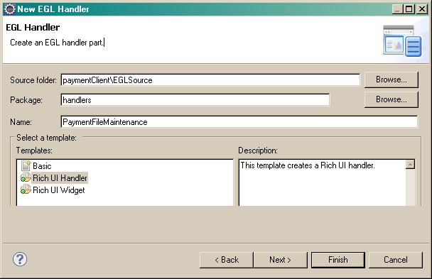
- In the PaymentClient project, select the EGLSource folder and click New > Handler.
- In the New Rich UI Handler part window,
enter the following information:
- In the EGL source file name field, enter the following name: PaymentFileMaintenance
- In the Package field, enter the following name: handlers
- Select the Rich UI Handler template
- Click Finish.
The new Handler opens in Design view in the Rich UI editor. EGL creates the handlers package for you in the EGLSource folder.
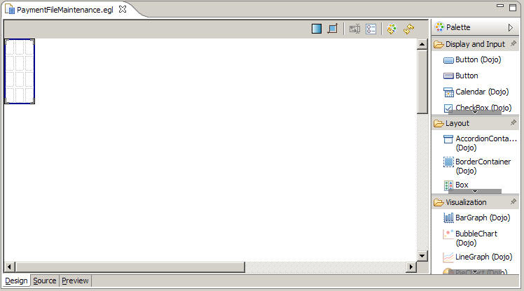
EGL automatically created a grid layout as your initial UI. By default, this widget has four rows and three columns. Compare this layout with the sketch in lesson 1, which uses only four cells.
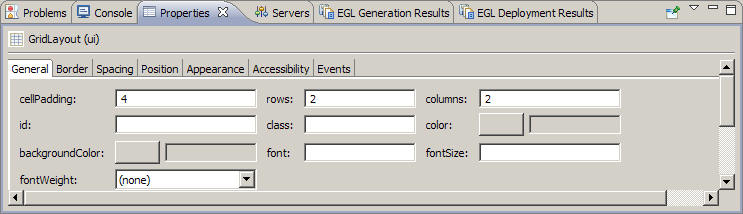
- To reduce the size of the layout, click into it and go
to the Properties view, which by default is one of several tabbed
pages below the editor pane. On the General page, set the rows property
to 2 and the columns property to 2, and then click the Design surface.
 A later step demonstrates
a different way to change the number of rows and columns in a grid
layout.
The main layout of this Rich UI handler
now has a first row, where the handler will display two sets of buttons,
and a second row, where the handler will display the following content: on
the left, a list of records, and on the right, a layout for displaying
the details of one record.
A later step demonstrates
a different way to change the number of rows and columns in a grid
layout.
The main layout of this Rich UI handler
now has a first row, where the handler will display two sets of buttons,
and a second row, where the handler will display the following content: on
the left, a list of records, and on the right, a layout for displaying
the details of one record.


Create a data grid to hold a set of database rows
Create a data grid by dragging a record array variable onto the Rich UI editor.
To create the data grid:
- Create a record array variable.
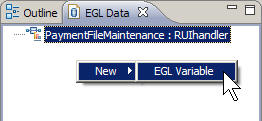
- Click on Window > Show View' and select EGL > EGL Data to bring up the EGL Data view. The EGL Data view, which is located by default in the
lower left corner of the workbench, lists all of the primitive and
record variables for the handler that is currently open in the editor.
Right-click the empty space below the entry for the PaymentFileMaintenance file.
Click New > EGL Variable.
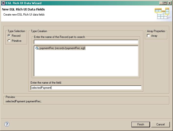
- In the New EGL Rich UI Data Fields wizard,
request a new record variable based on the paymentRec record:
- Make sure Type Selection is set to Record.
- Select the paymentRec record. This record should be the only one in the list.
- In the Array Properties section, select the Array check box. Leave the Size field blank.
- For Enter the name of the field, enter the following name: allPayments
- Click Finish.
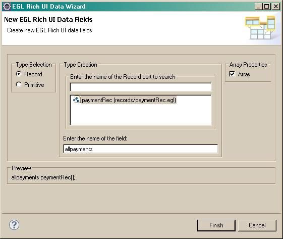
This process creates the following record declaration in the source code for the handler:
allPayments paymentRec[];
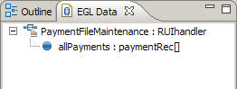
In the EGL Data view is now a record variable that you can drag the variable onto the editor.
- Click on Window > Show View' and select EGL > EGL Data to bring up the EGL Data view. The EGL Data view, which is located by default in the
lower left corner of the workbench, lists all of the primitive and
record variables for the handler that is currently open in the editor.
Right-click the empty space below the entry for the PaymentFileMaintenance file.
Click New > EGL Variable.
- Drag the allPayments record variable
from the EGL Data view to the lower left cell of the layout.
 EGL displays the Configure data widgets page of the Insert
Data wizard. Use this page to configure the widgets that
EGL creates. The widget types depend on the type of fields in the
record array that you dragged onto the Design surface.
EGL displays the Configure data widgets page of the Insert
Data wizard. Use this page to configure the widgets that
EGL creates. The widget types depend on the type of fields in the
record array that you dragged onto the Design surface.
- Make the following changes in the Insert Data wizard:
- Under Create Widgets for, leave the default value of Read-only data.
- The check boxes under the allPayments variable indicate the fields that are to be used as columns in the display. Clear all the fields by clicking None.
- Check the following fields:
- category
- description
- amount
- Change the labels for those fields:
- Change category to Type.
- Change description to Description.
- Change amount to Amount due.
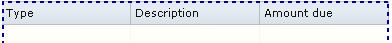
The wizard uses these labels as column headers for the grid.
- Clear Add support for formatting and validation. Here are the completed settings:
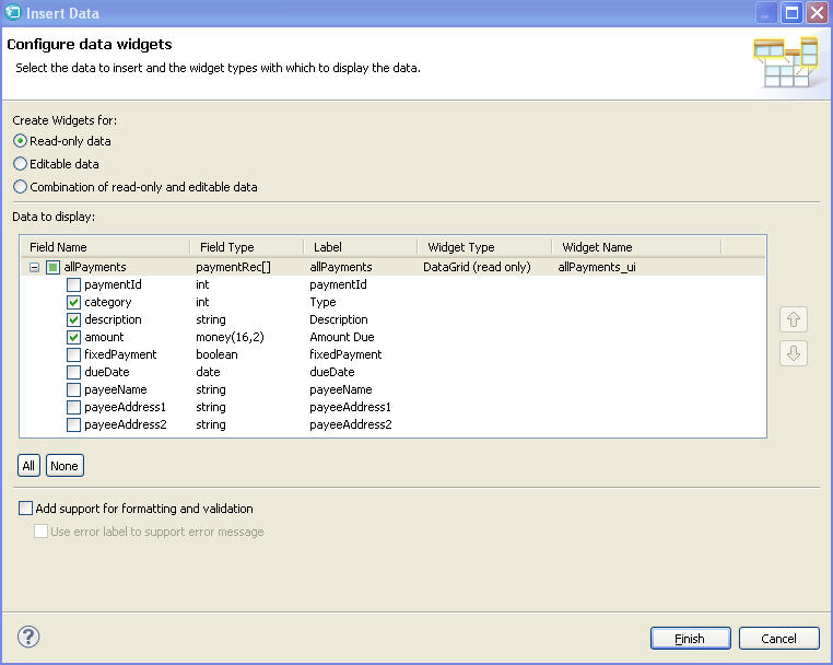
- Click Finish. The empty grid
is displayed:
- Click into the Properties view:
- Ensure that the following title is displayed: DataGrid (allPayments_ui). If not, click into the data grid, ensure that the title is displayed, and click back to the Properties view.
- On the General page, change the selectionMode property to SINGLE. This property indicates that the user can select only one row of the grid at a time.
- On the Layout page, change the verticalAlignment property
to TOP.
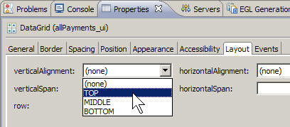
This property ensures that the allPayments_ui data grid will line up with the detail grid you will add later.
- Click the Source tab at the bottom of the editor to see the code that you already created.


Take this
opportunity to reduce the width of two columns in the data grid. Specifically,
consider the DataGridColumn declarations for the category and amount columns
and change the width property from the default 120 pixels to 90 pixels. Here is the data grid declaration after your change:
   allPayments_ui DataGrid {
      layoutData = new GridLayoutData
         { row = 2, column = 1
             verticalAlignment = GridLayoutLib.VALIGN_TOP},
             columns =[
                new DataGridColumn{name = "category",
                    displayName = "Type",
                    width = 90},
                new DataGridColumn{name = "description",
                    displayName = "Description",
                    width = 120},
                new DataGridColumn{name = "amount",
                    displayName = "Amount due",
                    width = 90}
              ],
              data = allPayments as any[],
              selectionMode = DataGridLib.SINGLE_SELECTION
          };
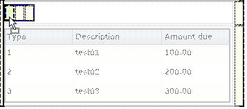
Add prototype data in the start function,
which is referenced in the onConstructionFunction property
of the handler and which runs before the user first accesses the web
page. Specifically, assign an array of records to the data property
of the data grid:
  function start()
      allPayments_ui.data =
        [
           new paymentRec{category = 1, description = "test01", amount = 100.00},
           new paymentRec{category = 2, description = "test02", amount = 200.00},
            new paymentRec{category = 3, description = "test03", amount = 300.00}
        ];
  end
Now to preview the file,
- To format the file, click Ctrl-Shift-F.
- Click the Preview tab.
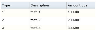
- Save the file.

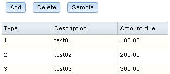
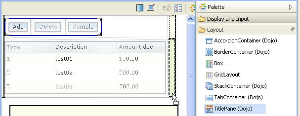
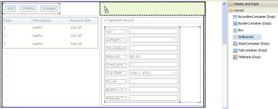
Add the first set of buttons
To create the Add, Delete, and Sample buttons on the Design surface:
- Click the Design tab.
- In the Palette view, go to the Layout drawer and find the
GridLayout widget type. Drag a new grid layout to the upper left corner
of the main layout. Assign the following name to the new widget:
buttonLayout
- Click into the new layout, right click a cell, and notice that you can insert or delete content from the menu.
- Click Delete > Row.
- Click again into the new layout, right click a cell, and click Delete > Row. A single row remains, with three columns.
- Create the Add button:
- In the Palette view, go to the Display and Input drawer
and then to Button (Dojo). Drag a Dojo Button
widget to the leftmost cell of buttonLayout.
- Assign the following name to the button: addButton
- Go to the Properties view:
- On the General page, change the text property to Add.
- On the Events page, select the row for the onClick event. A plus sign (+) is displayed at the far right of the line. Click the plus sign and specify the following name for a function that will be invoked when the user clicks the Add button: addRow
The Source view opens to display the addRow function. Rather than complete the function now, finish laying out this section of the web page. Click the Design tab to return to the Design surface.
- In the Palette view, go to the Display and Input drawer
and then to Button (Dojo). Drag a Dojo Button
widget to the leftmost cell of buttonLayout.
- Create the Delete button:
- In the Palette view, go to the Display and Input drawer and then to Button (Dojo). Drag a Dojo Button widget to the middle cell of buttonLayout.
- Assign the following name to the button: deleteButton
- Go the Properties view for the button:
- On the General page, change the text property to Delete.
- On the Events page, assign the following function name to the onClick event: deleteRow
- When the deleteRow function is displayed, click the Design tab.
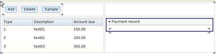
- Using the same process as in previous steps, create a Dojo button in the rightmost cell of buttonLayout. Name the button sampleButton, change the text property to Sample, and use the following name for the onClick function: sampleData. The sampleData function is displayed.
- Inspect the source code, noting the code that was provided for each of the buttons.
- Click the Preview tab.
- Save the file.


Add a variable and layout to handle a single row
You previously created an array to hold the database rows. You now declare a variable for a single row and then drag that variable onto the Design surface to create a layout for displaying the row.
To create the variable:
- Click the Design tab to display the Design surface.
- Right-click the background of the EGL Data view, which is likely to be at the bottom left of the workbench. Click New > Variable.
- In the Create a new EGL Data Variable wizard,
request a new record variable based on the paymentRec record:
- Make sure that Type Selection is set to Record.
- Select the paymentRec record.
- In the Array Properties section, make sure that the Array check box is cleared.
- For Enter the name of the field,
enter the following name:
selectedPayment
- Click Finish.
As noted in the Preview section of the page shown, the following record declaration is created in the source code for the handler:
selectedPayment paymentRec;

To create the grid layout:
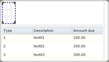
- In the Palette view, go to the Layout drawer and find the
TitlePane (Dojo) widget type. Drag a new title pane to the lower right
cell of the main grid layout, next to the cell that holds the allPayments_ui grid.
- Assign the following name to the title pane: editPane Click OK.
- Make the following changes to the properties for the editPane widget:
- On the General page, change the title property to Payment record
- On the Position page, change the width property to 350. This value leaves room for error messages.
- On the Layout page, change the verticalAlignment property to TOP.
The web page should now look like the following image:
- Save the file.
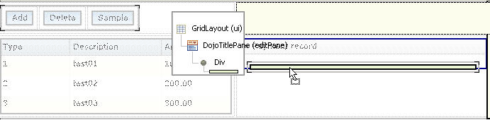
- From the EGL Data view, drag the selectedPayment variable
to the bracketed area inside the payment record pane.
 The Configure
data widgets wizard is displayed.
The Configure
data widgets wizard is displayed.
- Make the following changes:
- Under Create Widgets for, select Editable data.
- Make sure that the Widget Type for the selectedPayment record is GridLayout.
- Change the Label fields as shown
in the following table. These labels are used to identify the fields
in the display:
Table 1. Revised names for selectedPayment fields Default name Revised name paymentID Key: category Category: description Description: amount Amount: fixedPayment Fixed pmt: dueDate Due date: payeeName Payee: payeeAddress1 Address 1: payeeAddress2 Address 2: You must specify colons explicitly, as they are not added automatically to labels.
- For the category field, in the Widget Type column, click DojoTextField. A down arrow is displayed. Click the arrow, and then click DojoComboBox.
- For the amount field, in the Widget Type column, click DojoTextField. A down arrow is displayed. Click the arrow, and then click DojoCurrencyTextBox. This widget provides some basic formatting for currency.
- Ensure that Add support for formatting and
validation is checked. The selection creates
a Form Manager, which uses the EGL Rich UI Model-View-Controller (MVC)
framework to manage Rich UI validation and formatting.
Here are
the settings:
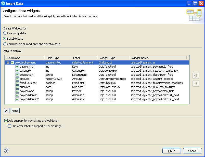
- Click Finish.
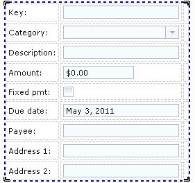
The new grid layout contains a form.
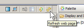
Note: You might need to click the Refresh button in the upper right corner of the Rich UI editor to see this change:
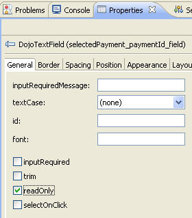
- Make the Key field read-only:
- Repeatedly click the Dojo text field next to the Key
label until only that field is surrounded by a dotted line.
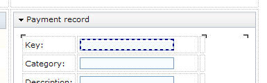
- In the Properties view, General page,
select the readOnly check box.
- Repeatedly click the Dojo text field next to the Key
label until only that field is surrounded by a dotted line.
- For a more uniform appearance, do as follows:
- Click the DojoCurrencyTextBox widget for Amount until only that widget is surrounded by a dotted line.
- On the Position page of the Properties view, set the width property to 166.


Add the second set of buttons
To add the Clear and Save buttons:
- In the Palette view, go to the Layout drawer and find the
GridLayout widget type. Drag a new grid layout to the upper right
corner of the main layout and assign the following name:
detailButtonLayout
- With the new layout selected, update the number of rows and columns in whichever way you prefer: in the Properties view, or by deleting the rows and columns, or by changing the source code. In any case, ensure that the layout has 1 row and 2 columns.
- At the Design surface, create the Clear button:
- In the Palette view, go to the Display and Input drawer and then to Button (Dojo). Drag a Dojo button to the first cell of the new layout.
- Using the same process as was used earlier, name the button clearButton, change the text property to Clear, and use the following name for the onClick function: clearAllFields. The clearAllFields function is displayed.
- Create the Save button:
- Click the Design tab.
- In the Palette view, go to the Display and Input drawer and then to Button (Dojo). Drag a Dojo button to the second cell of the new layout.
- Name the button saveButton and change the text property to Save.
- On the Events page, select the onClick event and click the down arrow in the second column to display the available function names. Click selectedPayment_form_Submit, which is a function that EGL created automatically when you dragged the selectedPayment record variable onto the user interface.
- Click the Preview tab.
- Save the file, which should match the finished code in Code for PaymentFileMaintenance.egl after lesson 4


Related reference
- Help topic: Overview of EGL Rich UI
- Help topic: Rich UI DataGrid and DataGridTooltip
- Help topic: Rich UI GridLayout
- Help topic: Rich UI validation and formatting
- Help topic: Form processing with Rich UI
Lesson checkpoint
In this lesson, you completed the following tasks:
- Created a Rich UI handler.
- Created variables in the EGL Data view.
- Created a data grid by dragging a record array variable onto the editor.
- Adjusted widgets in the Properties view and by using a menu.
- Worked in all three tabs of the Rich UI editor, updating the source and previewing the web page.
In the next lesson, you create the service that will access the database.
| < Previous | Next > |