Notice: this Wiki will be going read only early in 2024 and edits will no longer be possible. Please see: https://gitlab.eclipse.org/eclipsefdn/helpdesk/-/wikis/Wiki-shutdown-plan for the plan.
BIRT/FAQ/Charts2.2
< To: BIRT/FAQ
Contents
- 1 Download
- 2 Features
- 3 Integration
- 4 Chart Output Formats
- 5 Chart Terminology
- 6 Chart Rendering
- 7 Chart Engine Extensions
- 8 Chart API Programming
- 8.1 How to get started?
- 8.2 How is the Chart Model working?
- 8.3 Which Chart class should I start with?
- 8.4 How to navigate through the model structure?
- 8.5 How is the chart library structured?
- 8.6 What is a device renderer?
- 8.7 What is a display server?
- 8.8 What is a series renderer?
- 8.9 What are blocks?
- 8.10 How are defaults assigned to the model?
- 8.11 How do I create an equivalent of a ’Hello Chart’ first chart example with a plot containing axes?
- 8.12 How do I set the dimension (i.e. 2D, 2D with depth, 3D) of the chart?
- 8.13 How does transposing of the chart model work?
- 8.14 How do I set a solid color for various attributes (e.g. foreground, background, line edge)?
- 8.15 How do I set a gradient as the background fill of any region?
- 8.16 How do I set a tiled image as the background of the plot area?
- 8.17 How do I set a line or border edge style and thickness?
- 8.18 How do I set the edge color to represent a darker shade of a solid color?
- 8.19 How do I set text font face, size, styles, rotation, etc (for axis labels, title, data point values, etc)?
- 8.20 How do I apply insets within the text bounds of any label?
- 8.21 How do I draw a border with a custom line style around a label?
- 8.22 How do I add a shadow behind a rendered label?
- 8.23 How does ’auto axis scaling’ work?
- 8.24 How are axes and series defined in a ChartWithAxes?
- 8.25 How do I define the axis origin or the intersecting point between two perpendicular axes?
- 8.26 How are series defined in a chart without axes?
- 8.27 How do I create a combination chart?
- 8.28 How do I show data point labels next to my graphic elements in each chart type? How do I format these data point labels? How do I position these labels for the various supported chart types?
- 8.29 How do I define chart interaction via API for the generated output?
- 8.30 How do I create a chart and perform a minimal refresh to show updated scrolling data values using animation?
- 8.31 How do I set an axis scale as logarithmic?
- 8.32 How do I set a series as stacked? Are all series types stackable?
- 8.33 How do I set an axis scale as a percent scale?
- 8.34 Can I combine stacked, logarithmic and/or percent properties on a single scale?
- 8.35 How do I add marker lines and marker ranges to the plot?
- 8.36 How do I define a chart structure and populates it with data? As an example, provide a code snippet for bar chart creation.
- 8.37 How do I render a chart on an SWT Canvas?
- 8.38 How do I render a chart on a SWING JPanel?
- 8.39 How do I render a chart into an image?
- 9 Troubleshooting
Download
Where can I get the Eclipse Chart Engine distribution?
The Chart package is included in the main BIRT distribution, but you can get it separately from the download page.
Select the BIRT version you need, and choose the Chart Engine distribution, it contains three folders:
- ChartRuntime
You can extract this into the Eclipse directory, it contains all chart plugins required to run, render and edit charts. Note that nothing will appear inside Eclipse, those plugins are to be used by an application built on top of them.
- ChartSDK
This contains everything you need to create charting applications. It includes all the runtime plugins, an example plugin, an examples view, a WTP extension (if you build a Web application using charts), documentation, and source code
- DeploymentRuntime
If you need to run your charting application outside Eclipse (web application or simple java application), this contains all the jars you need to put in your classpath.
You can also get the chart plugins directly from CVS (/cvsroot/birt), if you wish to get the latest source and the unit tests.
Features
What are the supported chart types?
The following table summarizes the available chart types.
| Type | SubTypes | Dimensions | ||||
| 2D | 2D with depth (3D effect) |
3D (real 3D rendering) | ||||
| Bar | Side-by-side | Stacked | Percent Stacked | yes | yes | yes |
| Tube | Side-by-side | Stacked | Percent Stacked | yes | yes | yes |
| Cone | Side-by-side | Stacked | Percent Stacked | yes | yes | yes |
| Pyramid | Side-by-side | Stacked | Percent Stacked | yes | yes | yes |
| Line | Side-by-side | Stacked | Percent Stacked | yes | yes | yes |
| Area | Side-by-side | Stacked | Percent Stacked | yes | yes | yes |
| Stock | Candle Stick | Bar Stick | - | yes | no | no |
| Scatter | - | - | - | yes | no | no |
| Pie | - | - | - | yes | yes | no |
| Meter | Single Dials | Superimposed Dial | - | yes | no | no |
| Difference | - | - | - | yes | no | no |
| Gantt | - | - | - | yes | no | no |
| Bubble | - | - | - | yes | no | no |
Integration
Can I use the Eclipse Chart engine in my own application?
Yes. A primary goal of the Eclipse Chart Engine project is to provide a package that can be used both with the BIRT reporting components as well as standalone.
As such, it is a complete Charting library with both a Chart Builder UI and a Chart Engine, with an out-of-the-box integration with BIRT. It can run outside of Eclipse as well and provides numerous extension points to add new capabilities, or to integrate in any application.
What JARs are needed on the classpath to deploy the Eclipse Chart Engine?
The following JARs and folders need to be included in your CLASSPATH at build/run time. They are all available in the chart engine download, except for the EMF plugins you need to get from the Eclipse EMF download site. Note that you don’t necessarily need all of those if your application do not use certain functionalities.
Chart engine libraries:
- org.eclipse.birt.chart.device.extension_2.2.0.jar
- org.eclipse.birt.chart.device.svg_2.2.0.jar
- org.eclipse.birt.chart.device.swt_2.2.0.jar
- org.eclipse.birt.chart.device.pdf_2.2.0.jar
- org.eclipse.birt.chart.engine.extension_2.2.0.jar
- org.eclipse.birt.chart.engine_2.2.0.jar
- org.eclipse.birt.chart.ui_2.2.0.jar
- org.eclipse.birt.chart.ui.extension_2.2.0.jar
- org.eclipse.birt.core.ui_2.2.0.jar
- org.eclipse.birt.core_2.2.0.jar
- Any jar from a custom extension plugin you wrote.
Third party dependencies:
- org.mozilla.rhino_1.6.0 (folder)
- org.apache.commons.codec_1.3.0 (folder)
- org.apache.batik.*_1.6.0.jar
- org.apache.xerces_2.8.0.jar
- org.eclipse.emf.common_2.x.y.jar
- org.eclipse.emf.ecore_2.x.y.jar
- org.eclipse.emf.ecore.xmi_2.x.y.jar
- com.ibm.icu_3.6.x.jar
OSGi dependencies
Eclipse 3.3 now uses OSGi to load the plugins, so if you want to benefit from the extension mechanism outside Eclipse, you will need the org.eclipse.osgi jar. If you use STANDALONE (see below), you won’t need them though. Get the BIRT runtime package from the download site to see how plugins are organized outside Eclipse with OSGi support.
How to configure the Chart Engine environment?
Any application using the Chart Engine needs to set either one of those system properties (they should not be used together).
STANDALONE: if you don’t need any extension plugin, like the PDF plugin for instance. No value is needed.
BIRT_HOME: if you need chart extensions plugins to be loaded. Set the value to the directory containing the chart and extensions plugins, such as the PDF plugin (inside a plugins subfolder).
To set the property you can use System.setProperty() or set it in your java command line through –D. Example: java –DSTANDALONE MyApplication
Can I use the Chart Builder in my application?
Yes, the Chart Builder can be used outside of a BIRT report, and can be integrated in any Java environment. Look at the ChartWizardLauncher example in the org.eclipse.birt.chart.example plugin.
The Chart Builder is fully extensible and can take advantage of any chart model/engine extensions you write, it can also be integrated in any Data environment. It has no dependency on other BIRT reporting plugins.
How do I show a chart in my Eclipse RCP application?
You could create a plug-in with a ViewPart extension that creates an SWT canvas and notifies a PaintListener implementation where the chart rendering code may be written. Look at the SWT viewer examples in the examples plugin.
Chart Output Formats
What output formats does the chart engine support?
Internally, the charting engine writes to device independent primitives. This means that any output format may be plugged in by writing a device extension. A device refers to an implementation that translates rendering primitives into a specific file format. Release 2.0 provides the following:
- Static images (PNG, JPG, BMP) with optional ImageMap support.
- PDF document
- SWT graphics (GC)
- SWING graphics (Graphics2D)
- SVG (Scalable Vector Graphics)
In addition, custom extensions may be written to support additional file formats.
The device rendering framework is tailored to suit the needs of rendering a comprehensive set of graphics primitives, elaborate text layout (focused on typical usage of text rendering in charts), and event handling. The framework is optimized for performance.
What is the best static output format?
Each format has some advantages, so here is a quick guide to select the best output format for your needs:
SVG has a very good interactivity support, but requires the browser to support SVG. For IE, it means you need to install a SVG plugin.
PNG has a more limited interactivity support, but supports tooltips and hyperlinks through an HTML ImageMap. It is probably the best choice over JPG and BMP as it supports transparency, 32 bits colors, and compression without loss. It is widely supported across browsers. The rendering quality of text is also slightly better than SVG for small fonts, although this should be corrected in a future release.
What chart output formats are supported within BIRT reports?
The following table shows from which version each chart output format is supported in a BIRT report. For instance SVG is supported in HTML reports since version 2.0. Note that GIF support has been dropped in 2.1, and can be safely replaced by PNG.
| Chart Output Format | SVG | PNG | BMP | JPG |
| HTML Report | 2.0 | 1.0 | 2.0 | 2.0 |
| PDF Report | - | 2.0 | 2.0 | 1.0 |
Can the chart package output SVG or PDF?
SVG output is supported from release 1.0.1. It has been contributed by IBM as a chart extension plugin org.eclipse.birt.chart.svg, which is included in the BIRT distribution.
PDF is supported from release 2.1. It has also been contributed by IBM as an extension, and requires the batik, batik.pdf and xerces plugins.
What are the known limitations of SWT rendering?
There are some known SWT issues with Linux, and some anti-alias problems when drawing arcs, but those are relatively minor issues.
Chart Terminology
What is the difference between "2D with depth" and "3D"?
2D with depth charts are simply 2D charts with a 3D effect. This can make the charts generally look nicer and is normally sufficient for most cases, like Pie Charts or Bar Charts with a single Series. It is theoretically faster to render than 3D charts as there are no 3D computations done.
3D charts are represented by a 3D engine using lighting, real perspective, and allowing rotations. 3D charts are particularly useful for Charts with Axes with multiple series, as it adds a third Z-Axis to plot different series side by side in a third dimension.
What does "Inherit Report Data" do in Chart Builder?
"Inherit Report Data" means that the Chart will use the data available from its container. It only can work if the chart container is a report item such as a table or list item. In this case, depending on the cell where it is located, different rows will be available. A good example is when you place a chart within a group header or footer, the chart will use all the rows for that group, as a data input.
What do "Orthogonal’ and "Base" mean?
This is the old 1.0.x terminology to distinguish between the values plotted on the chart, and what they represent. The 2.0 release now uses Categories (Base) and Values (Orthogonal), as it is more representative. The Categories are plotted on the X-Axis in case of Chart with axes, while the Values are represented on the Y-Axis. Note that this terminology of Base and Orthogonal is still present in the API and code.
Chart Rendering
How do I externalize text that needs to retrieve a runtime value from a locale specific message file?
This depends on whether you are using the Chart within a BIRT report or in standalone mode.
BIRT Report Context
Several text components in a report design may contain externalized text references. The value of these components would be specified using the format:
key=<default value>
As an example, the chart title could be defined as:
sales.chart.title=Sales Title
At generation/presentation time, a lookup for the value for key=sales.chart.title would be performed against the locale specific property text resource bundle associated with the report design that incorporates the chart instance. If the resource bundle is not found or the externalized message key cannot be located, the default value will be presented.
Standalone Mode
In that case, you can use the IMessageLookup interface. By implementing it, it will allow the chart engine to retrieve the value of a given key. If the key is not found it will use the default value.
The key and default values are represented by an expression as Key=<default value>. This is set in the chart model for each static text property. At generation time, a lookup is performed for the key with IMessageLookup. If IMessageLookup does not return a value for the key, the default value will automatically be used.
Extensions Developers
If you are writing a chart extension, you need to make sure your code will support internationalization. Externalized text may be retrieved via the RunTimeContext instance which is available at chart generation time via the following API (independently of BIRT/Standalone):
String externalizedMessage(String key)
How do I intercept the chart generation/rendering process and alter the content of the chart using custom business logic?
The chart library provides support for writing custom business logic via JavaScript or Java. A detailed set of low level callback methods are provided to intercept the generation and rendering process and insert custom business logic. Look at the Chart Script specifications for more details: http://wiki.eclipse.org/BPS18
Chart Engine Extensions
How do I modify the EMF Chart Model?
In some cases, you might want to update the model to add new types for instance. Note that if you change the model, you will not be able to update to a later version without merging your changes.
The steps are:
- Get the chart engine plugin from CVS
- Update the xsd file in the xsd directory with your model changes, using a xml or schema editor
- In the src/model folder, right click on the model.genmodel file and choose "Reload…"
- In the popup window check the box
- Click next and finish
- Double click on model.genmodel to open it
- Right click on the root Model node and choose "Generate Model". It will update the chart model source code automatically.
How do I write a new series type that uses a custom data element?
An example of a chart type that uses a custom data element that already exists in the system is a Stock series chart. Each data element (held in a stock data set) holds four numerical values:
a. High
b. Low
c. Open
d. Close
These four values are encapsulated in a StockEntry class available in package org.eclipse.birt.chart.datafeed
A collection or array of StockEntry instances are wrapped in a StockDataSet instance and associated with a Stock series. At runtime, a StockDataSetProcessor (associated with a Stock series via an extension point definition) is capable of performing the following functions with a StockDataSet:
A] Build a stock data set by parsing a comma separated list of StockEntry values
B] Compute the smallest value of (high, low, open, close) of all StockEntry values
C] Compute the largest value of (high, low, open, close) of all StockEntry values
D] Capable of extracting values from resultset columns and creating StockEntry instances that are fed to a StockDataSet
As can be seen above, the following tasks are needed for a new custom dataset associated with a series:
Task-1: Update the appropriate schema files
Extend …/xsd/model.xsd from plug-in project org.eclipse.birt.chart.engine with a section like this (for the new CustomSeries being added):
<!-- Custom Series -->
<xsd:complexType name="CustomSeries">
<xsd:annotation>
<xsd:documentation xml:lang="en">
Custom series documentation goes here.
</xsd:documentation>
</xsd:annotation>
<xsd:complexContent>
<xsd:extension base="component:Series">
<xsd:sequence>
<xsd:element name="Property1" type="Type1">
<xsd:annotation>
<xsd:documentation xml:lang="en">
Documentation for Property1 goes here.
</xsd:documentation>
</xsd:annotation>
</xsd:element>
<xsd:element name="Property2" type="Type2">
<xsd:annotation>
<xsd:documentation xml:lang="en">
Documentation for Property2 goes here.
</xsd:documentation>
</xsd:annotation>
</xsd:element>
</xsd:sequence>
</xsd:extension>
</xsd:complexContent>
</xsd:complexType>
Note that the newly added custom series subclasses the component: org.eclipse.birt.chart.model.component.Series
This example illustrates two properties associated with every instance of the newly created CustomSeries
This will result in creation of:
org.eclipse.birt.chart.model.component.CustomSeries
org.eclipse.birt.chart.model.component.impl.CustomSeriesImpl
Now, extend …/xsd/data.xsd from plug-in project org.eclipse.birt.chart.engine with a section like this (for the new CustomDataSet being added):
- <!-- Custom Data Set -->
- <xsd:complexType name="CustomDataSet">
| <xsd:annotation> | ||||
| <xsd:documentation xml:lang="en"> | ||||
| Documentation for new dataset type | ||||
| </xsd:documentation> | ||||
| </xsd:annotation> | ||||
| <xsd:complexContent> | ||||
| <xsd:extension base="DataSet"> | ||||
| <xsd:sequence/> | ||||
| </xsd:extension> | ||||
| </xsd:complexContent> | ||||
| </xsd:complexType> | ||||
Note that the newly added custom data set subclasses the interface: org.eclipse.birt.chart.model.data.DataSet
This will result in creation of:
org.eclipse.birt.chart.model.data.CustomDataSet
org.eclipse.birt.chart.model.data.impl.CustomDataSetImpl
Task-2: Regenerate and incrementally update the existing Java source
Use EMF’s SDK to regenerate the Java source for all XSDs defined under xsd/
Ensure that the Java source is generated into a folder that contains the existing source. This ensures that existing manual changes are preserved in the existing Java source and only the new sections are incrementally appended.
Details on how to generate Java source using XSDs is available at:
http://download.eclipse.org/tools/emf/scripts/docs.php?doc=tutorials/xlibmod/xlibmod.html
Update the generated Java source into the org.eclipse.birt.chart.engine plug-in project
Task-3: Write the data set processor implementation
Create a new plug-in project (use a suitable name e.g. org.eclipse.birt.chart.dataset.extension)
Write a class CustomDataSetProcessor that subclasses org.eclipse.birt.chart.datafeed.DataSetAdapter (implements org.eclipse.birt.chart.datafeed.IDataSetProcessor). Fill in the implementation for each of the method declarations as appropriate.
Define an ’extension’ in this newly created plug-in project as follows:
extension point: org.eclipse.birt.chart.engine.datasetprocessors
series: org.eclipse.birt.chart.model.type.impl.CustomSeriesImpl
processor: org.eclipse.birt.chart.datafeed.CustomDataSetProcessorImpl
At this point, the engine API is updated to work with the newly defined CustomSeries and its associated CustomDataSet. However, there is no renderer capable of rendering values contained in the CustomDataSet on the plot.
Let us assume that we would like the CustomDataSet to contain DateRange (start, end) elements to be plotted on a datetime axis scale. A custom series renderer class would have to be written to support this.
Task-4: Writing a custom series renderer
A datetime range data structure is typically associated with a simple Gantt chart indicating start and end date/time values for the graphic element plotted along a datetime value scale. A Gantt graphic element renderer would be responsible for drawing rectangular bars (with possible captions) on a plot that could be rendered normally or transposed, in 2D or 2D with depth requiring the 2D bars to be extruded.
The custom series renderer could be either written in a new plug-in project or by reusing the same plug-in project defined in task 3.
Define the extension class as org.eclipse.birt.chart.render.Gantt which subclasses org.eclipse.birt.chart.render.AxesRenderer (because the Gantt graphic elements will be rendered on a plot that uses the Axis rendering framework).
Add an extension point as follows:
extension point: org.eclipse.birt.chart.engine.modelrenderers
series: org.eclipse.birt.chart.model.type.impl.CustomSeriesImpl
renderer: org.eclipse.birt.chart.render.Gantt
Implement all abstract methods that are subclassed in the Gantt core implementation series rendering class. These are:
void renderSeries(IPrimitiveRenderer ipr, Plot p, ISeriesRenderingHints isrh) throws ChartException
void renderLegendGraphic(IPrimitiveRenderer ipr, Legend lg, Fill fPaletteEntry, Bounds bo) throws ChartException
void compute(Bounds bo, Plot p, ISeriesRenderingHints isrh) throws ChartException
That’s all it takes to now create Gantt charts with a custom dataset via the chart API. If user interface property sheets need to be defined for specifying properties (data and attributes) associated with the Gantt chart, this is also possible. Refer to the documentation on how to extend the user interface for custom series types.
How does the chart library integrate with BIRT?
The following table summarizes the integration between the charting system and the BIRT reporting system. This can serve as a reference/example when integrating the charting system with your own application.
The plug-in org.eclipse.birt.chart.reportitem defines several classes that are responsible for integrating charts with BIRT. This plug-in is directly dependent on core chart plug-ins and its dependent libraries and indirectly dependent on extension chart plug-ins.
The following interface adapters were subclassed and methods implemented in this reportitem plug-in:
| Interface | No-op Adapter | Purpose |
| IReportItemFigureProvider | ReportItemFigureProvider | Actual class: ChartReportItemUIImpl Links extended item to the BIRT UI as a report item and provides UI related services. Also links the builder and the figure for design-time representation. |
| IReportItemBuilderUI | ReportItemBuilderUI | Actual class: ChartReportItemBuilderImpl Represents a extended item user interface builder to specify extended item definition. |
| IFigure | Figure | Actual class: DesignerRepresentation Subclassed and overridden the paint(Graphics) method to draw the extended item in the designer layout. |
| IReportItemFactory | ReportItemFactory | Actual class: ChartReportItemFactoryImpl Capable of creating new extended item ’IReportItem’ instances. Also provides hooks to retrieve localized messages. |
| IReportItem | ReportItem | Actual class: ChartReportItemImpl Holds instances of the underlying extended item model(s). Also returns available property definitions and hooks to set/get property definitions and serialize/deserialize/clone the model(s). |
| IElementCommand | ElementCommand | Actual class: ChartElementCommandImpl Attaches the extended item to the undo/redo framework and links to the command stack. |
| IChoiceDefinition | ChoiceDefinition | Actual class: ChartChoiceDefinitionImpl Used in exposing a property type that may contain a limited set of enumerated values. |
| IPropertyDefinition | PropertyDefinition | Actual class: ChartPropertyDefinitionImpl Used in defining any extended property that needs to be exposed in the property view. This includes the property name, type and default value. |
| IMessageLookup | - | Actual classes: BIRTMessageLookup, BIRTDesignerMessageLookup, ChartBuilderMessageLookup Externalize strings in chart rendered in BIRT reports, BIRT Designer and Chart Builder |
| IActionEvaluator | ActionEvaluatorAdapter | Actual class: BIRTActionEvaluator Invocated at generation time to retrieve the report expressions contained in interactive BIRT Hyperlinks. |
| IActionRenderer | ActionRendererAdapter | Actual class: BIRTActionRenderer Used at presentation time to convert BIRT dynamic Hyperlinks into standard HTTP Hyperlinks. |
| IStyleProcessor | - | Actual class: ChartReportStyleProcessor Used to map BIRT styles to Chart formatting properties |
| IDataServiceProvider | DefaultDataServiceProviderImpl | Actual class: ReportDataServiceProvider Used by chart builder to retrieve report data. |
| IDataRowExpressionEvaluator | DataRowExpressionEvaluatorAdapter | Actual class: BIRTDataRowEvaluator Used for both generation/presentation: evaluates a BIRT expression with a row context. |
| IReportItemQuery | ReportItemQueryBase | Actual class: ChartReportItemQueryImpl This is activated at runtime to invoke the generation process for a chart. Generation involves extended item query preparation, data binding (linking the BIRT defined data set to the chart) and creation of the device-independent display-server specific pre-computed chart structure. |
| IReportItemGeneration | ReportItemGenerationBase | Actual class: ChartReportItemGenerationImpl This is the generation step: the chart expressions are evaluated and registered in the report document. |
| IReportItemPresentation | ReportItemPresentationBase | Actual class: ChartReportItemPresentationImpl This step follows the generation step and is responsible for creating the device-specific finished chart output. In the context of BIRT, the extended item output must be provided as an image file format provided as a byte[] or as an InputStream. |
Note:
Items in BLUE refer to the UI related interfaces.
Items in GREEN refer to the common interfaces between UI and runtime.
Items in PURPLE refer to Chart engine interfaces
Items in RED refer to the runtime related interfaces.
Chart API Programming
How to get started?
Please get the org.eclipse.birt.chart.examples plugin, it contains a large set of examples demonstrating most of the chart engine features.
How is the Chart Model working?
A majority of the chart structure API comprises of Java classes generated out of XML schema using EMF (eclipse modeling framework).
Read more about EMF at:
http://www-128.ibm.com/developerworks/opensource/library/os-ecemf1/
EMF provides factory classes to create instances of chart components.
e.g. if a new Axis needs to be created, an instance is retrieved using:
Axis ax = ComponentFactory.eINSTANCE.createAxis();
This object ’ax’ is of type ’AxisImpl’ and implicitly cast into an ’Axis’ interface reference.
The ’Axis’ interface is located at org.eclipse.birt.chart.model.component
The ’AxisImpl’ class is located at org.eclipse.birt.chart.model.component.impl
’ComponentFactory’ is located at org.eclipse.birt.chart.model.component.util
Note the color coding used to identify the relationship between the class names, the package names and the method names.
Now, the new ’Axis’ instance created using this method has not been initialized. Default initialization of member variables within a chart component instance (and any other chart API object) is performed using an internal protected ’initialize()’ method. Since protected methods are unavailable in public API, appropriate public/static ’create()’ methods have been added in the chart APIs’ respective implementing classes for each component.
Hence, a preferred mechanism to obtain a new instance of any EMF object (in the context of the BIRT charting API) could be done using the convenient ’create’ method(s) as shown:
Axis ax = AxisImpl.create([argument1, argument2, …, argumentN]);
In general, for creation of any ’pre-initialized’ chart sub-component, use this mechanism:
ChartSubComponent csc = ChartSubComponentImpl.create(…)
To reiterate, default EMF factory classes should not be used to create object instances (unless all appropriate ’setter’ methods are called to initialize member variables). Instead, the defined static ’create(…)’ methods should be used. At the time of writing this document, not all impl classes contain a ’create(…)’ method. In the absence of a ’create(…)’ method, the EMF factory methods may be used.
Which Chart class should I start with?
Decide on a chart type to work with (e.g. Bar, Line, Pie, Stock, Scatter or a combination).
If the chart contains axes, use an instance of ChartWithAxes else, select ChartWithoutAxes. Note that BIRT charts provide pre-defined functionality for rendering a plot with axis in 2D, 2D with depth and 3D.
ChartWithoutAxes does not imply that axes may not be rendered on the plot. It presents a more generic implementation of a chart structure that relies on extension implementations to render the entire plot area.
Hence, using the suggested sub-component creation paradigm, we could create a new Bar chart instance as follows:
ChartWithAxes cwa = ChartWithAxesImpl.create();
Note that the classes that represents the entire chart model is maintained at:
org.eclipse.birt.chart.model
This internally creates a chart instance with the following pre-initialized sub-components:
- The various blocks (i.e. Title, Plot, Legend) that comprise the chart
- The title area with a default attributes
- The plot area with default attributes
- Two primary axes (one vertical and one horizontal). Each axis contains:
- Default positioning and font selection of axis labels
- Default caption, positioning and font selection of each axis title
- Default attributes for major and minor ticks
- Intersection of each primary axis against the other axis
- The plot background
- The legend with default block attributes, text attributes and positioning
Note that BIRT charts containing axes use the following terminology/rules:
1. By default, the horizontal axis is called the ’BASE’ axis and the vertical axis is called the ’ORTHOGONAL’ axis. Note that when a BIRT chart is transposed (swapping of axes), the base axis becomes the vertical axis and the orthogonal axis becomes the horizontal axis. Transposing a chart containing axes is as simple as calling:
cwa.setTransposed(true);
2. A category axis treats data as a sequence of labels with no value. Typically, category axes represent text labels with no intrinsic value. Category axes may also be used with other data types formatted as text values. A category axis always aligns the text caption centrally with respect to each axis unit.
3. A value axis treats data as continuously varying numeric or datetime data and markers (or other graphic elements) in the chart are plotted at a point along the axis which varies according to the numerical or datetime data value.
4. The base axis may be specified as a category or a value axis. As previously indicated in 3 (a) above, two axis are pre-created when a new ChartWithAxes instance is created using the convenient chart sub-component creation API.
To obtain a reference to the base axis, the following API should be used:
Axis[] axaBase = cwa.getPrimaryBaseAxes();
By default, BIRT charts only support a single base axis in release 1. Future releases may provide support for additional base axes.
Hence, to obtain an instance of the primary base axis, use:
Axis axPrimaryBase = axaBase[0];
5. The orthogonal axis may be specified as a value axis only. Category axes are not permitted along an orthogonal axis. To obtain a list of orthogonal axes associated with a specified base axis, use the following API:
Axis[] axaOrthogonal = cwa.getOrthogonalAxes(axPrimaryBase, true);
Each ’chart with axes’ may contain one or more orthogonal axes. Only of these orthogonal axes may be defined as a primary axis. All other orthogonal axes are called ’overlay axes’.
The second boolean argument in the getOrthogonalAxes(…) API indicates if the primary orthogonal axis should included or excluded in the returned array.
6. Each axis could have one or more series definitions associated with them. A series definition refers to a constant value that generates a single runtime series or an expression that defines a grouping criterion for multiple runtime series creation.
Hence, a series definition could be defined as:
a. SomeConstantValue resulting in 1 runtime series containing a dataset (e.g. numerical 2, 3, 7, 9, 6)
OR
b. SomeExpression(…) e.g. Census.CITY resulting in 3 runtime series:
i. For New York, values (2, 9, 4, 5, 7)
ii. For Boston, values (4, 6, 9, 8, 6)
iii. For San Francisco, values (8, 1, 6, 2, 4)
Note that all runtime series must contain a data set with a fixed size. If series 6(b)(ii) contained 6 values versus 5 values in 6(b)(i), a validation error occurs at chart generation time indicating that data is out of sync.
Also note that all series associated with a base axis and all series associated with an orthogonal axis must contain the same count of elements in the respective datasets.
7. Each runtime series is provided by a chart type series. Hence, a chart with axes containing a BarSeries and LineSeries would result in a combination Bar/Line chart. Each new series type containing datasets would have to be manually added using API into their respective series definition class.
Typically, all runtime series associated with a base axis are specified using the type independent series class org.eclipse.birt.chart.model.component.Series
All runtime series associated with an orthogonal axis are specified using type specific series classes such as:
org.eclipse.birt.chart.model.type.BarSeries
org.eclipse.birt.chart.model.type.LineSeries
… etc
8. For most chart types, a base axis contains a single series definition resulting in a single runtime series. E.g. The series definition would refer to a constant ’All Cities’ and the runtime series’ dataset would contain { New York, Boston, San Francisco }.
9. Each orthogonal axis could contain one or more series definitions resulting in any number of runtime series. However, as previously noted, all runtime series must contain an identical dataset count for correct chart generation and rendering.
10. Auto axis scaling is turned on by default. If scaling is to be specified manually, then the appropriate setMaximum, setMinimum, setStep API need to be called individually depending on which elements of the scale are to be automated. Calling manual override axis scaling API on a text axis has no effect.
11. A chart containing axes must contain one base axis and any number of orthogonal axes. To get or update attributes in a chart, the following convention is used:
cwa.getTitle().getLabel().getCaption().setValue("The chart title");
12. Intersection between primary base and orthogonal axis may be specified as one of:
a. A fixed value (axis data type specific) e.g. at 0 or at 6/15/2003
b. At the plot MAXIMUM end (above for a vertical axis and to the right for a horizontal axis)
c. At the plot MINIMUM end (below for a vertical axis and to the left for a horizontal axis)
13. Base axis labels and title may be positioned below or above the axis. When transposed, the axis labels and title are positioned to the left or to the right of the axis respectively. Similarly, orthogonal axes labels’ and titles may be positioned to the left or to the right of the corresponding axes. When transposed, the positions are switched to below or above respectively.
14. All positions and orientations must be specified as though the chart is not transposed. Attempting to set the label and title position of an X axis to the left or right will result in a chart generation error.
15. The plot content general attributes are defined by a client area structure:
ClientArea ca = cwa.getPlot().getClientArea();
How is the chart library structured?
The chart library comprises of 8 projects (formatted as eclipse plug-ins but not dependent on the eclipse framework) of which 4 are core library components and 4 are true extensions (indicated with a *).
1. BIRT core (org.eclipse.birt.core)
2. BIRT core UI (org.eclipse.birt.core.ui)
3. The engine (org.eclipse.birt.chart.engine)
4. The user interface (org.eclipse.birt.chart.ui)
5. *Engine extensions (org.eclipse.birt.chart.engine.extension)
6. *Device extensions (org.eclipse.birt.chart.device.extension and org.eclipse.birt.chart.device.svg).
7. *User interface extensions (org.eclipse.birt.chart.ui.extension)
8. *The BIRT Report item adapter (aids in integrating the chart library with the BIRT reporting suite) (org.eclipse.birt.chart.reportitem)
What is a device renderer?
A device renderer is implemented as an extension class. It is responsible for generating output to an output file format or device that supports rendering of primitives and user interaction. Default device renderers (implemented as extensions) provided with the chart plug-ins are:
a. A SWING device renderer (capable of rendering charts on a SWING Graphics2D context)
b. A SWT device renderer (capable of rendering charts on an SWT GC context)
c. Image renders for the following image file types:
i) 32-bit PNGs
ii) 24-bit JPEGs
iii) 24-bit BMPs
d. An SVG device renderer (contribution from IBM)
e. A PDF device renderer (contribution from IBM)
What is a display server?
A display server provides generic services to a device renderer. These services include text metric retrieval, image loading, detection of screen resolution, etc. The default display servers provided with the chart plug-ins are:
e. A SWING display server
f. An SWT display server
The display server is used in internally computing the chart content offscreen before the rendering process begins. As an example, the display server provides font metrics that are critical in determining how an axis may be auto scaled using a best-fit algorithm.
What is a series renderer?
A series renderer corresponds to a subclass of either:
a. org.eclipse.birt.chart.render.BaseRenderer
b. org.eclipse.birt.chart.render.AxesRenderer
… depending on the chart type.
Examples of series renderers are:
org.eclipse.birt.chart.render.Bar (subclasses AxesRenderer)
org.eclipse.birt.chart.render.Pie (subclasses BaseRenderer)
Note that AxesRenderer provides a detailed plot rendering framework capable of rendering, scaling, transposing and auto positioning of plot components that contain axes. Offscreen computations (for a chart with axes) are performed using an internal class called PlotWith2DAxes.
What are blocks?
Blocks are rectangular sub-regions within the chart bounds. They serve as a container for various sub-components of a chart. There are several different block types:
Outermost (one per chart)
Title (one per chart)
Label (containing annoted text)
Legend (one per chart)
Plot (one per chart)
By default, a new chart that is created uses the block structure with the following hierarchy:
Outermost
Title
- Plot
- Legend
The title block uses a ’preferred size’ and is anchored north.
The legend block uses a ’preferred size’ and is anchored west (or ’right’ by default).
The legend block may be repositioned using a combination of the position attribute and the anchor attribute.
Note that the Legend could be ’positioned’ INSIDE the bounds of the Plot. When that is done, the generation manager updates the block structure and moves the Legend block within the Plot block. The anchor value determines WHERE in the plot area the legend is placed. If the anchor value is unspecified, the legend is centered within the plot (not well placed for most chart types).
You could obtain references to the blocks as a flattened enumerated list using the following API:
Chart cm = …;
Block blOutermost = cm.getBlock();
Enumeration eBlocks = blOutermost.children();
Or you could ’search’ for blocks using convenience API such as:
Chart cm = …;
Plot pl = cm.getPlot();
Legend lg = cm.getLegend();
Title ti = cm.getTitle();
Properties such as a ’background fill’, ’border line attributes’, ’insets’, etc may be set on blocks. In addition, a plot and a legend contain a client area which presents a context on which block specific items are rendered. The client area may be obtained using:
ClientArea ca = pl.getClientArea();
Again, properties such as a ’background fill’, ’border line attributes’, ’insets’ may be specified on the client area.
How are defaults assigned to the model?
Defaults are hardwired into the model in the various public ’create’ and protected ’initialize’ convenience methods that are provided. This will be changed to read in values from a DefaultsManager that will provide defaults for:
A] Axis label attributes + title attributes
B] Axis attributes
C] Grid attributes (major + minor)
D] Data point label attributes
E] Block attributes – for each block type
How do I create an equivalent of a ’Hello Chart’ first chart example with a plot containing axes?
The following code snippet illustrates how this may be done:
ChartWithAxes cwaEmpty = ChartWithAxesImpl.create();
cwaEmpty.getTitle().getLabel().getCaption().setValue("Hello Chart");
How do I set the dimension (i.e. 2D, 2D with depth, 3D) of the chart?
Specify the dimension using the ChartDimension enumerated structure as shown below:
Chart cm = …;
cm.setDimension(ChartDimension.TWO_DIMENSIONAL_WITH_DEPTH_LITERAL);
Typically, EMF enumerated constants are defined as string values (with a convention that indicates a suffix of _LITERAL) that must be directly used as shown above.
How does transposing of the chart model work?
You could transpose the entire rendered chart (swapping the orientation of the axes) using a simple API call as shown below:
ChartWithAxes cwa = …;
… // BUILD THE CHART STRUCTURE
cwa.setTransposed(true);
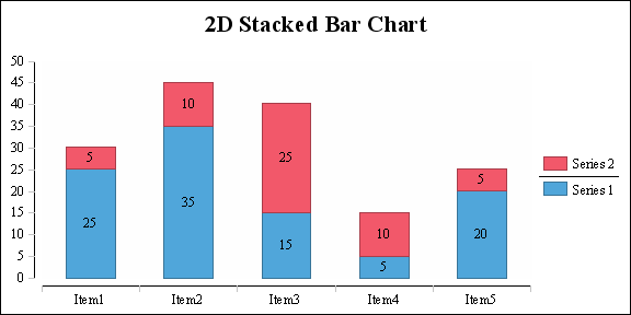
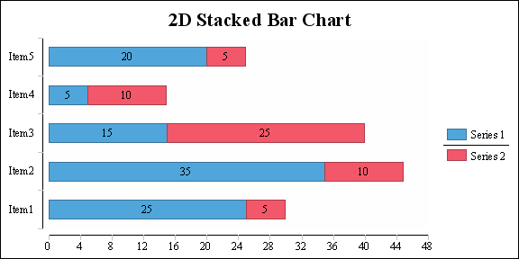
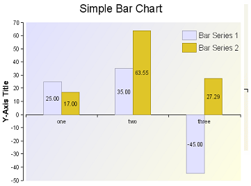
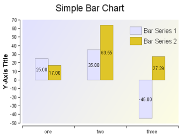
Obviously, transposing of a chart is associated with transposing the axes in a plot associated with a ’chart with axes’ model. The following two images illustrate the same chart presented in a standard orientation and transposed. Note that when the chart is transposed, only the plot area (along with axes and axes’ titles) is transposed.
Note: The legend and the chart title are left unchanged in a transposed chart.
How do I set a solid color for various attributes (e.g. foreground, background, line edge)?
Any solid color is defined in a chart model using a ColorDefinition instance:
ColorDefinition cd = ColorDefinitionImpl.create(r[0-255], g[0-255], b[0-255], a[0-255]);
ColorDefinition cd = ColorDefinitionImpl.create(r[0-255], g[0-255], b[0-255]);
Or using one of the existing color definitions defined as a constant method call:
i.e.
ColorDefinition cd = ColorDefinitionImpl.RED();
ColorDefinition cd = ColorDefinitionImpl.BLUE();
… etc
Note that the EMF framework mandates creation of new instances for every usage instance. If a single RED color definition instance is associated with object-1 and then re-associated with object-2, the original association is broken.
You would set colors on various components as follows:
xAxis.getGrid().getLineAttributes().setColor(ColorDefinitionImpl.BLUE());
yAxis.getTitle().setBackground(ColorDefinitionImpl.RED());
cwa.getTitle().getCaption().setColor(ColorDefinitionImpl.CYAN());
cwa.getTitle().getCaption().setColor(ColorDefinitionImpl.create(232, 55, 196));
How do I set a gradient as the background fill of any region?
Any object (rectangle, polygon, arc, etc) that supports a call to ’setBackground’, accepts an abstract org.eclipse.birt.chart.model.attribute.Fill instance. This fill attribute may be defined as a Gradient as shown:
Gradient gr = GradientImpl.create(
ColorDefinitionImpl.ORANGE(),
ColorDefinitionImpl.CYAN(), -35, false
);
myObj.setBackground(gr);
The value -35 suggests the angle of the gradient change with respect to a horizontal base.
How do I set a tiled image as the background of the plot area?
Any object (rectangle, polygon, arc, etc) that supports a call to ’setBackground’, accepts an abstract org.eclipse.birt.chart.model.attribute.Fill instance. This fill attribute may be defined as a tiled image as shown:
Image imgTiled = ImageImpl.create("http://www.eclipse.org/feather.gif")
myObj.setBackground(imgTiled);
How do I set a line or border edge style and thickness?
The class LineAttributes defines a color, style and thickness. This may be created using:
LineAttributes lia = LineAttributesImpl.create(
- ColorDefinition,
- LineStyle,
- double dThickness
);
How do I set the edge color to represent a darker shade of a solid color?
Set the line edge color associated with a fillable area to null.
LineAttributes lia = cm.getPlot().getOutline();
lia.setColor(null);
Note that if the fill associated with this ’null’ outline is not a solid color, the darker edged outline will be suppressed. In the attached image, the edge color for each of the graphic element bars are defined as nulls. As a result, they are evaluated on-the-fly as a darker version of the bar fill color (if defined as a solid color).
How do I set text font face, size, styles, rotation, etc (for axis labels, title, data point values, etc)?
Obtain an instance of the label representing the text that would be rendered. Typically, this is available using a getLabel() or getTitle() API.
Hence,
Label la = …;
la.getCaption().getFont().setXXX(…)
How do I apply insets within the text bounds of any label?
Insets are associated with any label.
Label la = …;
la.getCaption().getInsets().set(top, left, bottom, right);
Note that the value of these insets ’top’, etc must be specified in POINTs. The adjacent image illustrates sample insets defined in points for the series label (caption = 2000) as (8, 10, 0, 5) with results as shown.
How do I draw a border with a custom line style around a label?
Borders are associated with any label.
Label la = …;
LineAttributes lia = la.getCaption().getOutline();
Border line attributes are associated with all four sides of a label. They cannot be individually defined for each side. The adjacent image illustrates a rotated sample label with a solid black border drawn around it.
How do I add a shadow behind a rendered label?
Shadows are associated with any label.
Label la = …;
la.setShadowColor(ColorDefinitionImpl.GREY());
Note that shadows should be associated with a label containing a background fill otherwise the results may be undesirable. The adjacent image illustrates rotated series labels associated with a pie chart that contain a grey shadow color.
Do I need to manually add an axis? How do I add an overlay axis?=== When you create a new ChartWithAxes instance using the preferred static ’create(…)’ method, a base axis and an orthogonal axis are already created. If additional orthogonal overlay axes are required, they may be created using:
The primary base and orthogonal axes may be retrieved using the following APIs:
ChartWithAxes cwa = …
Axis[] cwa.getPrimaryBaseAxes()
Axis[] cwa.getOrthogonalAxes(axaPrimaryBase, true);
A new overlay axis may be added to the model using the following APIs:
Axis yAxisOverlay1 = AxisImpl.create();
… // SETUP ATTRIBUTES AND PROPERTIES FOR ’yAxisOverlay1’
xAxisPrimary.getAssociatedAxes().add(yAxisOverlay1);
By default, the default base axis data type is set as TEXT.
The default orthogonal axis data type is set as NUMERICAL LINEAR.
The axis data type may be altered using the following API:
xAxisPrimary.setType(AxisType.LINEAR_LITERAL);
xAxisPrimary.setCategory(true);
This sets the X base axis as a numerical linear category axis.
How does ’auto axis scaling’ work?
The scale of the axis is computed automatically if various scale components (i.e. min, max, step, unit) are not explicitly specified. Scaling of the axis occurs on-the-fly and is dependent on the following factors:
A] The range (specifically min and max) of values in all series datasets associated with the given axis.
B] The font (and angle of text rotation) that defines the axis label
C] The format specifier associated with the axis label value that affects the presentation value (if not text)
D] The actual presentation value of each axis label
E] The length of the axis (longer axis lines may accommodate more axis labels)
As an example, assuming that a series containing dataset (36, -4, 99, 26, 5.32, -104) are used. The min value = -105 and the max value = 99. This would result in a default scale where:
The min = -110
The max = 100
The step = 10
The absolute difference between min and max = 210
For the given step, this would result in 210 / 10 = 21 axis labels
Case I
For the given axis length and axis label font/rotation, if all 21 axis labels fit cleanly without any rendering overlap, then…
The scale is zoomed IN to try and accommodate more axis labels. For a numerically linear axis, zooming into the step of 10 would change the step to 5 and the min and max values would be recalculated. The result:
The min = -105
The max = 100
The step = 5
The absolute difference between min and max = 205
For the given step, this would result in 205 / 5 = 41 axis labels
If all 41 labels fit cleanly without any overlap, (i) is repeated for a new zoomed step value.
Steps are zoomed IN for a linear numeric scale as 10, 5, 1, 0.5, 0.1, 0.05, 0.01, etc
As soon as a step is determined that causes the labels to not fit anymore, the last fitting step is used as the most optimal auto computed scale.
Case II
For the given axis length and axis label font/rotation, if all 21 axis labels do not fit cleanly due to a rendering overlap, then…
The scale is zoomed OUT to try and accommodate fewer axis labels. For a numerically linear axis, zooming out a step of 10 would change the step to 50 and the min and max values would be recalculated. The result:
The min = -150
The max = 100
The step = 50
The absolute difference between min and max = 250
For the new zoomed in step, this would result in 250 / 50 = 5 axis labels
If all 5 axis labels do not fit cleanly due to an overlap, (ii) is repeated for a new zoomed out step value.
Steps are zoomed OUT for a linear numeric scale as 10, 50, 100, 500, 1000, etc
As soon as a step is determined that causes the labels to fit, it is used as the most optimal auto computed scale.
The same scaling algorithm (with different zoomed in and zoomed out step values) is used for:
A] Logarithmic scales
B] DateTime scales (uses the scale unit in addition to the step)
Note: Category axes and text value axes do not use any scaling algorithm.
How are axes and series defined in a ChartWithAxes?
A chart with axes contains a set of axes that may be retrieved using:
ChartWithAxes cwa = …;
Axis[] axaBase = cwa.getPrimaryBaseAxes( );
In the initial release, charts with axes may only contain a single primary base axis. Hence, axaBase contains 1 axis that may be de-referenced using axaBase[0].
Hence,
Axis axPrimaryBase = axaBase[0];
The primary orthogonal axis may be retrieved using:
Axis axPrimaryOrthogonal = cwa.getPrimaryOrthogonalAxis(axPrimaryBase);
An axis is defined as primary if it represents the ’main’ axis for a given orientation (e.g. horizontal) and is capable of intersecting the primary axis in the orthogonal orientation (vertical) at any given value. All other axes are defined as non-primary or overlay axes that may be situated at the min or max location of the plot. If an overlay axis is vertical and located at the min of the plot, it is positioned to the left of the plot (and max corresponds to the right). If an overlay axis is horizontal and located at the min of the plot, it is positioned to the bottom of the plot (and max corresponds to above the plot).
Each axis defines a collection of series definitions.
Each series definition is defined using a design-time series type (e.g. bar series) and a query expression that would return a distinct set of runtime values that result in creation of one runtime series (cloned from the design-time bar series) per value.
A second series definition could define a design-time series type (e.g. line series) and a different query expression that would again return a distinct set of runtime values that result in creation of one runtime series (cloned from the design-time line series) per value.
For a chart with axes, series definitions are associated with the base axis and the orthogonal axes.
Note that a base axis typically holds one series definition with the design-time series type specified as a generic non-typed Series instance. Data associated with a base axis may be defined either using a category scale or a value scale.
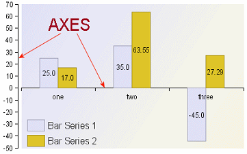
How do I define the axis origin or the intersecting point between two perpendicular axes?
In each orientation (horizontal or vertical), only one primary axis may be defined. By default, when a new ’chart with axes’ model is created, a primary axis is already created. If additional overlay orthogonal axes are to be added, new Axis objects may be created and added to the base axis.
Only a primary axis may intersect another primary perpendicular axis at a specific value offset. As an example, the primary base X axis could be defined using a text scale while the primary orthogonal Y axis could be defined using a numeric scale. The X axis could be set to intersect the Y axis at value ’0’ on its numeric scale. In addition, the X axis could be set to intersect the Y axis at the ’min’ end of the plot or at the ’max’ end of the plot. The ’min’ end is defined as either the ’left’ edge of the plot or the ’bottom’ edge of the plot depending on whether the plot is transposed or not respectively. Similarly, the max end is defined as the ’right’ edge or the ’top’ edge depending on whether the plot is transposed or not.
Note that non primary axes may only intersect a perpendicular primary axis at the ’min’ or ’max’ end. However, a primary axis may intersect a perpendicular primary axis at the ’min’ end, the ’max’ end or at any arbitrary value defined on the scale of the perpendicular primary axis.
The intersection between two axes is defined using the following code snippet:
Figure 1: X axis intersects Y axis at value = 0
xAxis.getOrigin().setType(IntersectionType.VALUE_LITERAL);
xAxis.getOrigin().setValue(NumberDataElementImpl.create(0));
Figure 2: X axis intersects Y axis at vertical MIN
xAxis.getOrigin().setType(IntersectionType.MIN_LITERAL);
Figure 3: X axis intersects Y axis at vertical MAX
xAxis.getOrigin().setType(IntersectionType.MAX_LITERAL);
How are series defined in a chart without axes?
When a new ChartWithoutAxes instance is created using the preferred static ’create(…)’ method, there are no series definitions created. Base level series definitions are associated with the model directly. These may be retrieved using:
ChartWithoutAxes cwoa = …;
EList elBase = cwoa.getSeriesDefinitions();
For each base series definition, there may be one or more orthogonal series definitions defined. Note that typically only one base series definition may be associated with a chart without axes.
We retrieve the list of orthogonal series definitions as follows:
SeriesDefinition sdBase = (SeriesDefinition) elBase.get(0);
EList elOrthogonal = sdBase.getSeriesDefinitions();
Each orthogonal series definition may be retrieved by walking through the contents of the EList. Note that an EList is an EMF List implementation.
How do I create a combination chart?
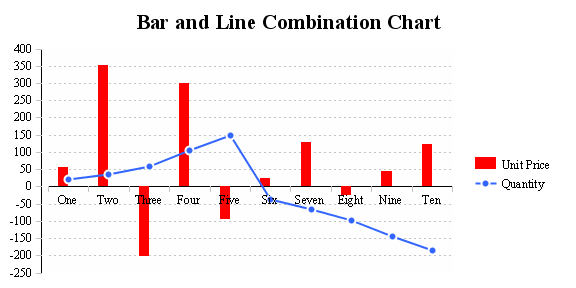
Combination charts may be only created using a ChartWithAxes instance. A combination chart is built by superimposing multiple series on a single plot. The multiple series may be plotted against either a single primary orthogonal axis or multiple overlay orthogonal axes. Hence, if a bar series and a line series are added to a ChartWithAxes instance, a combination chart would be created. Note that the two series may be associated with either a single series definition or multiple series definitions. Each series definition is associated with an orthogonal axis as previously described.
ChartWithAxes cwa = …; // BUILD THE CHART STRUCTURE
Axis axBase = cwa.getPrimaryBaseAxes()[0];
Axis[] axaOrthogonal = cwa.getOrthogonalAxes(axBase, true);
// SETUP THE A SERIES DEFINITION FOR THE X-AXIS
SeriesDefinition sdX = SeriesDefinitionImpl.create();
axBase.getSeriesDefinitions().add(sdX);
// SETUP THE TWO SERIES DEFINITIONS FOR THE Y-AXIS
final int FIRST = 0;
'SeriesDefinition sdY1 '= SeriesDefinitionImpl.create();
axaOrthogonal[FIRST].getSeriesDefinitions().add(sdY1);
'SeriesDefinition sdY2 '= SeriesDefinitionImpl.create();
axaOrthogonal[FIRST].getSeriesDefinitions().add(sdY2);
'// ADD A BAR SERIES 'TO SERIES DEFINITION ’sdY1’
BarSeries bs = (BarSeries) BarSeriesImpl.create();
bs.setDataSet(…);
bs.setRiserOutline(ColorDefinitionImpl.BLACK());
sdY1.getSeries().add(bs);
'// ADD A LINE SERIES 'TO SERIES DEFINITION ’sdY2’
LineSeries ls = (LineSeries) LineSeriesImpl.create();
ls.setDataSet(…);
ls.getLineAttributes().setColor(ColorDefinitionImpl.GREEN());
ls.getMarker().setType(MarkerType.BOX_LITERAL);
sdY2.getSeries().add(ls);
The bar series and the line series will both be superimposed over the plot area in the order in which they were created.
How do I show data point labels next to my graphic elements in each chart type? How do I format these data point labels? How do I position these labels for the various supported chart types?
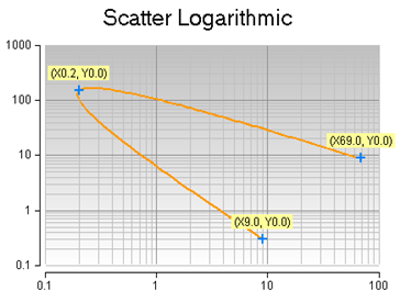
Data point labels are already created but set as invisible for each newly created series type (via the preferred static ’create(…)’ methods). This is because presentation of data point labels may clutter the plot area.
The adjacent image illustrates data points shown against a yellow background for each value plotted in a scatter chart. These data point labels are positioned above the series markers.
If a data point label needs to be made visible, this may be done using:
BarSeries bs = …;
bs.getLabel().setVisible(true);
To specify the structure of the data points, do the following:
DataPoint dp = bs.getDataPoint( ); // already created with the orthogonal value and a comma separator
dp.clear( ); // removes the already created orthogonal value entry
dp.getComponents().add(
DataPointComponentImpl.create(
DataPointComponentType.BASE_VALUE_LITERAL,
null // no format specified if text values are used
)
);
dp.getComponents().add(
DataPointComponentImpl.create(
DataPointComponentType.ORTHOGONAL_VALUE_LITERAL, JavaNumberFormatSpecifierImpl.create("0.00")
)
);
This would setup the data point format as BASE, ORTHOGONAL. Note that the SERIES value may be also presented in the data point in any order.
The permissible positions (set using bs.setLabelPosition(Position.XYZ) ) for the data point values w.r.t. the graphic element rendered for each series type is as listed:
| Bar Series | Outside (beyond the outer edge of the bar), Inside (middle of the bar) … irrespective of bar orientation |
| Line Series | Above or Below (transposed into Right or Left respectively) |
| Pie Series | Outside (with leader lines), Inside (middle of each slice) |
| Stock Series | Left or Right (transposed into Above or Below respectively) |
| Scatter Series | Left, Right, Above or Below (transposed into Above, Below, Left or Right respectively) |
How do I define chart interaction via API for the generated output?
Chart interaction is implemented by defining triggers. A single trigger is represented by a condition-action pair. Triggers may be associated with series types or blocks.
The various conditions available are:
| Name | Description |
| onclick | Occurs when the pointing device button is clicked over an element |
| ondblclick | Occurs when the pointing device button is double clicked over an element. |
| onmousedown | Occurs when the pointing device button is pressed over an element. |
| onmouseup | Occurs when the pointing device button is released over an element. |
| onmouseover | Occurs when the pointing device is moved onto an element. |
| onmousemove | Occurs when the pointing device is moved while it is over an element. |
| onmouseout | Occurs when the pointing device is moved away from an element. |
| onfocus | Occurs when an element receives focus either by the pointing device or by tabbing navigation |
| onblur | Occurs when an element loses focus either by the pointing device or by tabbing navigation |
| onkeydown | Occurs when a key is pressed down on an element |
| onkeypress | Occurs when a key is pressed on an element |
| onkeyup | Occurs when a key is up on an element |
| onload | Occurs when the chart is loaded in the viewer |
The available actions are:
Url_Redirect
Show_Tooltip
Highlight
Toggle_Visibility
Toggle_DataPoint_Visibility
Invoke_Script
Call_Back
Triggers may be associated with a series type as follows:
e.g.
BarSeries bs = (BarSeries) BarSeriesImpl.create( );
bs.getTriggers( ).add(
TriggerImpl.create( TriggerCondition.ONCLICK_LITERAL, ActionImpl.create( ActionType.HIGHLIGHT_LITERAL, SeriesValueImpl.create(String.valueOf( bs.getSeriesIdentifier( ) ) ) ) ) );
More details are available in the Chart Interactivity Specifications document
How do I create a chart and perform a minimal refresh to show updated scrolling data values using animation?
A chart may be created by subclassing ChartWithAxes or ChartWithoutAxes as the outermost structure using the preferred creation method. Once the data structures are setup (including dataset binding), the chart needs to be built into a device-independent output format termed as the ’GeneratedChartState’. The generated chart state includes rendering hints to optimize rendering speed when eventually rendered out to device-specific output formats. Hence, to summarize, the various stages are:
A] Create the chart model
B] Bind the dataset(s)
C] Build the chart
D] Render the chart
Now, if the content of the datasets are altered, this may be reflected in the output by:
C] Minimal re-building (using refresh) OR a full re-build (using build) and
D] Re-rendering the chart
… or simply…
D] Re-rendering the chart
The choice for picking one option over the other depends on the values contained in the updated dataset(s).
If the min/max of all numeric values (for a value series dataset) on a value axis are changed and the axis scaling is setup as auto, then a minimal chart re-build is necessary which updates the axis with the new min/max values as determined. If the min/max of all numeric values is unchanged or guaranteed to be contained within the axis value limits, then a basic re-rendering (or refresh) is only needed. If the chart structure is changed, a full rebuild is needed.
If the rendered dimensions of the chart are to be updated, the chart needs to be rebuilt to take into account the new bounds in which the chart content needs to be rendered. Hence, if a chart is built for given bounds, it will be rendered for the same bounds. The bounds used in generation are preserved in the GeneratedChartState structure.
The build, refresh and render API are defined in Generator as:
GeneratedChartState build(IDisplayServer xs, Chart cmDesignTime, Scriptable scParent, Bounds bo, RunTimeContext rtc) throws ChartException
void refresh(GeneratedChartState gcs) throws ChartException
void render(IDeviceRenderer idr, GeneratedChartState gcs) throws ChartException
Refer to the chart demo that illustrates how an animated chart may be computed with minimal overhead.
How do I set an axis scale as logarithmic?
The logarithmic scale is set on an axis by setting the axis data type. Typically, this is set for the orthogonal Y axis as follows:
Axis axYNumerical = …;
axYNumerical.setType(AxisType.LOGARITHMIC_LITERAL);
Logarithmic scales, like linear scales, use numeric values to identify the scale. The difference between a logarithmic scale and a linear scale is that a logarithmic scale is based on a geometric progression while a linear scale is based on an arithmetic progression.
How do I set a series as stacked? Are all series types stackable?
Typically, a pair of series is set as stacked. A series may be stacked as follows:
BarSeries bse1 = …;
BarSeries bse2 = …;
bse1.setStacked(true);
bse2.setStacked(true);
This would result in a stack group containing BSE1 and BSE2. Stack grouping is dynamically performed based on the series definitions associated with the series.
Hence, if bar series 1 (BSE1) and bar series 2 (BSE2) were dynamically generated using series definition 1 (SD1) while line series 1 (LSE1) and line series 2 (LSE2) were associated with series definition 2 (SD2), two transient stack groups would be setup at the time of plot computations:
SG1 – stack group 1 – containing BSE1 and BSE2
SG2 – stack group 2 – containing LSE1 and LSE2
These two stack groups could be plotted simultaneously against a single orthogonal axis or against two different orthogonal axes resulting in fairly complex and useful chart illustrations.
Not all series types are stackable. The base series class defines stackable as false. However, this value may be overridden by series subclasses by overriding the ’boolean canBeStacked()’ method and returning a ’true’. The value returned by ’canBeStacked’ for a Bar and a Line series is ’true’.
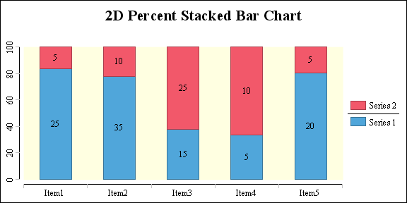
How do I set an axis scale as a percent scale?
A numeric (either linear or logarithmic) axis’ scale may be set as a percent scale using the following code snippet:
Axis axOrthogonalNumerical = …;
axOrthogonalNumerical.setPercent(true);
This would result in a chart as shown below:
Can I combine stacked, logarithmic and/or percent properties on a single scale?
Yes. The following combinations of numeric scales are possible:
[Linear | Logarithmic] [| Percent] [| Stacked]
Note however that a logarithmic scale cannot plot negative values resulting in a runtime error. Also, the percent modifier is only available for numeric type scales and will result in errors if applied to non-numeric axes.
The axis type can be set using the following APIs: Axis xAxis = …;
xAxis.setType(AxisType.TEXT_LITERAL);
Axis yAxis = …;
yAxis.setType(AxisType.LINEAR_LITERAL);
yAxis.setPercent(true);
Stacking is applied on the series … not on an axis.
Hence, the API to stack a series (as previously discussed) is:
BarSeries bse1 = …;
BarSeries bse2 = …;
BarSeries bse3 = …;
bse1.setStacked(true);
bse2.setStacked(true);
bse3.setStacked(false);
This example above results in an interesting chart type wherein a single X-axis category unit is split into two subunits (assuming that all 3 bar series are attached to a single Y-axis):
Subunit-1 contains bse1 and bse2 as stacked
Subunit-2 contains bse3 unstacked as a solitary series
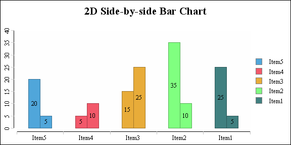
See the attached sample that illustrates how various combinations of stacked and un-stacked series may be used in a single plot:
How do I add marker lines and marker ranges to the plot?
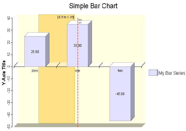
A marker line is associated with an axis at a specific value. If the axis represents a category axis, the marker line value represents the category unit index. A decimal marker line value may be used to place the marker line in between category units. Marker lines are rendered in front of the series graphic elements.
Here’s an example of a marker line associated with a category axis:
MarkerLine ml = MarkerLineImpl.create(xAxis, NumberDataElementImpl.create(1.5)); // between unit 1 and 2
ml.setLabelAnchor(Anchor.NORTH_EAST_LITERAL);
Here’s an example of a marker line associated with a value axis:
MarkerLine ml = MarkerLineImpl.create(yAxis, NumberDataElementImpl.create(23.25)); // at an absolute value
ml.setLabelAnchor(Anchor.NORTH_WEST_LITERAL);
The label anchor identifies the position of the label associated with the marker line. A format specifier may be used to define the presentation format for the marker line value being displayed.
In addition, the marker line’s attributes (color, style, thickness) are configurable.
Marker ranges are similar to marker lines. These are presented as rectangular regions as a backdrop behind all series graphic elements. Here’s an example of a marker range being associated with a value axis:
MarkerRange mr = MarkerRangeImpl.create(
yAxisPrimary,
NumberDataElementImpl.create(23.5),
NumberDataElementImpl.create(61.35),
ColorDefinitionImpl.ORANGE()
);
mr.setLabelAnchor(Anchor.NORTH_EAST_LITERAL);
The two values 23.5 and 61.35 indicate the start and end values mapped on the value axis – yAxisPrimary. As with marker lines, a label that presents the ’range value’ is positioned using the anchor property inside the rectangle shaped marker range bounds.
The image illustrates a bar chart with a sample red dashed marker line and an orange marker range.
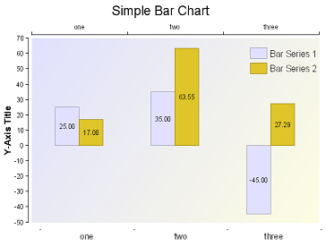
How do I define a chart structure and populates it with data? As an example, provide a code snippet for bar chart creation.
The code snippet below illustrates how a bar chart may be created with some default attributes specified. [Note that imports have been omitted for improved readability and to reduce clutter. Ensure that the chart runtime library is included in the build path.]
public static Chart createMyChart()
{
// BAR CHARTS ARE BASED ON CHARTS THAT CONTAIN AXES
ChartWithAxes cwaBar = ChartWithAxesImpl.create();
cwaBar.getBlock().setBackground(
ColorDefinitionImpl.WHITE()
);
cwaBar.getBlock().getOutline().setVisible(true);
cwaBar.setDimension(
ChartDimension.TWO_DIMENSIONAL_WITH_DEPTH_LITERAL
);
// CUSTOMIZE THE PLOT
Plot p = cwaBar.getPlot();
p.getClientArea().setBackground(
ColorDefinitionImpl.create(255, 255, 225)
);
p.getOutline().setVisible(false);
cwaBar.getTitle().getLabel().getCaption().setValue(
"Simple Bar Chart"
);
// CUSTOMIZE THE LEGEND
Legend lg = cwaBar.getLegend();
lg.getText().getFont().setSize(16);
lg.getInsets().set(10, 5, 0, 0);
lg.setAnchor(Anchor.NORTH_LITERAL);
// CUSTOMIZE THE X-AXIS
Axis xAxisPrimary = cwaBar.getPrimaryBaseAxes()[0];
xAxisPrimary.setType(AxisType.TEXT_LITERAL);
xAxisPrimary.getMajorGrid().setTickStyle(
TickStyle.BELOW_LITERAL
);
xAxisPrimary.getOrigin().setType(
IntersectionType.VALUE_LITERAL
);
xAxisPrimary.getTitle().setVisible(false);
// CUSTOMIZE THE Y-AXIS
Axis yAxisPrimary = cwaBar.getPrimaryOrthogonalAxis(
xAxisPrimary
);
yAxisPrimary.getMajorGrid().setTickStyle(
TickStyle.LEFT_LITERAL
);
yAxisPrimary.setType(AxisType.LINEAR_LITERAL);
yAxisPrimary.getLabel().getCaption().getFont().setRotation(90);
// INITIALIZE A COLLECTION WITH THE X-SERIES DATA
Vector vs = new Vector();
vs.add("zero");
vs.add("one");
vs.add("two");
TextDataSet categoryValues = TextDataSetImpl.create(vs);
// INITIALIZE A COLLECTION WITH THE Y-SERIES DATA
ArrayList vn1 = new ArrayList();
vn1.add(new Double(25));
vn1.add(new Double(35));
vn1.add(new Double(-45));
NumberDataSet orthoValues1 = NumberDataSetImpl.create(
vn1
);
// CREATE THE CATEGORY BASE SERIES
Series seCategory = SeriesImpl.create();
seCategory.setDataSet(categoryValues);
// CREATE THE VALUE ORTHOGONAL SERIES
BarSeries bs1 = (BarSeries) BarSeriesImpl.create();
bs1.setSeriesIdentifier("My Bar Series");
bs1.setDataSet(orthoValues1);
bs1.setRiserOutline(null);
bs1.getLabel().setVisible(true);
bs1.setLabelPosition(Position.INSIDE_LITERAL);
// WRAP THE BASE SERIES IN THE X-AXIS SERIES DEFINITION
SeriesDefinition sdX = SeriesDefinitionImpl.create();
sdX.getSeriesPalette().update(0); // SET THE COLORS IN THE PALETTE
xAxisPrimary.getSeriesDefinitions().add(sdX);
sdX.getSeries().add(seCategory);
// WRAP THE ORTHOGONAL SERIES IN THE X-AXIS SERIES DEFINITION
SeriesDefinition sdY = SeriesDefinitionImpl.create();
sdY.getSeriesPalette().update(1); // SET THE COLOR IN THE PALETTE
yAxisPrimary.getSeriesDefinitions().add(sdY);
sdY.getSeries().add(bs1);
return cwaBar;
}
How do I render a chart on an SWT Canvas?
A chart, once created (perhaps the bar chart from the previous Q), may be rendered on an SWT Canvas using the code snippet shown below. [Note that imports have been omitted for improved readability and to reduce clutter. Also, the createMyChart() method needs to provide a chart structure. Ensure that the chart runtime library is included in the build path.]
public class ChartViewerSWT implements PaintListener
{
private IDeviceRenderer idr = null;
private Chart cm = null;
/**
* The program entry point
| * @param args |
*/
public static void main(String[] args)
{
ChartViewerSWT scv = new ChartViewerSWT();
GridLayout gl = new GridLayout();
gl.numColumns = 1;
Display d = Display.getDefault();
Shell sh = new Shell(d);
sh.setSize(900, 700);
sh.setLayout(gl);
sh.setText(scv.getClass().getName() + " [device="+scv.idr.getClass().getName()+"]");
GridData gd = new GridData(GridData.FILL_BOTH);
Canvas cCenter = new Canvas(sh, SWT.NONE);
cCenter.setLayoutData(gd);
cCenter.addPaintListener(scv);
sh.open();
while (!sh.isDisposed())
{
if (!d.readAndDispatch())
{
d.sleep();
}
}
}
/**
* The constructor
*/
ChartViewerSWT()
{
// INITIALIZE THE SWT RENDERING DEVICE
final PluginSettings ps = PluginSettings.instance();
try {
idr = ps.getDevice("dv.SWT");
} catch (ChartException pex)
{
DefaultLoggerImpl.instance().log(pex);
}
cm = createSimpleBarChart();
}
/**
* The SWT paint callback
*/
public void paintControl(PaintEvent pe)
{
idr.setProperty(
IDeviceRenderer.GRAPHICS_CONTEXT, pe.gc);
Composite co = (Composite) pe.getSource();
Rectangle re = co.getClientArea();
Bounds bo = BoundsImpl.create(re.x, re.y,
re.width, re.height);
bo.scale(
72d /
idr.getDisplayServer().getDpiResolution()
); // BOUNDS MUST BE SPECIFIED IN POINTS
| // BUILD AND RENDER THE CHART |
Generator gr = Generator.instance();
try {
gr.render(
idr,
gr.build(
idr.getDisplayServer(),
cm, null,
bo,
null
)
);
} catch (ChartException gex)
{
gex.printStackTrace();
}
}
}
How do I render a chart on a SWING JPanel?
A chart, once created, may be rendered on a SWING JPanel using the code snippet shown below. [Note that imports have been omitted for improved readability and to reduce clutter. Also, the createMyChart() method needs to provide a chart structure. Ensure that the chart runtime library is included in the build path.]
public class ChartViewer extends JPanel
{
private boolean bNeedsGeneration = true;
private GeneratedChartState gcs = null;
private Chart cm = null;
private IDeviceRenderer idr = null;
/**
* The program entry point
| * @param args |
*/
public static void main(String[] args)
{
ChartViewer scv = new ChartViewer();
JFrame jf = new JFrame();
jf.setDefaultCloseOperation(JFrame.DISPOSE_ON_CLOSE);
Container co = jf.getContentPane();
co.setLayout(new BorderLayout());
co.add(scv, BorderLayout.CENTER);
// CENTER WINDOW ON SCREEN, ETC
Dimension dScreen = Toolkit.getDefaultToolkit().getScreenSize();
Dimension dApp = new Dimension(800, 700);
jf.setSize(dApp);
jf.setLocation((dScreen.width - dApp.width)/2, (dScreen.height - dApp.height) / 2);
jf.setTitle(scv.getClass().getName() + " [device="+scv.idr.getClass().getName()+"]");
jf.show();
}
/**
* The constructor
*/
ChartViewer()
{
// INITIALIZE THE SWING RENDERING DEVICE
final PluginSettings ps = PluginSettings.instance();
try {
idr = ps.getDevice("dv.SWING");
} catch (ChartException pex)
{
DefaultLoggerImpl.instance().log(pex);
}
cm = createMyChart(); // CHART CREATION IS PERFORMED ONCE - OFFSCREEN
}
/**
* The SWING paint callback
*/
public void paint(Graphics g)
{
super.paint(g);
| // SETUP AS NEEDED |
Graphics2D g2d = (Graphics2D) g;
idr.setProperty(
IDeviceRenderer.GRAPHICS_CONTEXT, g2d);
Dimension d = getSize();
Bounds bo = BoundsImpl.create(0, 0,
d.width, d.height);
bo.scale(
72d /
idr.getDisplayServer().getDpiResolution()
); // BOUNDS MUST BE SPECIFIED IN POINTS
// BUILD ONLY WHEN NECESSARY
Generator gr = Generator.instance();
if (bNeedsGeneration)
{
bNeedsGeneration = false;
try {
- gcs = gr.build(
- idr.getDisplayServer(),
- cm, null,
- bo,
- null
- );
- } catch (ChartException gex)
- {
- gex.printStackTrace();
- }
}
try { // RENDERING DONE WHEN JPANEL IS PAINTED
gr.render(
idr,
gcs
);
} catch (ChartException rex)
{
rex.printStackTrace();
}
}
}
How do I render a chart into an image?
The following code snippet illustrates how a chart may be written out to a supported image file format. Note that the image device renders using pure Java2D to render charts. This is because rendering of charts into images is more often needed in web applications (where dependencies on SWT system libraries limits portability).
// DEFINE A CHART STRUCTURE
Chart cm = SampleCharts.createMyChart();
// OBTAIN A PNG IMAGE DEVICE RENDERER
PluginSettings ps = PluginSettings.instance();
IDeviceRenderer idr = null;
try {
idr = ps.getDevice("dv.PNG");
} catch (ChartException pex)
{
DefaultLoggerImpl.instance().log(pex);
}
// DEFINE THE BOUNDS IN POINTS
Bounds bo = BoundsImpl.create(0, 0, 800, 600); // IN POINTS
// BUILD THE RENDERED CHART STRUCTURE
Generator gr = Generator.instance();
GeneratedChartState gcs = null;
try {
gcs = gr.build(
| idr.getDisplayServer(), |
cm, null,
bo, null
);
} catch (ChartException gex)
{
DefaultLoggerImpl.instance().log(gex);
System.exit(0);
}
// RENDER THE CHART TO A PNG FILE
Image img = new BufferedImage(
(int) bo.getWidth(), (int) bo.getHeight(), BufferedImage.TYPE_INT_ARGB
);
idr.setProperty(IDeviceRenderer.FILE_IDENTIFIER, "chart.png");
try {
gr.render(idr, gcs);
} catch (ChartException rex)
{
DefaultLoggerImpl.instance().log(rex);
}
Troubleshooting
Charts not rendering on Unix systems
Problem: If your chart or report engine runs on a Unix server, there is a chance that no display server is available, and you will get this error when generating a chart:
java.lang.InternalError: Can't connect to X11 window server using ':0.0' as the value of the DISPLAY variable.
Resolution: You can fix this by running your application in headless AWT graphics mode. To specify this, a "-Djava.awt.headless=true" option should be added to the JVM argument list or other server configuration script. Note the headless option is only available since JDK1.4. More information about headless mode can be found here: http://java.sun.com/developer/technicalArticles/J2SE/Desktop/headless/
Another solution is to use Java 5, where this issue has been resolved, and does not require any special setting.
GDI+ Error in BIRT Designer
Problem: With version 2.1 or higher, you see this error when trying to use charts in the BIRT designer: "Unable to load graphics library [GDI+ is required]"
Resolution: BIRT 2.1.1 is using some of the SWT 3.1 new features for better rendering. Those new features require GDI+ on Windows, and Cairo on X Windows. Refer to the SWT FAQ for details.
There are two solutions:
- start Eclipse with "eclipse.exe -vmargs -DR31ENHANCE=false". This will not
use any of the new SWT 3.1 functionalities, and so doesnt' require GDI+.
Distorted Charts - Hyperlinks/Tooltips not working
Problem: When the chart is rendered in a report, it appears distorted, and hyperlinks set on the chart are not present (or present at the wrong place)
The cause of this problem is typically a width or height of the chart set as a percentage value. This causes the browser to resize the chart image based on the current browser page width. Hence the image is distorted and the image map holding the hyperlinks cannot work.
Resolution: To solve that issue, change the width and height unit of your chart to a non-percentage choice such as pixel, points, inches,... It's possible that some old reports in 2.2 will not show any unit at all for the width or height, as the percentage has been removed for charts from the UI, but the report model still refers to percentage (it can be fixed by selecting one of the available units such as points, pixels, etc...)
If the fix above doesn't work, it may be that the dpi settings on your machine is set to 120 dpi. This is a known issue, it can be worked around by either:
- Changing your machine dpi to 96 (on Windows, right click on desktop, click properties/settings/advanced)
- Append the dpi of your machine in the url used to generate the report using &__dpi=120 (or whatever your dpi is) in the url
- Use SVG to render the chart (option in the chart builder, you have to install the SVG plugin in IE), SVG is vector-based and can rescale the image without quality loss.
Microsoft JScript Runtime error : Permission denied
Problem: If the chart format is SVG and the mouse click action of series is set to invoking script which contains a window open operation 'window.open(...)' to open a new window by mouse click. When the chart runs in IE6 or IE7, mouse clicks on series, the new window don't be opened, but a Microsoft JScript Runtime error dialog will display with 'Permission denied' message. The same chart runs OK in Firefox.
Resolution: It may be a problem of IE6 and IE7, you can find some related information from http://support.microsoft.com/default.aspx/kb/934365. To solve this issue, you can replace script 'window.open(...)' with 'window.parent.open(...)' or 'top.open(...)', it can be executed normally.
Charts cannot render more than 10,000 rows
Problem: Charts are not designed to render several thousands of rows as it will not be readable, and an unintentional binding of too many rows could lead to out of memory errors, hence this limitation.
Resolution: If grouping is set at the chart level on a high number of rows, try doing the grouping in your SQL query instead, it will be more efficient and will resolve the issue.
You can also use the JVM property CHART_MAX_ROW to set a higher number. For instance change the command line of your java application to -DCHART_MAX_ROW=30000, to increase the limit to 30,000 rows.
Charts render with a grey background in IE6
Problem: PNG charts show a grey background in IE6. This is due to the fact that the chart background is transparent and that IE6 does not support PNG transparency.
Resolution: There are several ways to fix the problems: If the chart is supposed to be rendered in SVG, but render as PNG, it's because the SVG plugin is not installed in IE. Installing it will render the chart as SVG, and the background will render correctly Another way to fix the issue is to set a non-transparent background for the chart such as white. Finally the problem is fixed in IE7, so upgrading the browser will solve the issue.

