Notice: this Wiki will be going read only early in 2024 and edits will no longer be possible. Please see: https://gitlab.eclipse.org/eclipsefdn/helpdesk/-/wikis/Wiki-shutdown-plan for the plan.
Difference between revisions of "09052007Notifications"
m |
m |
||
| (11 intermediate revisions by the same user not shown) | |||
| Line 1: | Line 1: | ||
| + | |||
| + | Presentation on Notifications | ||
| + | by Kimberley Peter on September 5, 2007 | ||
| + | |||
| + | |||
== Overview == | == Overview == | ||
| − | The focus of this page is on alert pop-up notifications in Jazz | + | The focus of this page is on alert pop-up notifications in Jazz. This is a point-in-time snapshot of the alerts implementation and design, not a representation of the final approach the platform will take. |
| − | ==== Requirements | + | ==== Requirements ==== |
| − | * Show source of | + | * Show source of pop up: What component does the alert come from? |
| − | * Show type of | + | * Show type of pop up: Information, Error, Warning, Success |
* Support aggregation: Showing multiple alerts from multiple sources | * Support aggregation: Showing multiple alerts from multiple sources | ||
* Show incoming information | * Show incoming information | ||
| Line 15: | Line 20: | ||
== Content & Layout == | == Content & Layout == | ||
| − | ==== | + | ==== Implementation ==== |
'''Title area''' | '''Title area''' | ||
| − | * Type | + | * Type |
* Drop down settings | * Drop down settings | ||
** Disable/enable trigger by component or all | ** Disable/enable trigger by component or all | ||
| Line 31: | Line 36: | ||
| − | ==== | + | ==== Design ==== |
'''Title area''' | '''Title area''' | ||
| Line 44: | Line 49: | ||
'''Body''' | '''Body''' | ||
* Model object | * Model object | ||
| − | * Object overlay to show type | + | * Object overlay to show type |
* Message, linkable | * Message, linkable | ||
| Line 55: | Line 60: | ||
* Will be adaptable to OS theme | * Will be adaptable to OS theme | ||
| + | '''Early Style Exploration''' | ||
| + | |||
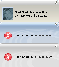
| + | [[Image:style-explorations.jpg]] | ||
| + | |||
| + | '''Adaptable color''' | ||
| + | |||
| + | [[Image:adaptable-color.jpg]] | ||
== Animation == | == Animation == | ||
| − | ==== | + | ==== Implementation ==== |
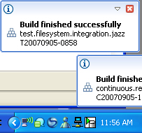
* Motion = In from right | * Motion = In from right | ||
| − | * Aggregation = Stacked | + | * Aggregation = Stacked; slide down and out to the right |
[[Image:current-ani.jpg]] | [[Image:current-ani.jpg]] | ||
| − | ==== | + | ==== Design ==== |
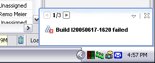
* Motion = In from right or up from bottom, to be finalized | * Motion = In from right or up from bottom, to be finalized | ||
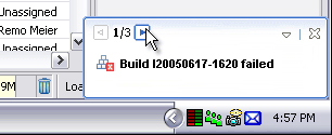
* Aggregation = Paginated | * Aggregation = Paginated | ||
| Line 83: | Line 95: | ||
== Preferences == | == Preferences == | ||
| − | + | ||
| + | Currently, you select an item in the tree and turn on, off, or add triggers. | ||
Latest revision as of 18:06, 5 August 2008
Presentation on Notifications by Kimberley Peter on September 5, 2007
Contents
Overview
The focus of this page is on alert pop-up notifications in Jazz. This is a point-in-time snapshot of the alerts implementation and design, not a representation of the final approach the platform will take.
Requirements
- Show source of pop up: What component does the alert come from?
- Show type of pop up: Information, Error, Warning, Success
- Support aggregation: Showing multiple alerts from multiple sources
- Show incoming information
- Provide quickly accessible settings:
- Link to preferences
- Trigger enable/disable
Content & Layout
Implementation
Title area
- Type
- Drop down settings
- Disable/enable trigger by component or all
- Preferences
- Close
Body
- Model object
- Message, linkable
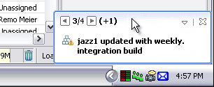
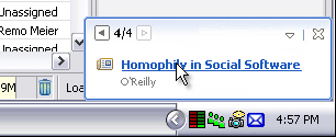
Design
Title area
- Pagination controls
- See new incoming as "+n"
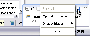
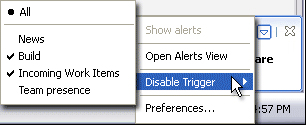
- Drop down settings
- Show alerts
- Disable/enable trigger by component or all
- Preferences
- Close
Body
- Model object
- Object overlay to show type
- Message, linkable
Style & Color
- Form-like style with gradient
- Blue only, at present
- Will be adaptable to OS theme
Early Style Exploration
Adaptable color
Animation
Implementation
- Motion = In from right
- Aggregation = Stacked; slide down and out to the right
Design
- Motion = In from right or up from bottom, to be finalized
- Aggregation = Paginated
Preferences
Currently, you select an item in the tree and turn on, off, or add triggers.


